Yu-Gi-Oh! Logo
“Yu-Gi-Oh!” is a manga and anime series by Kazuki Takahashi, featuring the card game Duel Monsters. Players duel with magical cards in strategic, fantasy battles. Protagonist Yugi Mutou becomes infused with a pharaoh’s spirit, enhancing his gaming skills. The plot weaves adventure, camaraderie, and rivalry as Yugi and allies confront foes and discover ancient secrets. Adaptations include a TV series, films, and a widely played real-world card game. The franchise also explores themes of identity and fate, as Yugi’s connection to the pharaoh deepens. “Yu-Gi-Oh!” has had a significant cultural impact, influencing card gaming and anime storytelling globally.
Meaning and history
“Yu-Gi-Oh!”, a groundbreaking franchise, was created by Kazuki Takahashi and first appeared in Japan in 1996 as a manga series in the weekly magazine “Shonen Jump”. Takahashi, fascinated by games and inspired by his desire to create a story where the main character faces various challenges through games, birthed this iconic series. It initially focused on a variety of games but eventually centered on “Duel Monsters”, a fictional card game within the story.
The narrative follows Yugi Mutou, a timid young student who solves an ancient Egyptian artifact known as the Millennium Puzzle, consequently awakening a dual personality within him – a Pharaoh from Egyptian times. This Pharaoh, later identified as Atem, engages in battles that are fought in the form of card games but reflect deeper themes of bravery, strategy, and supernatural elements.
As the series progressed, it explored the connections between the card game, the characters’ personal growth, and the mystical elements of the Millennium Items – artifacts with powerful abilities tied to the game’s lore. The popularity of the manga led to an animated TV series, which significantly boosted the franchise’s popularity worldwide. This success was further cemented with the release of a real-world version of the Duel Monsters game, drawing fans into the strategic and fantastical world of “Yu-Gi-Oh!”.
The story also delves into the themes of friendship, as Yugi is often accompanied and supported by friends Joey, Tristan, and Téa. The series contrasts the lives of these modern-day teenagers with the ancient, mystical past of the Pharaoh, blending contemporary life with fantasy.
“Yu-Gi-Oh!” has had a lasting impact on pop culture, spawning multiple anime series, movies, and a trading card game that is played internationally. Its blend of mysticism, adventure, and the universal appeal of its strategic card game has made it a beloved franchise with a diverse and dedicated fan base. Kazuki Takahashi’s creation is more than just entertainment; it’s a cultural phenomenon that bridges generations and transcends borders.
What is Yu-Gi-Oh?
“Yu-Gi-Oh!” is a Japanese multimedia franchise that revolves around a fictional trading card game, Duel Monsters. Originating from a manga series by Kazuki Takahashi, it has grown into an extensive world with an animated TV series, movies, and a globally popular physical card game. The story combines elements of ancient Egyptian mysticism, strategic gameplay, and adventures, focusing on themes of friendship and competition.
2001 – 2006
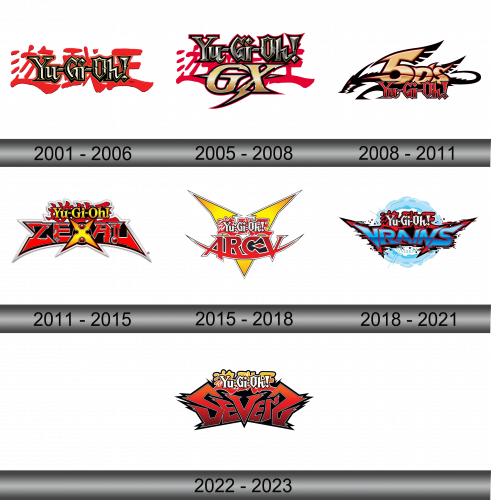
The logo in the image is a dynamic and striking emblem of the “Yu-Gi-Oh!” brand. It features a bold, stylized font with sharp, angular lines that give a sense of motion and energy. The main text is black with a metallic sheen, suggesting a modern, techno-influenced aesthetic. This is superimposed on a vibrant red splash background, reminiscent of a mysterious yet explosive energy, which adds to the logo’s visual impact. The overall design captures the essence of the game’s blend of ancient mysticism and futuristic competition. The exclamation mark punctuates the logo with a sense of excitement and anticipation, embodying the spirit of the thrilling duels the brand is known for.
2005 – 2008
The “Yu-Gi-Oh! GX” logo features “GX” in gold with a futuristic touch, adding sophistication. A lightning bolt motif adds power and vitality to the logo. The classic “Yu-Gi-Oh!” text retains its sharpness, now against a more angular red splash, indicating intensified action. This logo symbolizes the franchise’s growth and visual evolution, respecting its heritage. The design shift reflects the new energy of the “GX” series, known for its novel twists in the story. The logo’s evolution mirrors the show’s thematic progression, signaling advanced dueling eras.
2008 – 2011
The logo shows a striking transformation from previous incarnations, prominently featuring the letters “5D” in bold gold font against a black dragon background, conveying a sense of speed and innovation.This new addition, placed above the familiar “Yu-Gi-Oh!” text, is styled with sharp edges and a streamlined appearance, reminiscent of high-velocity motion, possibly reflecting the series’ narrative shift towards a more dynamic and futuristic setting. The “Yu-Gi-Oh!” text below retains its classic metallic sheen but is now flanked by wing-like motifs that give an impression of flight or soaring ambition. The background has been simplified, focusing the attention on the textual elements and their new design features. Overall, the logo captures a sense of progression and acceleration, aligning with the themes of the updated series it represents.
2011 – 2015
The “Yu-Gi-Oh! ZEXAL” logo features bold, angular “ZEXAL” text within a starburst, signaling a fresh, intense series chapter. Red and black hues deliver a striking visual impact, aligning with the show’s heightened drama. The traditional “Yu-Gi-Oh!” script is tweaked for a futuristic look, maintaining brand continuity. The logo’s sharp contrasts and edges hint at novel adventures and pioneering spirit. Metallic gradients and glowing orbs add a supernatural energy to the starburst, enhancing the logo’s vibrancy. This redesign marks a transformative era for “Yu-Gi-Oh!”, embracing a forward-thinking narrative and visual identity.
2015 – 2018
In this logo, “Yu-Gi-Oh! ARC-V” is emblazoned in a vivid display, taking a stark turn from its predecessor. The design introduces “ARC-V” in a prominent, red font with a 3D effect, positioned within a yellow, star-like burst that suggests dynamism and explosive energy. The “Yu-Gi-Oh!” text sits atop in white with a red outline, maintaining brand continuity while complementing the new subtitle. The edges of the star are jagged, evoking a sense of sharpness and modernity, which could be indicative of cutting-edge themes in the series. This logo shifts away from the darker tones of the previous one, using bright colors and bold shapes to signify a fresh and energetic direction for the franchise.
2018 – 2021
This rendition of the “Yu-Gi-Oh!” logo, representing the “VRAINS” series, presents a futuristic twist with digital aesthetics. The “VRAINS” text takes center stage in a striking red and blue gradient. The background features a translucent blue sphere with a digital grid, symbolizing the virtual world that is integral to the “VRAINS” narrative. The traditional “Yu-Gi-Oh!” text above is overlaid with a digital glitch effect, further emphasizing the techno-centric vibe of this era in the franchise. The logo’s evolution reflects a step into a new, high-tech dimension, staying true to the series’ roots while venturing into contemporary storytelling.
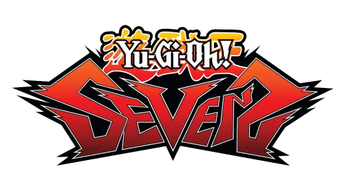
2022 – 2023
The “Yu-Gi-Oh! SEVENS” logo breaks from the cyber-themed predecessor with a bold return to a more traditional, yet energetic design. The word “SEVENS” dominates in a striking, angular font with a red and black gradient, conveying a sense of raw power and intensity. The font has a jagged outline, reminiscent of lightning bolts or seismic energy, evoking excitement and dynamism. In contrast to the previous logo’s digital sphere and grid, this design opts for a straightforward, impactful approach that seems to leap forward, indicative of a new, action-packed direction in the series. The “Yu-Gi-Oh!” text above “SEVENS” retains its classic color scheme but adopts a more playful, cartoon-like style, suggesting a possible shift towards a younger audience or a fresh, reinvigorated take on the franchise.
