Aegean Airlines Logo
Aegean Airlines is the largest airline in Greece, with flights within the country and internationally. Millions of people use the company’s services every year. The airline is a member of the world’s largest aviation alliance Star Alliance. The company was founded in 1987, since then it has been steadily developing, mastering new markets.
Meaning and history
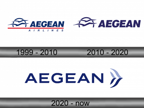
Initially, the airline did not have its own logo. The first logo was presented in 1999. By that time, the company had already become a fairly well-known air carrier, the need for a logo was dictated by the need for further development. The company initially served only VIP clients, and when entering the mass market, it needs recognition among other brands.
1999 – 2010
The first logo included the name Aegean Airlines, with Aegean in large letters and Airlines below in smaller and different typefaces. The two parts of the lettering are separated by a red vertical line. Also to the right of the word Aegean is a semicircle (symbolizing the sun) and a pair of birds flying towards the semicircle. The birds are shown schematically.
2010 – 2020
In 2010, Aegean Airlines became a member of the Star Alliance, which was the reason for the development and presentation of a new logo. It partially remained the same, the red stripe and the word Airlines were removed from it. During these years, there was a variant of the emblem, when a thin blue line was drawn under the main part of the logo, and A Star Alliance member was written below.
2020 – now
The next logo was unveiled on February 12, 2020. The font has changed, the spacing between letters has increased. It only uses the word Aegean. To the right of the word there are checkmarks symbolizing birds, and one is larger than the other, the second is placed between its wings. They are located vertically, horizontally divided in half, the upper part is shown in blue (like the inscription itself), the lower one – in blue.
Color and font
The Aegean Airlines logo has always used shades of blue, with the exception of the first logo, which also used a horizontal red line. Blue is the color of the sky, so its use for an airline is quite justified. The font has changed in 2020, it is more modern, with crisp letters. There are two color options for the 2020 logo. The first one is blue letters and blue-blue check marks on a white background. The second one is white letters and blue and white butterflies on a blue background.

