Aeroperú Logo
As you can figure it from the name, Aeroperu was a large Peruvian airline, controlled by the government. This company linked the country with the neighbors such as US or Latin and South American countries. It functioned as a flag carrier for Peru from 1973 to 1999. The hub was Jorge Chavez Airport in the city of Lima.
Meaning and History
The full name of the company was Peruvian air transport company (Empresa de transporte aéreo del Perú). Aeroperu was formed to replace SATCO, an older airline, established in 1960 and operated by the government. Aeroperu gained all the functions of the predecessor and in fact became its heir.
1973 – 1995
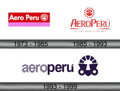
The initial logo they introduced in 1973 featured a bicolor rectangle – 2/3 red, 1/3 pink. On the red part, they’ve written the company name (arranged as ‘Aero Peru’) in white. Right next to it, they’ve put an emblem of the Sun with something that looks like a plane in its middle.
1985 – 1993
In 1985, they somewhat rearranged the structure. The emblem was now on top, followed below by the company name. This one was styled as ‘AeroPeru’ now and sported a more unique, serif typeface with two underlining strokes below. The very bottom featured the company’s title in Spanish that said ‘Flag Carrier’, basically.
All of the above was colored red – after the colors of Peru.
1993 – 1999
The general logotype which the company used most of its history until the ceasing of its operations depicted the bright red name with a mark on the last character. On the left side from the inscription, there was a company’s emblem – the bright red monochrome image with a curious symbol, surrounded by many lines over the circle.
Emblem and Symbol
There was also another, semi-official emblem, which was in use for the last years of the company, along with the red one. This logo had the dark blue word ‘Aeroperu’, the first half of which is sometimes striped horizontally. The symbol they use for decorating planes is also there.


