Airbus Logo
Airbus is a European consortium of various aircraft manufacturers specifically created to compete with the American counterparts, specifically Boeing. As such, they are considered one of the world’s top airplane manufacturers, and a good portion of the aircraft in the world is made by them.
Meaning and History
The Airbus Company in its current form has been created in 2000 when many smaller companies have united into one big corporation. Prior to that, it was a looser association of manufacturers with the same name. This is why Airbus is characterized as ‘Europe-wide’ company with HQ in Germany, France, Spain, UK, etc.
What is Airbus?
It’s a giant Europe-wide conglomerate of plane manufacturers. Thanks to its size, Airbus can compete with the likes of Boeing.
2001 – 2010
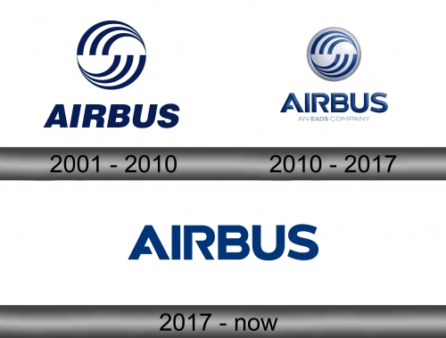
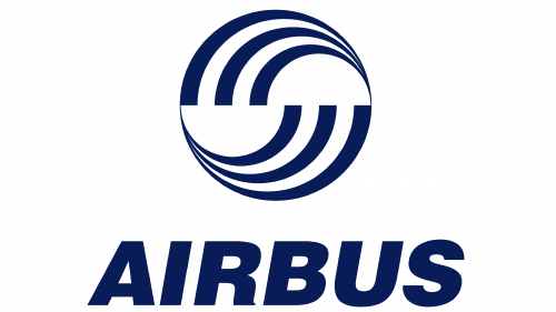
The original logo introduced their iconic emblem – a circular shape reminiscent of the Yin-Yang symbol: there are two currents of air (shapes that consist of three lines each) with blank pockets between them. Usually, they would paint these blue, but other colors (such as orange) were also common.
Below, there was a rather ordinary sans-serif name inscription. It was tilted to the right and mostly bereft of any oddities. The usual color was also blue.
2010 – 2017
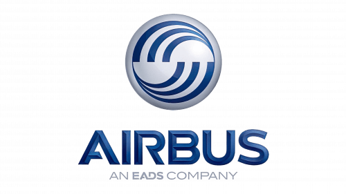
In 2010, they decided to model their usual emblem into a badge of sorts. They gave it a distinct blue background, added glint, shading, gradient and volume (3D was fashionable back then). They commonly put this new design onto the left-most side of the logo, followed on the right by the company’s name.
Many new quirks the emblem had also applied to the text, including shading, volume and more. There was also a new font – a futuristic style with many sharp edges and cuts used by many other aerospace companies. The letters were usually colored blue.
2017 – today
In 2017, they got rid of the emblem and simply took the name writing from before. It was now free of additional 3D effects, but the new style received in the previous iteration stayed.
Emblem and Symbol
Even though the company doesn’t use their emblem on the official logo since 2017, it still finds purpose as the livery for their newly-built planes. Typically, this pattern can be seen partially on the vertical stabilizers in the back of the vessel. Although, it’s more like a pale imitation put onto a blue background.
