Air France Logo
Air France is the national flag carrier of the titular country. They are also the biggest airline in it and one of the largest in Europe, both in terms of fleet size and sheer productivity. Most of their destinations include Europe (primarily Western Europe; France in particular), but it’s also an internationally operating company.
Meaning and History
The airline was created in 1933 specifically with the idea that it would be the nation’s chief airline. It was formed by merging several smaller, diverse flight providers, and upon creation it was rather extensive. At the moment, it can be safely regarded as one of the world leaders in this trade.
Who owns Air France?
Air France is owned by a corporation called Air France-KLM. They basically just own these two airlines and a few smaller ones.
1933 – 1976
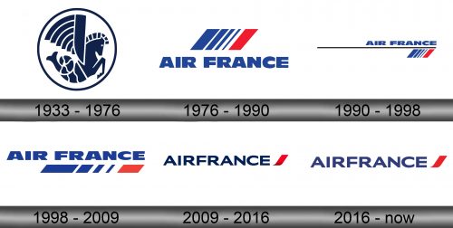
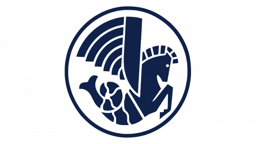
For several decades, Air France had an iconic Pegasus logo. It was actually a combination of two creatures: a winged horse (Pegasus) and a fish-tailed horse (Hippocampus). Both appear in the Greek mythology, but here they represent the idea of traversing both air and ocean.
The entire creature was blue, with white details all over it. They purposefully squished it into a curved position, because it was further surrounded by a blue ring. The resulting negative space was white (after the national colors).
1976 – 1990
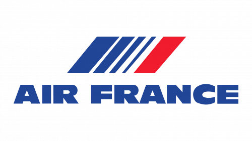
In 1976, they’ve adopted a more ordinary design: the company name topped by a number of geometric shapes. The name consisted of rather bulky, big letters, all colored in blue, and all capital. The shapes above were a collection of tilted rectangles: four increasingly thinner blue ones and a red one on the right side.
1990 – 1998
In 1990, they decided to instead put the name part over the rectangle gathering, align both on the right side and then separate them with a long black line. It was very long – almost as long as the ‘Air France’ inscription itself.
1998 – 2009
In 1998, they removed the line, took both parts and squished them vertically. Basically, they became shorter, but it’s much more visible with the figures, because they made them about a ¼ of their previous height and stretched them to the left as far as the word ‘Air’.
What is Air France?
It’s one of the most prominent airlines in Europe. Since 1933, they’ve been a flag carrier for France.
2009 – 2016
In 2009, they decided to play with a different typeface – a much simpler, thin style that looks like an ordinary sans-serif. Both words were also put together and colored dark blue. As for the geometric mess, the logo was only left with the red part. It was returned to the normal proportions and made to look like a ribbon of sorts.
2016 – today
The same year, they tweaked the colors a bit – changed the blue to a slightly brighter hue and removed shading they left in the bottom of the red ribbon.
Emblem and Symbol
Where does Air France fly?
Most of their journeys happen in Europe – most often, across France and into other Western European countries. But it’s a global company with many travel routes all over the place.
They actually still use the old blue-and-red amalgamation of figures, except on the planes livery, and not as part of the logotype. Moreover, they stretched them even further up to match the length of the vertical stabilizer that sticks out of the plane’s rear. They are the French national carrier, and this, after all, looks mightily like the French flag.
