Aston Martin Logo
Aston Martin is the name of a British vehicle manufacturer, which appeared in 1913. They are best known for producing high-quality cars, designed for various purposes such as races, sports completions, or just as luxury cars. Their services also include proving parts for their cars, as well as their tuning and fixing. This is the company that stood at the beginning of the British automobile industry. Throughout their history, they had not only built a reputation as a luxury class car provider, but they also boosted the British economy.
Meaning and history
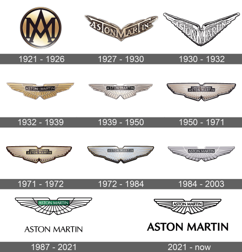
Initially, the company name was Bamford & Martin. It was called after its founders – Robert Bamford and Lionel Martin. But then in 1914, Lionel took part in Aston Hill races, and he suggested putting the ‘Aston’ word in place of ‘Bamford’. Robert agreed without any objections. The brand logotype appeared in 1921. For 7 years before this, the brand had been using just its nameplate as a logo. Its brand identity didn’t change many times throughout its history. Only once they replace a circular badge with wings.
What is Aston Martin?
Aston Martin is an automobile manufacturer, founded in 1913 and located in the United Kingdom. They produce high-class quality sports cars, tourers, as well as luxury cars. Their list of professional services also includes modification, repairing, and changing parts of their vehicles. This is one of the most recognizable companies, which designs, produces, and selling various premium cars, popular across the whole world for their outstanding safety, high speed, and strict style.
1921 – 1926
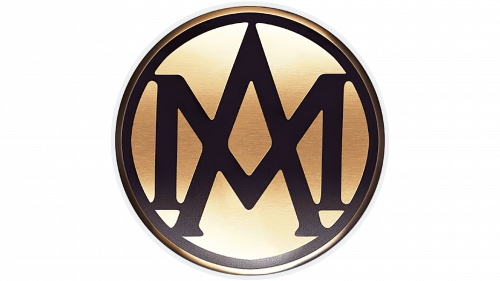
The first Aston Martin logotype was a circular badge with a monogram with the brand’s initials at the center. The black ‘A’ and ‘M’ characters intertwined each other and had a black serif typeface with classic strict lines. They were located on a gradient golden and white background. The frame of the badge had a gradient and black coloring.
1927 – 1930
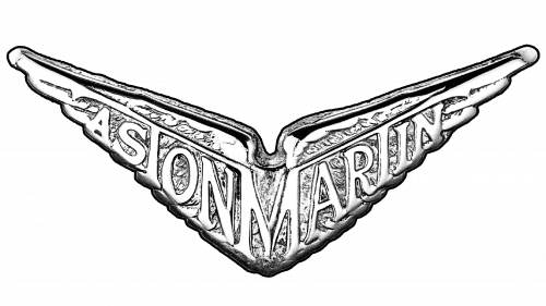
The familiar wings were made in 1927, though they didn’t look just like the modern variant. These ones had a bronze coloring and a rough tilt at the center. The ‘M’ character served as the middle of the whole emblem, and it had long lines coming from its vertical bars to the left and right sides. The ‘T’ characters of both words were featured as two vertical lines coming out of lines of the ‘M’ character. All other letters, which were along with two halves of the emblem, had a heavy serif type with fewer gaps between serif letters.
1930 – 1932
A few years later, they modified the original wings. The coloring was changed to silver, and the wings themselves became even more tilted.
1932 – 1939
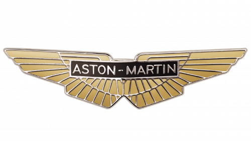
The following logotype depicted well-known horizontal wings, on which they drew a small rectangle with the brand name on it. The wings in the 1932 edition of the logotype were colored golden and had various silver lines. The rectangle was colored black and had a silver framing. The ‘Aston-Martin’ inscription had an uppercase sans-serif typeface with fewer gaps between letters. Due to all these features, the 1932 logo looked luxurious, strict, and clean.
1939 – 1950
In 1939, they’d made the logo more angular and even straighter than it was previously. The wings were also recolored silver and black.
1950 – 1971
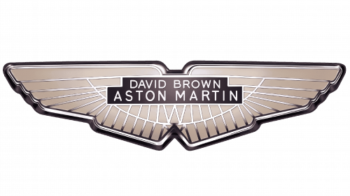
The next logotype in the Aston Martin collection depicted gradient beige and white wings with a red area at the center. In this area, they wrote the name of the company leader of that time – David Brown. It was placed above the name of the brand. The whole emblem now was a bit narrow in comparison with the previous logotype.
1971 – 1972
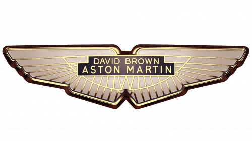
For a year, they used a logotype of beige wings with multiple golden lines on them. The inscription also changed its color to golden yellow.
1972 – 1984
They changed the wings coloring to sky blue and the rectangle coloring to dark blue. The ‘David Brown’ inscription was removed. Also, they added a 3D effect to the whole logo, which made it more stylish.
1984 – 2003
In 1984, they changed the logo style to silver and black and added a black outline at the bottom of the logo. Also, there was a white circle going in the middle of the wings.
1987 – 2021
The 2003 edition of the wings doesn’t show us any special elements. There is only a schematic featuring the wings, executed in black and white shades. We can also see a gradient green and black rectangle, on which they wrote the white name. Below the wings, the black variant of the name in bigger size was showing off.
2021 – now
Font
The Aston Martin emblem has a simple yet strict and serious color palette, consisting of black and white shades. The white wings, which have many black lines on them, stand as the main part of the logo. The font used to write the name has a thin and slim sans serif style with uppercase letters and fewer gaps between them.
Color
In the central part of the emblem, we can see a gradient green and black plate, on which they wrote a white inscription with the name of the brand. The same inscription is written below the whole emblem, but it has a black coloring. The font used to write the name has a thin and slim sans serif style with uppercase letters and fewer gaps between them.
