ANZ Logo
ANZ refers to the Australia and New Zealand Banking Group Limited, commonly known as ANZ. This multinational banking and financial services corporation was established in London, initially as the Bank of Australasia. ANZ was created to facilitate trade and commerce between the United Kingdom and Australia. Over the years, it has grown to become one of the largest banks in Australia and New Zealand, offering a wide range of financial products and services, including retail, commercial, and institutional banking.
Meaning and history
ANZ, short for Australia and New Zealand Banking Group, has a rich history. Founded in 1835 in London, it began as the Bank of Australasia. By 1951, it merged with Union Bank of Australia. This move expanded its Australian presence significantly. ANZ ventured into the Pacific in the 1970s, establishing a strong regional footprint. In 1970, it merged with the English, Scottish & Australian Bank. This further solidified its standing in the banking world. The 1980s saw ANZ’s growth in Asia, marking a global expansion. By 2003, it acquired several Asian banks, enhancing its Asian market influence. Today, ANZ is a banking giant, prominent in Australasia and beyond, offering diverse financial services. Its journey reflects adaptability and strategic growth in the financial sector.
What is ANZ?
ANZ stands for Australia and New Zealand Banking Group Limited, a major financial entity. Originating in the 19th century, it has blossomed into a key player in Australasian banking, offering a wide spectrum of banking and financial services. Renowned for its global presence, ANZ continues to be a significant force in the financial world.
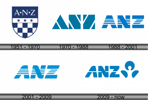
1951 – 1970
This emblem presents a traditional heraldic shield, anchored in a deep navy blue. The top third showcases the letters ‘ANZ’ in white, punctuated by a single star on either side and one above, conveying excellence and aspiration. Below, a white stripe hosts three more stars, symbolizing unity and the Southern Cross constellation, tying the bank’s identity to the Australasian region. The shield’s bottom half features a checkered pattern of blue and white, suggesting a blend of stability and transparency in the bank’s dealings. This design effectively marries tradition with corporate identity.
1970 – 1988
Transitioning from the previous design, this logo adopts a minimalist, abstract approach. The shield motif is replaced by a stylized “ANZ” monogram, composed of geometric shapes that suggest upward momentum and dynamism. The color scheme remains a consistent shade of blue, symbolizing reliability and trust. This contemporary rendition strips away detail in favor of bold simplicity, reflecting modernity and a forward-thinking corporate identity. The design’s clean lines and sharp angles convey a sense of efficiency and progressiveness.
1988 – 2001
This iteration of the logo further evolves the design, presenting the “ANZ” initials in a striking striped pattern. The uniform blue is segmented by horizontal white lines, giving a sense of structure and clarity. This visual strategy breaks the solidity of the previous design, imparting a more dynamic and accessible image. The geometric precision remains, but the stripes add a layer of visual interest, suggesting movement and a progressive outlook. The logo’s transformation reflects a modern, innovative approach to banking.
2001 – 2009
The logo maintains its previous color scheme and abstract design but introduces a new dynamism by altering the stripes. The lines now cascade down each letter, creating a visual effect of depth and perspective. This suggests a sense of movement and progression. The design remains clean and modern, with the stripes offering a subtle nod to traditional financial stability while embracing a forward-thinking ethos. The update signifies an evolution, keeping with the times while maintaining brand recognition.
2009 – Today
In this evolution, the ANZ logo drops the stripes for a cleaner, more solid typeface, emphasizing clarity and strength. Notably, a new symbol appears: an abstract, human-like figure. This icon, composed of three swooping shapes, suggests connection, growth, and customer focus. The logo’s blue hue is maintained, ensuring brand continuity. The addition of the human-esque emblem represents a significant brand shift, highlighting a commitment to personal relationships and community engagement. It’s a modern, approachable image for the digital age.


