Asiana Airlines Logo
Asiana is one of the main airlines in South Korea. It operates domestic and international passenger and cargo flights in 21 countries including China, France, Italy, Russia and others. The main offices and hubs, where the company’s central management is located, are the Gimpo and Incheon airports.
Meaning and History
The company was established in the year 1988 as the subsidiary of the South Korean conglomerate called Kumho Asiana Group. The name of the newly formed company was chosen ‘Asiana Airlines’ to make it associative with the parent company. This affects the Asiana visual identity as well: from the start, it had some features similar to the Kumho.
What is Asiana Airlines?
It’s a major South Korean airline. They control about a ¼ of the overall market in the country.
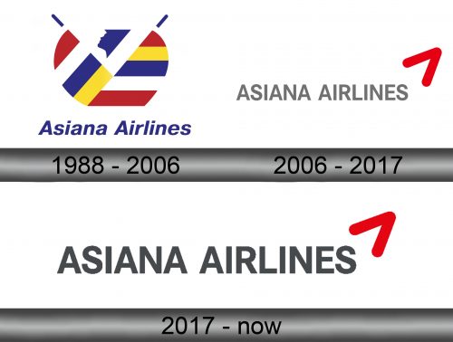
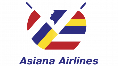
1988 – 2006
The initial brand logotype, which appeared with the company foundation, had the bright blue-colored inscription ‘Asiana Airlines’, written in the bent sans-serif typeface, without any special features. Right side from inscription, we can see the curious multicolored image, depicted in the horizontal and vertical lines that are connected to each others.
2006 – 2017
As we’ve mentioned, as the subsidiary of the Kumho Group, Asiana Airlines used the similar features in the logo as its parent company. The logo of 2006 consisted of the new emblem, the red tick mark, and the new typeface for inscription. It had the gray sans-serif style with the straighter letters. Also, the whole word was capitalized.
Where does Asiana Airlines fly?
They mostly fly to Asian countries. It particularly includes China, Japan and bits of Russia.
2017 – today
In the year 2017, the new corporate trademark was introduced. It had the same style as the previous one, but it was a bit darkened to the similar shade as it is in the Kumho logo. Due to the simple and clear color palette and other details in the logotype, this brand logo is easy to modify and change according to the background or the place for the logo.
Emblem and Symbol
Who owns Asiana Airlines?
The company is partially owned by the Korean government. That being said, it’s still largely controlled by the investors.
While using the inscription with the tick mark for the corp logo on the fuselages and offices’ signboards, for the social media accounts Asiana uses the three-colored tail logo, featured in three red, yellow and blue figures intertwining each other and forming the shades. This emblem is easy to use in social media due to the simple and clear style.

