Atlanta Falcons Logo
Based in Atlanta, the Falcons is a professional American football team. The team is owned by businessman Arthur Blank, who is ranked #375 on the Forbes list. In 2017, the Atlanta Falcons acquired a new home in the Mercedes-Benz Stadium. It is known as a world-class sports and entertainment venue.
Meaning and History
Born in 1965, the Falcons were the team the NFL added as part of an expansion. For quite some time, Atlanta Falcons’ main achievement was a Conference Championship in 1998. In the 2016/2017 season, though, they surprised all the experts and even their own fans by making it to the 2017 Super Bowl. Unfortunately, they lost it to the New England Patriots when everyone was expecting them to win. A contest was run to find a name. As the winner said, the falcon has all the qualities the team would need to represent it.
What is Atlanta Falcons?
This is a football club that has its origins city in its name. For over ten seasons, the mascot was a live bird that even managed to escape during one of the practice games.
1966 – 1989
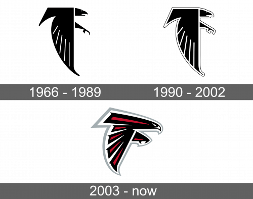
The team’s emblem depicted a bird of prey done in black color. Not surprisingly, it was a falcon. The image had a very graphic design with straight and sharp corners and lines. The top was a straight line with the wing going down and a straight line on the right with a curved line on the left. Relatively thin white lines were used as a separation between the feathers on the wing. The bird had a very small eye and an open mouth. Its foot was extended forward as if ready to catch its prey. The image had a white outline followed by a thin red one, which created an even more impressive and bold feel.
1990 – 2002
Many years later, the team used a completely black and white emblem it had originally created. A lack of red outline gave the emblem a more professional and modern look. Otherwise, they stayed true to their roots.
2003 – Today
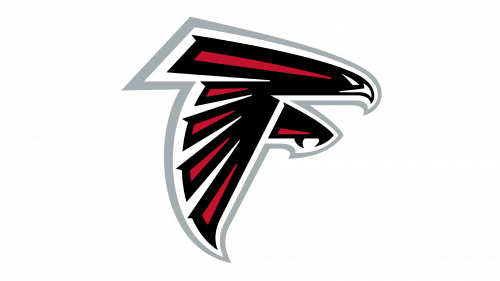
The bird was completely redrawn, although it maintained the same bold and threatening feel. The emblem still had very straight, sharp lines that contributed to that powerful feel. The range of colors used is the most noticeable alteration as the logo also got dark pink for the inside the bird along with gray colors. The latter was used as an outline around the bird and had varying thicknesses. The bird was black with white eyes and beak. Inside, it had elongated pink triangles that created accents on its body and wing. The leg got significantly bigger with two sharp claws and a pink accent triangle towards the bottom.
