Autodesk Maya Logo
Autodesk Maya, a leading 3D animation software, was born from the innovation of Alias Systems Corporation in Toronto, Canada. Launched in the late 90s, it revolutionized digital art, enabling creation of intricate animations and models. Designed for animators, VFX artists, and game developers, Maya offers tools for modeling, simulation, and rendering. Its acquisition by Autodesk in 2005 expanded its prowess in the entertainment industry, cementing its status as a cornerstone for creators worldwide.
Meaning and history
Autodesk Maya, often just called Maya, is a powerful 3D modeling and animation software. Created by Alias Systems Corporation, it was initially released in 1998. Maya quickly became a favorite in the film and video games industry for its comprehensive tools and capabilities. Autodesk, Inc. acquired it in 2005, further enhancing its features. Maya is known for its advanced effects, simulation tools, and ability to handle complex data. It supports a wide range of projects, from animated movies to visual effects in live-action films. Over the years, Maya has played a crucial role in creating award-winning works in entertainment and media. Its continuous updates ensure it meets modern digital art requirements, making it indispensable for professionals worldwide.
What is Autodesk Maya?
Autodesk Maya stands as a beacon in the 3D design and animation realm, offering a versatile platform for artists to sculpt, animate, and render their visions into reality. Crafted for the creatives of digital media, it bridges the gap between imagination and visual storytelling, enabling the creation of everything from animated masterpieces to intricate visual effects.
1999 – 2006
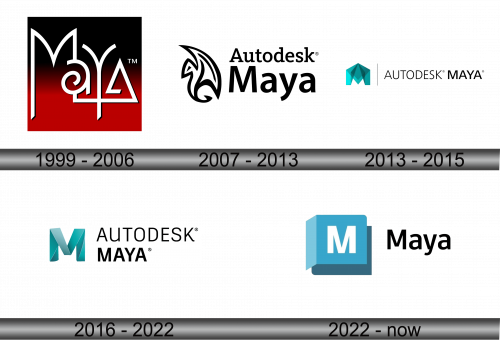
The logo presents a stylized amalgamation of letters to spell ‘Maya’ in a bold red and black palette. Its design marries sharp geometric shapes with fluid curves, encapsulating both the precision and creativity inherent in the 3D software it represents. The ‘M’ and ‘Y’ ascend assertively. The circular swirl in the ‘a’ adds a dynamic, almost whimsical touch, hinting at the software’s capability to breathe life into designs. The contrasting backdrop accentuates the logo’s forward-thinking essence.
2007 – 2013
This iteration of the Autodesk Maya logo juxtaposes the stark simplicity of its typeface with an intricate tribal-like emblem. The emblem, a fluid, abstract shape reminiscent of a flame or a feather, suggests movement and transformation, themes central to the software’s purpose in animating and modeling. The word ‘Autodesk’ sits above ‘Maya’ in a clean, sans-serif font, asserting the brand’s authority while allowing ‘Maya’ to remain the focal point. The registered trademark symbol asserts the logo’s proprietary status, underscoring Autodesk’s stewardship of the software. The monochromatic scheme imparts a classic, professional feel.
2013 – 2015
The latest Autodesk Maya logo marks a significant shift towards minimalism and modernity. The emblem, a teal origami-like “M”, suggests three-dimensionality and precision, reflecting the software’s purpose in 3D design. The typeface of “AUTODESK MAYA” is sleek and contemporary, with a vertical bar separating the brand from the product, promoting a clear, structured identity. This design moves away from the previous emblem’s complexity towards a simplified, geometric aesthetic, aligning with current graphic trends. The use of teal injects a fresh, digital feel, symbolizing innovation in technology.
2016 – 2022
This rendition of the Autodesk Maya logo distills its essence further, with a solid teal “M” signifying the software’s initial. Abandoning the origami-like facets, the “M” now opts for a solid, shadowed form, giving a nod to depth and dimensionality intrinsic to 3D modeling. “AUTODESK MAYA” retains its sleek, sans-serif font, but now the “M” is prominently detached, emphasizing the software’s standout identity within the Autodesk suite. The color palette remains consistent, maintaining the brand’s modern and digital vibe.
2022 – Today
The evolution of the Autodesk Maya logo continues, now featuring a flat design “M” within a blue square that resembles a folded paper corner. This symbol signifies accessibility and user-friendliness, hinting at a software that is both powerful and approachable. The word “Maya” is written in a casual, sans-serif typeface, a departure from the corporate style of Autodesk, suggesting a more user-centric and creative focus. The color shifts to a lighter blue, inviting a fresh and contemporary atmosphere. This design leans towards simplicity and clarity, reflecting modern design trends.
