Bacardi Logo
Bacardi is one of the largest alcohol producers in the world. Originally, they were a rum-making enterprise based in Santiago de Cuba. Later, they expanded to include many mores sorts of alcohol into their assortment. They don’t create them all under their own supervision, mind you; they simply own a lot of iconic brands.
Meaning and History
The first Bacardi distillery was opened in 1862. The name is directly derived from the family name of the founders – the Bacardi family. It was originally just a rum-making enterprise, but eventually they bought many important worldwide alcohol brands, including rums, tequilas, cognacs, whisky, vodka and more.
1862 – 1890
The very first logo of the distillery resembled a red stamp with a black outline and a monochrome illustration of a fruit bat. These animals were chosen to be a symbol for the new brand because the premises where Bacardi operated were initially infested with these.
This illustration is not particularly realistic or took much effort. They simply painted the outline and filled out some parts of it.
1890 – 1900
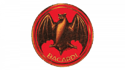
They put a bit more effort into this next logo. The black frame is gone, and the bat is now a more realistic shape of a fruit bat. They colored it various hues of brown and made it rather chubbier than before. Directly below it, they also put the brand name of ‘Bacardi’ in yellow capital letters alongside the edge of the circle.
1900 – 1931
In 1900, they decided to mostly return to the original logo concept, except they made the dark frame outside a bit thinner, left some nuance to the bat and added the words ‘Marca de Fabrica’ (‘Trademark’) where the brand name was before. This time, they colored the letters black, although the script stayed.
1931 – 1959
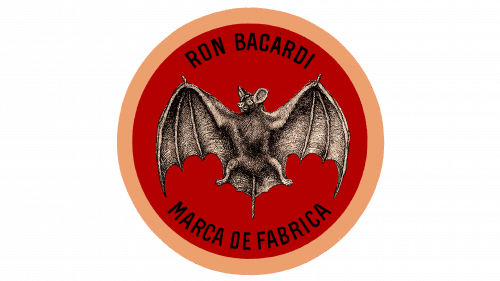
In 1931, they decided to make their animal mascot as realistic as possible, and it actually looks like something from the school textbook. The text this time stayed as it was, although they did add the new ‘Ron Bacardi’ (‘Bacardi Rum’) inscription above. The outside frame also changed from black to golden.
1959 – 2002
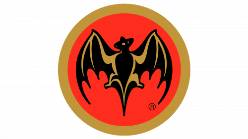
A simplification effort followed in 1959. They removed all the written parts and instead made the illustration much bigger. It also changed to a more simplistic and artistic depiction of the animal, not to mention that it now had just two colors – yellow and black.
2002 – 2005
It mostly stayed the same into the 21st century, except they added a little dark shade on the inner side of the golden ring that still surrounded the logo.
2005 – 2010
They got rid of the shade, but instead gave the logo some volume and depth this time. You can see that the brightness changes throughout the logo surface. The bat was also enlarged again, and this time its wings started encroaching onto the outer ring.
2010 – 2013
In 2010, a new inscription started accompanying the old emblem. They started writing ‘Bacardi’ in big black letters directly below the bat emblem. Also, the bat grew in size again – particularly, in the wing area. Because of it, it now extended outside its previous confines.
2013 – today
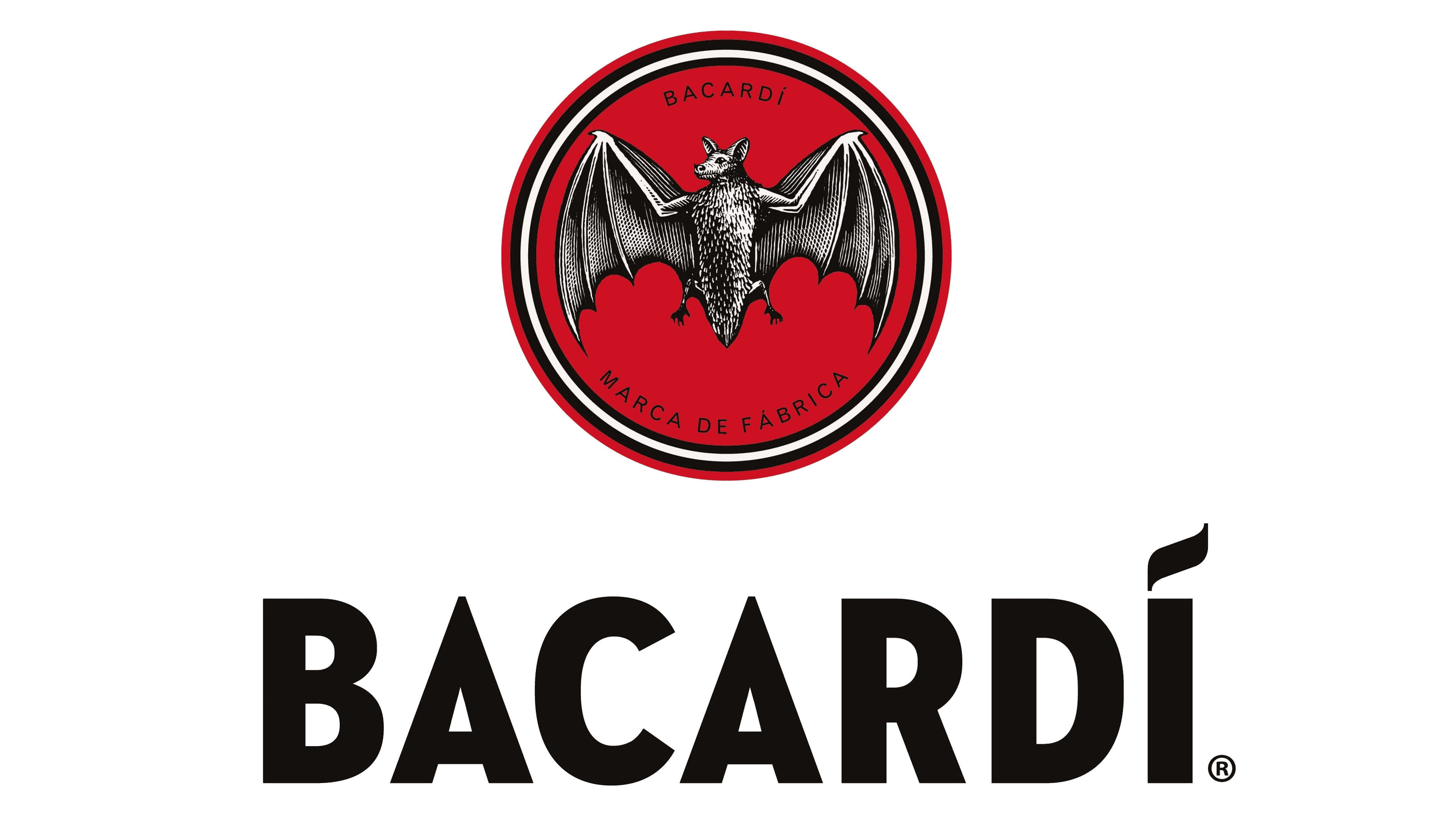
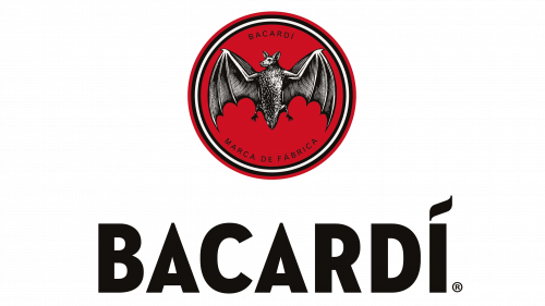
Two main things changed in 2013. The bottom text was increased in size; all the while the emblem above became smaller by comparison. What’s more, the emblem also changed: the outer frame was now white, black and red; the bat now given more nuance once more, as well as new grey coloring; the words ‘Bacardi’ and ‘Marca de Fabrica’ appeared again.
Emblem and Symbol
These logotypes are actually meant for the rum bottles rather than the company use. Whenever the Bacardi Company in general wants a logo, they use a similar bat emblem, but paint it golden. They also don’t always use the same logo designs as their rum. For instance, the company stuck to the 2010 logo even after the logo changed in 2013
