C.P. Company Logo
C.P. Company is a clothing brand known for its innovative design and use of technical fabrics. Massimo Osti founded the brand in Italy. The brand originated with the aim to bring traditional clothing elements into modern contexts using new technologies.
Meaning and history
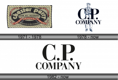
C.P. Company was established in 1971 by designer Massimo Osti. Initially named Chester Perry, the brand focused on creating functional, urban-inspired apparel. In 1978, it was rebranded to C.P. Company to better reflect its evolving fashion identity. The brand gained recognition for its garment dyeing techniques and use of unusual materials, which became iconic in the 1980s. Over the years, it has maintained a focus on innovation with numerous patents in garment manufacturing.
What is C.P. Company?
C.P. Company is an Italian apparel brand renowned for its technical innovation and urban style. It merges classic wardrobe elements with groundbreaking fabric research, appealing to those who value both tradition and modernity in their clothing. The brand stands out for its distinctive dyeing techniques and the use of high-performance materials.
1971 – 1978
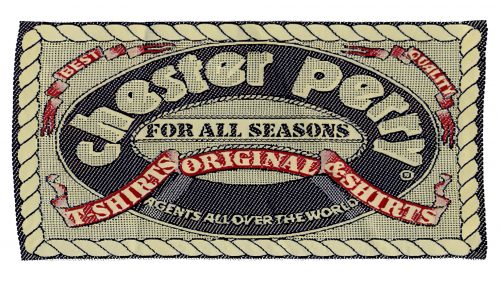
The logo features a boldly stitched edge, framing a fabric-like texture. Inside, a vintage font spells “Chester Perry”, highlighted by “Best Quality Shirts”. Beneath, “For All Seasons” arches, complementing “Original & Genuine”. “Shirts” stands out in red, underscoring “Agents all over the World”. The design evokes timeless craftsmanship and global reach.
1978 – Today
The new logo portrays a poised figure, encapsulating the brand’s spirit. Above him, “C.P. Company” commands in bold, oversized letters. A minimalist palette conveys modern sophistication. This emblem symbolizes a fusion of human craftsmanship and fashion-forward thinking.
1982 – Today
Stripped to its essence, the logo presents “C.P. Company” in stark, confident typography. Gone is the figure, leaving a clean and modern impression. It’s a bold distillation of the brand’s identity.


