Canada Goose Logo
Canadian brand Canada Goose has long been known around the world for its ultra-warm winter jackets. It specializes in the production of winter clothing for outdoor trips and everyday wear. The brand makes the best extreme clothing in the world, which has become a symbol of protection from the extreme conditions of the North. To protect against counterfeiting, a special hologram with a complex design is sewn into each jacket. The production of clothes takes place automatically by computerized robots, while a person only controls all processes.
Meaning and History
![]()
Sam Thicke founded a company called Metro Sportswear Ltd in 1957, seven years after he immigrated to Canada. It specialized in tailoring vests and raincoats made of wool, as well as suits for snowmobiles. In the early 70s, his son-in-law David Reis joined the business. He began expanding the product range and launched a line of comfortable down jackets. Ten years later, he became the new owner. First of all, David changed the name to Snow Goose. In the early 90s, the company entered the European market, but since there was already a brand with this name it sold the products under Canada Goose. In 1997, the founder’s grandson joined the company and four years later succeeded his father as CEO. Since then, the Canada Goose brand name was used for all products.
What is Canada Goose?
Canadian brand Canada Goose is a well-known outerwear manufacturer that has gone from making woolen vests to producing large-scale lines of functional outwear for people who spend time outside in the cold. Thousands of stores around the world and high sales on online platforms are proof of the company’s success.
1957 – 1985
![]()
A brown bear, which is a symbol of the Canadian wilderness as it is one of the most impressive and strongest mammals in North America, is drawn in front of another symbol of this country – a red maple leaf. Underneath, there is the name of the company. “Metro Sportswear Limited” is done in bold, capitalized, sans-serif letters. It is underlined by a thick red line that goes with the red maple leaf. At the very bottom, the emblem states the brand’s original location.
1985 – 2000
![]()
As the name changed, a new logo was required. The brand name was done in delicate, sans-serif cursive writing of a golden color. The second word was placed lower to add some dynamics. The logo was completed with two white geese, one of which was flying while the other one was just taking off and had its wings spread across the emblem.
2000 – 20??
![]()
The brand name which has been used only in Europe now became the only brand name. The logo used a goose with its wings spread from the previous version and printed it with a golden outline. The company name “Canada Goose” was printed underneath using a basic, bold, sans-serif font of white color. Considering the name, the use of this bird on the logo was more than appropriate.
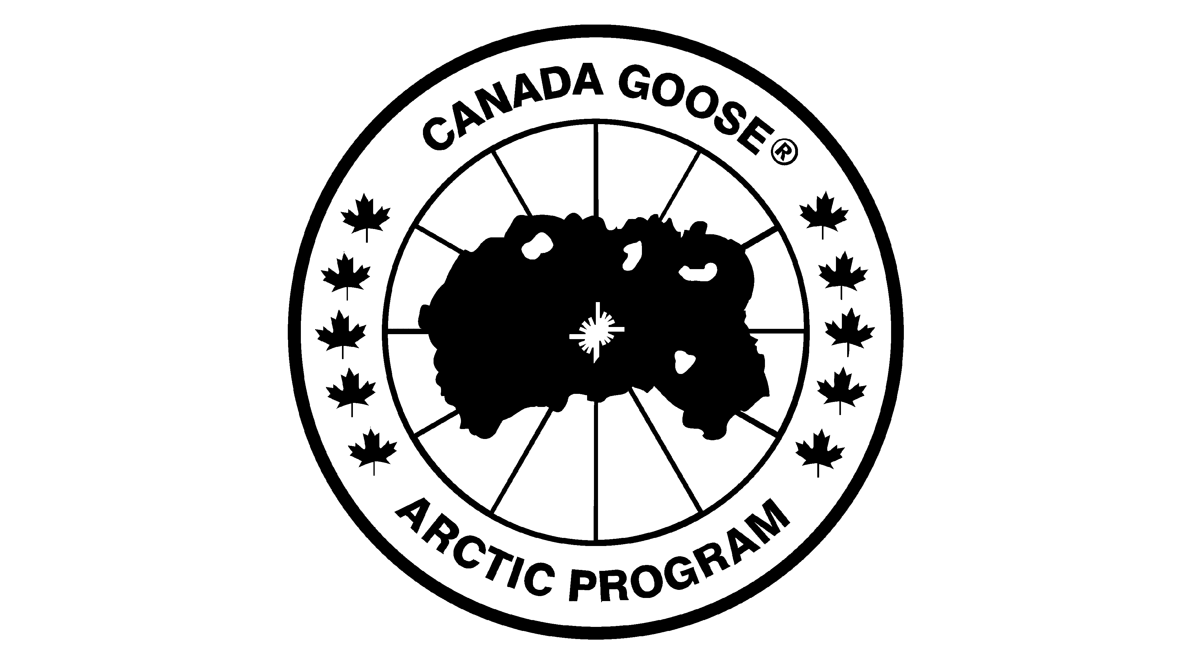
20?? – Today
![]()
A more modern approach to the logo design was taken this time. The coldest place on Earth was drawn in the center, implying that the products of this brand could be comfortably used even on the North Pole. The red longitude and latitude lines were coming out of the white center, reaching a red circle. A white wide border with a red outline had the brand name in the upper half and “Arctic Program” in the bottom half. Five small maple leaves were placed on the left and right side, filling the empty space between the inscriptions.
Font and Color
The red, dark blue, and white color palette of the latest logo symbolizes strength, energy, security, and perfection, which are great associations for a brand that focuses on winter outwear. The red and blue colors were also used in the original logo. In between, the company went for golden, which gave a warm feeling, and white for its logos. Most Canada Goose logos used a classic, sans-serif bold font. There was a period, though, when the logo featured very elegant, cursive writing.


