Car Brands That Start With L
In the dynamic realm of the automotive industry, the essence of a brand is often encapsulated in its logo. This article embarks on an exploration of logos from illustrious car brands that begin with the letter “L”, each emblem not merely a design but a narrative of innovation, luxury, and legacy. These logos are more than mere symbols; they are the storytellers of their brands, weaving tales of technological marvels, design evolution, and visionary leadership in the automotive domain.
We start our journey with the “L” in these logos, which transcends beyond being just a letter. It represents a lineage of automotive excellence, a testament to groundbreaking engineering and aesthetic finesse. From the opulent sophistication of Lexus, signifying luxury and innovation, to Lamborghini’s embodiment of sheer power and performance, each logo narrates a unique story of its own.
In this article, we delve into the origins, design philosophy, and the evolutionary journey of these logos. We explore how they mirror the brands’ ethos, their cultural significance, and their impact in shaping the identity and legacy of these automotive giants. These emblems stand at the crossroads of history and modernity, symbolizing not just cars, but the aspirations and achievements of the brands they represent.
Join us as we traverse through this fascinating world of automotive logos that start with ‘L’, uncovering the stories behind these iconic symbols that have become benchmarks of excellence in the world of automobiles.
Lada
Lada, a prominent Russian automobile manufacturer, gained international recognition for its durable and affordable vehicles, particularly the Lada Niva, an iconic off-road vehicle. Known for revolutionizing the automobile market with vehicles like the Lada Niva, Lada’s emblem stands as a testament to its philosophy of simplicity merged with functionality. The logo, encapsulating a silver-grey sailboat within an oval, mirrors the brand’s journey akin to a sail navigating the waters. The rightward progression of the sail, filled in to emphasize its form, symbolizes Lada’s dedication to forward-thinking and continuous improvement in the automotive industry. This emblem serves not just as a brand identifier but as a symbol of the resilience and adaptability that have marked Lada’s history.
La Fayette
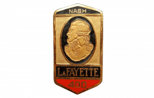
Drawing its name from a figure synonymous with liberty and leadership, the La Fayette brand’s logo is a fusion of historical reverence and luxury. The golden shield, outlined in black and featuring a classical European aristocrat’s embossed profile, connects the brand’s identity to a legacy of distinction and refinement. The inclusion of ‘NASH’ above the profile and ‘LAFAYETTE’ on a red banner below, with the numeral ‘400’, adds layers of depth, hinting at exclusive editions or significant milestones in the brand’s storied past. This logo is not just a mark but a narrative of La Fayette’s luxurious and historic roots in the American automobile scene of the 1920s.
Lagonda
As a marque that became a part of the esteemed Aston Martin legacy, Lagonda’s logo is a celebration of its prestigious heritage and innovative spirit. The art deco-inspired wings in the emblem are reminiscent of the brand’s commitment to elegance and aerodynamic design. The prominence of ‘LAGONDA’ at the center, set against the backdrop of sleek wings, speaks to a legacy that has seamlessly blended performance with luxury. This emblem is a nod to the brand’s pioneering role in defining what luxury cars could embody, blending artistic design with mechanical prowess.
Lamborghini
Lamborghini’s logo is an embodiment of luxury and formidable strength, reflecting the brand’s prestigious status in the world of high-performance sports cars. The emblem, a shield-shaped motif, prominently features a golden bull against a stark black backdrop. This powerful imagery is a nod to the zodiac sign of the brand’s founder, Ferruccio Lamborghini, symbolizing the tenacity and boldness that define Lamborghini vehicles. On the top of the shield, above the bull, is the brand name in gold capital letters. This logo is more than a mere symbol; it’s a testament to Lamborghini’s legacy of crafting exhilarating, style-defining luxury sports cars.
Lambretta
Lambretta, an iconic name in Italian transportation since 1947, is synonymous with stylish and practical scooters, epitomizing the spirit of freedom and Italian post-war culture. The logo, in its elegant simplicity, features the name ‘LAMBRETTA’ in a striking shade of red, rendered in lowercase letters. The choice of a modern, dynamic typeface for the logo reflects a sense of movement and energy, resonating with the brand’s essence. The logo’s straightforward design, coupled with the bold color choice, mirrors Lambretta’s approachable and contemporary brand identity, perfectly aligning with its reputation for producing transportation solutions that blend style with functionality.
Lanchester
As one of the pioneering British car manufacturers, founded in 1895, Lanchester was renowned for its innovative engineering and luxury vehicles, significantly influencing the early automotive industry. The emblem encapsulates this heritage, displaying the name ‘LANCHESTER’ in an elegant, serif font. The use of a single, deep blue hue adds a layer of sophistication, indicating a brand steeped in tradition and history. The logo’s simplicity and classic elegance position it as a symbol of high-end, quality craftsmanship.
Lancia
A subsidiary of Stellantis, Lancia was established in 1906 and has since become synonymous with rally heritage and technical innovation. Notable achievements include the unibody chassis of the 1922 Lambda and the 1948 Ardea’s five-speed gearbox. Lancia’s logo, a dark blue triangular emblem, features a mix of geometric shapes and a central rectangular shield with rounded edges. The shield, circled and inscribed with ‘LANCIA’ in bold white letters, is framed by a metallic border, exuding classic elegance. The logo’s color scheme and design reflect the brand’s storied history and Italian craftsmanship, resonating with the aura of luxury automobiles.
LandFighter
Specializing in all-terrain vehicles, LandFighter is a European manufacturer known for its durable and high-performance designs, suitable for rugged environments. The logo features a dynamic, abstract mark within a circular emblem, creating a three-dimensional effect. This emblem, composed of sleek metal lines, forms a stylized representation of the letters ‘L’ and ‘F’. Below, the brand name ‘LAND FIGHTER’ is boldly displayed in capitalized letters, with an eye-catching orange hue contrasting sharply against the metallic tones of the emblem. This design conveys a sense of vigor and adventure, fits perfectly with the brand’s focus on off-road and rugged terrain vehicles.
Land Rover
Established in 1948, Land Rover stands as a paragon of British automotive engineering, renowned for its luxury SUVs like the Defender and Range Rover. The emblem of Land Rover is a testament to its heritage of robust elegance. An elongated oval frames the brand name, set in bold, relief-styled white letters against a backdrop of deep British racing green. The lettering’s three-dimensional effect, highlighted by a metallic silver border, eloquently articulates the brand’s ethos of rugged luxury and adventure. This logo encapsulates the essence of Land Rover: a harmonious blend of refinement and capability, emblematic of their all-terrain vehicles.
Landwind
As part of the Jiangling Motors Corporation, Landwind represents China’s burgeoning influence in the global automotive market, known for its affordable SUVs. The Landwind emblem blends geometric precision with organic fluidity, enclosed within a metallic border with rounded edges. At its heart lies a stylized, flowing red figure resembling the letter ‘L’, extending into a flame-like motif, indicative of movement and passion. The dual presentation of the brand name ‘LANDWIND’, in both Chinese characters and the Roman alphabet, underscores its international reach and ambition in the automotive sector.
LaSalle
Created by General Motors in 1927, LaSalle emerged as a stylish yet more accessible alternative to Cadillac, influencing American automotive design in the early 20th century. The LaSalle logo is a nod to vintage elegance, featuring a circular badge that radiates nostalgic charm. Its vibrant red background starkly contrasts with the white, cursive ‘LAS’ monogram, reminiscent of the era’s design sensibilities. This script, with its elegant curves and bold strokes, encapsulates the essence of early 20th-century luxury automobiles, evoking a blend of grace and enduring quality that defined the LaSalle brand.
Laurin and Klement
Originating as a Czech bicycle company in 1895, Laurin and Klement evolved into Škoda Auto, leaving a lasting legacy in the automotive industry. The logo for Laurin & Klement, a precursor to Škoda, is steeped in elegance and historical significance. It features a gold circular border adorned with decorative laurel leaves, encircling a deep maroon field. Within this field, the intertwined initials ‘LK’ form a sophisticated monogram, with the ‘&’ symbol subtly integrated into the ‘K’. This emblem reflects the early 20th-century artistry and prestige of its Czech founders, symbolizing a rich heritage of innovation and craftsmanship.
LAZ (Lvivsky Avtobusnyi Zavod)
Established in 1945, LAZ has been an integral part of Ukraine’s public transportation sector, specializing in buses and trolleybuses. The logo encapsulates the brand’s ethos with its distinctive blue and white color scheme. The bold ‘Л’, nestled within a triangular shape and encircled by a ring, conveys unity and robustness. This design, blending clean lines with a modernist aesthetic, speaks to LAZ’s commitment to innovation and progressive manufacturing practices in the field of urban transportation.
Leader
Operating in the specialized vehicle manufacturing sector, Leader may not be widely recognized, but it stands out for its commitment to quality and innovation. The emblem, a fusion of a shield-like shape in black and white, features a stylized ‘L’ at its core. This arrangement creates a striking visual contrast, symbolizing strength and authority. The shield motif embodies the brand’s values of leadership, stability, and prominence in specialized vehicle production, resonating with the brand’s name and mission.
Lea-Francis
With a legacy dating back to 1903, Lea-Francis, the British car and motorcycle manufacturer, is celebrated for its luxury vehicles and notable achievements in motorsports. The logo is a blend of mythology and heritage, depicting a majestic creature that is half-horse and half-fish, set against a bold red background. This imagery, coupled with the brand’s name “LEA-FRANCIS COVENTRY” along the circular border, reflects its deep-rooted British heritage and manufacturing prowess. This emblem, steeped in tradition, symbolizes agility and fluidity, echoing the company’s legacy in luxury vehicle and motorcycle production.
LEDL
A brand carving its niche in the automotive industry, LEDL is recognized for its specialized vehicle designs, showcasing an unwavering commitment to innovation. The logo is a testament to modernist sensibilities, featuring bold, sans-serif letters spelling out ‘LEDL’. The contrast of the black typography against a white backdrop captures the essence of contemporary design, suggesting a brand identity that is direct, robust, and forward-thinking. This minimalist yet impactful design is indicative of a brand that values practical innovation and a futuristic approach in its automotive solutions.
Leon Bollee
Founded in 1895 by the visionary French automotive pioneer Leon Bollee, the company swiftly established itself as a frontrunner in early automobile technology. The logo of Léon Bollée, reflecting this pioneering spirit, features the brand name in a whimsical, bold red typeface. The playful serifs and shadowing effects impart a sense of depth and movement, symbolizing the company’s innovative approach in the late 19th and early 20th centuries. Known for their groundbreaking tricars and early automobiles, the logo encapsulates the brand’s creative energy and technological foresight in a rapidly evolving industry.
LEVC (London Electric Vehicle Company)
LEVC stands at the forefront of revolutionizing urban transport, transitioning the iconic London black cab into electric models. The logo, embodying this transformation, showcases a stylized horse’s head set within expansive wings, bordered by the acronym ‘LEVC’. This design symbolizes speed, freedom, and the pursuit of innovation, mirroring the brand’s commitment to modernizing city transportation with an eco-friendly approach. The black and white color scheme underscores the blend of traditional British heritage with a contemporary, environmentally conscious vision.
Lexington Motor Car Company
Active in the early 20th century, Lexington made a name for itself with endurance-tested, high-quality vehicles, highlighted by successes like the Pikes Peak Hill Climb. The logo, a quintessential representation of early American automotive branding, features a patriotic red, white, and blue color scheme. The circular badge, adorned with the brand name in a fluid cursive script, embodies motion and elegance, encapsulating Lexington’s ambition to produce top-tier automobiles in Connersville, Indiana, during the brass era of automotive history.
Le Zebre
Founded in 1909, Le Zebre played a pivotal role in democratizing motoring in early 20th century France, known for its small, dependable cars. The logo is a charming tribute to the brand’s name, which translates to “zebra” in French. It features a stylized zebra figure, creatively enclosed within two black concentric circles. The playful use of alternating black and white colors echoes the zebra’s stripes, infusing the badge with whimsy and character. This design captures the essence of Le Zebre’s mission to create accessible, distinctive automobiles, showcasing the brand’s unique identity in the automotive landscape.
LIAZ
LIAZ (Liberecké Automobilové Závody), originally a Czech truck and bus manufacturer, has a rich history dating back to 1951, known for its heavy-duty vehicles, especially in Eastern Europe. the LIAZ logo is characterized by its bold, no-nonsense design featuring the brand’s name in a heavy sans-serif font within a black circle. The stark contrast of the white lettering against the black background imparts a strong visual impact, underscoring the Czech manufacturer’s industrial heritage in producing reliable buses and trucks.
Licorne
Licorne, a notable French automobile manufacturer active from 1907 to 1949, was recognized for its innovative designs and quality vehicles, playing a significant role in early 20th-century French motoring history. The logo for La Licorne features a gallant silver unicorn rearing up against a vibrant red backdrop, encircled by a classical grey border with the brand name ‘LA LICORNE’ inscribed in an elegant serif typeface. This French automobile manufacturer’s emblem, rich in mythical symbolism, represents purity and strength, resonating with the company’s history of producing cars between 1901 and 1949.
Lida Buses Neman
Lida Buses Neman, based in Belarus, specializes in the production of buses and trolleybuses, serving as a key player in the Eastern European public transportation industry with their durable and efficient designs. The Lida Buses Neman logo is a modernistic interpretation of the letter ‘H’ in a striking blue hue, intersected by a sleek horizontal white line that gives the design a sense of balance and motion. The emblem’s dynamic and contemporary aesthetic reflects the brand’s focus on the production of buses, aligning with modern engineering and design principles.
Lifan
Lifan, established in China in 1992, quickly grew into a multinational conglomerate, well-known for its motorcycles, cars, and passenger vehicles, illustrating China’s rapid advancement in the automotive sector. The logo for Lifan, depicted in a serene blue color, features a modern emblem with the stylized letter ‘L’ that also resembles a person in motion, encapsulating the company’s dynamic approach to mobility. Below the emblem, the brand’s name is spelled out in capitalized, bold letters, reinforcing the logo’s visual impact. This design conveys Lifan’s commitment to innovation and international reach in the automotive and motorcycle sectors.
Lifan Motors Plc in Ethiopia
Since 2014, Lifan Group has been an active player in Ethiopia’s automotive market, assembling various car models using local labor. Lifan Motors Plc, the company’s Ethiopian subsidiary, underscores its commitment to the region with a substantial facility in the Eastern Industrial Zone. The logo of Lifan Motors is a testament to this dedication, featuring a dynamic representation of three consecutive letters “L”, each slightly shifted upward, enclosed within a circle. This design symbolizes movement and progression, resonating with the company’s ethos of growth and development in new markets. The logo, rendered in a reliable blue hue, echoes the global presence of the Chinese firm in the automobile and motorcycle sectors, signifying trustworthiness and stability.
Lightning Car Company
As a UK-based innovator in electric vehicle technology, Lightning Car Company has made a name for itself with the high-performance Lightning GT. The company’s logo, a sleek, silver script, embodies the essence of speed and modernity. Its cursive, elongated typeface exudes elegance and sophistication, capturing the brand’s commitment to crafting high-end electric sports cars. This logo is a nod to the company’s pioneering spirit in integrating cutting-edge technology into the auto industry, aligning with its vision of revolutionizing electric vehicle performance.
Ligier
Founded in 1968, Ligier is a celebrated French automobile maker known for its foray into motorsports, especially Formula One, and its later venture into microcar production. The brand’s logo features a bold, blue wordmark ‘LIGIER’, underscored by the word ‘AUTOMOBILES’. Above this, the French tricolor and a checkered racing flag are crossed, symbolizing the brand’s deep-rooted connection with motorsport heritage and its French origins. This emblem is a visual representation of Ligier’s enduring commitment to automotive excellence and its storied association with the racing world.
Lincoln (Ford)
Since 1917, Lincoln, a subsidiary of Ford, has epitomized American luxury in the automotive industry. The Lincoln logo is characterized by a refined, compass-like design, paired with the brand name in a dignified, uppercase font. This minimalist and contemporary emblem is a representation of the brand’s journey towards sophistication and modern luxury. The sleek design of the logo reflects Lincoln’s reputation for crafting vehicles with sophisticated designs and premium features, symbolizing the essence of American luxury in the automotive landscape.
Lister Cars
Established in 1954, Lister Cars is a storied British sports car manufacturer, celebrated for its significant role in motorsports, including the creation of the renowned Lister Jaguar cars in the 1950s. The logo features a distinctive design with three stylized silver swords set against a yellow circular backdrop, framed by a green border. This imagery is a homage to the brand’s competitive spirit and its illustrious British racing heritage. The bold white font spelling out ‘LISTER’ above the swords underscores the company’s dedication to high performance and precision in crafting elite sports cars.
LiXiang (Li Auto)
LiXiang (Li Auto): As a leading figure in China’s electric vehicle landscape, LiXiang, also known as Li Auto, has made waves with its innovative extended-range electric vehicles. The LiXiang logo encapsulates this pioneering spirit, showcasing a bold, geometric interpretation of the letters ‘LX’. The sharp, angular design of the logo is a visual metaphor for cutting-edge technology and modernity, reflecting the manufacturer’s commitment to pushing the boundaries in the automotive industry, especially in the realm of electric vehicles.
Lloyd
Part of the Borgward group, Lloyd was a notable German car manufacturer in the 1950s and 60s, recognized for producing small and affordable cars like the Lloyd Alexander. The Lloyd logo is characterized by a triangular emblem, with the brand name ‘LLOYD’ in solid black letters at the base. Inside the triangle, ascending red vertical stripes of varying lengths rise towards the apex, creating a dynamic sense of movement and upward progress. This design symbolizes the brand’s forward-thinking and dynamic approach, resonating with its history of producing innovative and accessible vehicles.
LMX Sirex
The LMX Sirex holds a unique place in automotive history as an Italian sports car known for its distinct design and use of fiberglass bodies in the early 1970s. The logo for the LMX Sirex features a classic shield shape containing a striking image of a mythical creature that is part lion and part sea monster, rendered in gold. Above this creature, the initials ‘LMX’ are boldly presented in yellow against a black backdrop. This emblem captures the essence of the brand’s strength and tradition in sports car manufacturing, symbolizing the Italian manufacturer’s distinct heritage and the unique style of its vehicles.
Lobini
Lobini, a Brazilian sports car manufacturer established in the early 2000s, is known for the Lobini H1, a car that combines sleek design with high performance, reflecting Brazil’s foray into sports car production. The Lobini logo features a snarling wolf’s head in profile, cast in black against a vivid yellow background encircled by a silver rim. Below the wolf is the brand name “LOBINI” in bold black letters. This Brazilian sports car manufacturer’s logo conveys a sense of ferocity and agility, befitting the powerful and swift nature of its vehicles.
Locomobile
Locomobile, an American company active from 1899 to 1929, started with steam-powered vehicles and later transitioned to luxury gasoline automobiles, becoming one of the top U.S. manufacturers of the early 20th century. The Locomobile logo is elegant and classic, with a scripted “L” intertwined with leafy motifs inside a simple black-lined rectangle. The brand name “Locomobile” is written below in a flowing, cursive font, exuding a vintage charm. This logo reflects the brand’s early 20th-century heritage as a pioneer in luxury automobile manufacturing in the United States.
Lola
Lola Cars, founded in 1958 in the UK, was a highly influential race car manufacturer, particularly in Formula One and sports car racing, known for innovative designs and engineering. The logo presents the word “LOLA” in bold, capitalized letters. The typeface is straightforward with a modern, clean look, characterized by strong horizontal lines and sharp angles, suggesting efficiency and speed. The letters are colored in a deep shade of blue and set against a bright yellow, oval-shaped background. This color combination—yellow and blue—is vibrant and highly visible, often used to denote energy, enthusiasm, and innovation. The logo’s simplicity makes it versatile and easily recognizable.
Lorraine
Lorraine, a less commonly known but historically significant brand, made contributions to the early automotive industry, focusing on robust engineering and design. The logo features a prominent golden cross with flared ends, known as a cross pattée, set against a deep blue circular background. The cross is centered and occupies most of the available space, giving the logo a striking and regal appearance. The gold-on-blue color scheme is often associated with royalty, heraldry, and prestige.
Lotec
Lotec is a German sports car manufacturer, established in 1962, known for producing custom-built cars and high-performance vehicles, including the ultra-rare Lotec Sirius. The logo displays the stylized letters “LOTEC” in a bold, black font on a white background. The typography is unique, with a futuristic touch, characterized by the use of negative space within the letters to create a visual interplay. For instance, the “O” is not fully closed, and the “E” connects to the “C” in a seamless manner, which could suggest connectivity and technology. The font has a heavy weight, indicating solidity and presence.
Lotus
Lotus Cars, a British manufacturer founded by Colin Chapman in 1948, is famous for its lightweight and fine-handling sports and racing cars, embodying a philosophy of “simplify, then add lightness.” The logo consists of a triangular crest encapsulated within a bright yellow circle. The crest is a dark green with the word “LOTUS” in block, capitalized letters, positioned at the lower part of the crest. Above the text is a monogram of the letters “ACBC,” which are intertwined in a fluid, cursive style. The monogram represents initials, adding a personal touch to the emblem. The color scheme of green and yellow is lively and dynamic, which may be indicative of the brand’s energetic and fresh approach. The overall design is clean, with a classic yet contemporary feel.
Lozier
Lozier was an American automobile manufacturer, operational from 1900 to 1915, known for producing luxury cars in Detroit, and was one of the most expensive and prestigious vehicles of that era. The logo features the word “LOZIER” in a dynamic, vintage script that evokes a sense of motion and classic elegance. The typography is ornate, with the letters presented in a three-dimensional style and decorated with shading and outlines that give them depth. The “L” and the “R” extend beyond the main body of text and are embellished with wing-like flourishes, suggesting speed and grace. The entire word is superimposed on what appears to be a stylized depiction of a wheel, further reinforcing the automotive theme of the logo.
LTI
LTI (London Taxis International), now known as LEVC, is renowned for manufacturing the iconic London black cabs, a symbol of British automotive culture known for their durability and distinct design. The logo consists of the acronym “LTI” set in bold, block letters against an elliptical background that transitions from a deep orange in the center to a lighter yellow at the periphery. The letters are black with a subtle shadow effect, which creates a sense of depth. The oval shape of the logo, along with the color gradient, gives it a modern and forward-looking feel. The simplicity and contrast of the design ensure that it is easily recognizable and can be scaled across various mediums.
LuAZ
As a notable Ukrainian automotive manufacturer, LuAZ has carved a niche for itself with small, durable off-road vehicles, adeptly suited to the challenging terrains of the region. The LuAZ logo is a visual representation of this rugged and practical ethos. The emblem features a stylized interpretation of the acronym ‘LuAZ’, executed predominantly in a striking shade of blue, symbolizing the brand’s reliability and strength.
The design ingeniously utilizes geometric shapes to construct the letters, where curves intersect with straight lines, evoking a sense of dynamism and fluidity. This design choice mirrors the vehicles’ capability to navigate difficult landscapes seamlessly. Below this graphic element, the brand’s name ‘ЛуАЗ’ is inscribed in a straightforward, modern sans-serif font. The contrast between the dynamic emblem and the minimalist typeface below it strikes a balance, encapsulating LuAZ’s commitment to functional design and engineering excellence.
This emblem, with its blend of artistic expression and clear readability, not only brands the vehicles but also tells a story of the manufacturer’s adaptability and focus on creating vehicles that are both functional and resilient, tailored to the unique demands of their environment. The LuAZ logo thus stands as a symbol of the manufacturer’s ingenuity and the rugged charm of its automotive creations.
Lucalia Clubman
Lucalia Clubman, while not as widely recognized as major automotive brands, represents a niche in the car industry, focusing on unique design elements and specialized performance features. The logo displays the text “LUCALIA CLUBMAN” in a serif font with a vintage feel. The letters have a textured appearance, as if they’ve been stamped or have an aged effect, which adds character and a sense of history to the design. The word “LUCALIA” is placed above “CLUBMAN,” both words sharing the same stylistic features. The use of capital letters throughout lends the logo a dignified and established tone. The maroon color of the text suggests sophistication and perhaps a connection to luxury or tradition.
Lucid Motors
Lucid Motors, an American electric vehicle manufacturer founded in 2007, has made headlines with the Lucid Air, a luxury sedan noted for its high range and innovative electric technology. The first logo spells out the name “LUCID” in a sleek, minimalist font. The letters are evenly spaced and feature clean lines with right angles, which suggests modernity and clarity – attributes that are fitting for a brand named “Lucid.” The design is unembellished, relying on the strength of the typography alone to convey its message, which may indicate a focus on transparency and straightforwardness.
Lutzmann
Lutzmann, one of the early German automobile manufacturers, was known for its pioneering efforts in the late 19th century and laid foundational work for future automotive advancements in Germany. The logo showcases “LUTZMANN” within a gear-shaped border, implying an association with mechanical or automotive industries. The gear is detailed with teeth around the circumference, and the name is inscribed across the center on a contrasting banner, which cuts through a shaded circle. The font is classic and bold, which stands out against the more intricate background of the gear, suggesting a fusion of tradition and industry.
Luxgen
Luxgen, a Taiwanese automobile brand established in 2008, is known for integrating smart technology into its vehicles to enhance driver experience and safety. The logo features a single, stylized, chrome-like letter “L” set against a glossy black shield-shaped background. The “L” is rendered with a fluid, ribbon-like twist at the bottom, giving it a luxurious and contemporary look. The use of metallic sheen against the dark background creates a striking contrast, conveying sophistication, modernity, and possibly high-tech or premium quality.
