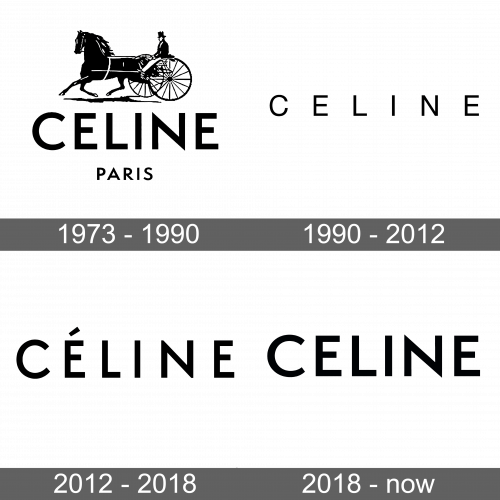
Celine Logo
It is not uncommon in the history of fashion for a brand’s specialization to change over time. Celine is one of them. Starting as a bespoke children’s shoe shop, the brand has grown into a world-renowned manufacturer of women’s clothing and luxury accessories. Vipiana knew that the post-war years would give women a renewed desire for luxury goods and believed that the modern woman needed not fancy, but luxurious clothing. Céline’s design style was based on simplicity and elegance.
Meaning and History
Surprisingly, the birth of the brand took place in 1945 when the war was just over. At first, it was a small Parisian shop that sold children’s shoes made by Celine Vipiana and her husband. In the `60s, the brand offered about the same variety of goods as it does today. By the ‘70s, Celine had gone international, with new boutiques opening across the globe. The real fame came at the end of the `90s when the LVMH holding acquired Céline as it was now considered a luxury brand. Vipiana remained the designer of Celine until her death. She passed away in 1997 at the age of 84.
What is Celine?
Celine is a French pret-a-porter de luxe brand. Celine Vipiana knew how to guess the desires of her consumer, so her shoes and later clothes were not only comfortable but also elegant. She presented a sexy and feminine style that was at the same time discreet and natural.
1973 – 1990
The name along with a much smaller “Paris” inscription underneath and a horse carriage at the very top was the first brand image. The horse carriage was drawn with details and added a classical touch. “Celine” was printed using a sans-serif font and all uppercase letters.
1990 – 2012
The “Celine” inscription became the only element of the logo. The letters were no longer bold and the fine strokes gave a feminine, delicate, and elegant touch. Bigger spacing gave the brand image an impressive and more determined appearance.
2012 – 2018
An updated version featured a font that resembled the one used in the original logo. A unique feature of this emblem was the addition of the accent above the “E”. The bold strokes and narrow spacing, though, were brought back. There were no other elements besides the name.
2018 – Today
In 2018, it became known that the former creative director of Saint Laurent, Hedi Slimane, was invited to replace Philo. Slimane changed the logo immediately, removing the accent from the name. The spacing got even smaller and the letters seemed to have thicker lines. The updated versions looked powerful and sophisticated.
Font and Color
The logo introduced in 1990 featured an elegant typeface that looks a lot like Neue Helvética. The other logos use a typeface that resembles Futura BT Pro Medium. Some versions have wider spacing, while others have the letters printed quite closely together. The brand always stuck with a classic black that gave it a luxurious, stylish, and timeless feel.


