Chicago White Sox Logo
The Chicago White Sox is a baseball team and Major League Baseball franchise in Chicago, Illinois, United States. The list of the Chicago White Sox regalia has 6 victories in the American League and 3 World Series titles. Considering that they have over 100 years of history, it does not sound impressive. Nonetheless, this team regularly held 2nd and 3rd places and was often very close to winning.
Meaning and History
The Chicago baseball club, unlike the Boston club, cannot claim that it always had the same name because for three seasons, from 1901 to 1903, it was known as the White Stockings. Since 1904, though, when the stockings were “cut off” and the word “Chicago” was added to the name, there was no change to the name.
What is Chicago White Sox?
This is an American professional baseball team based in Chicago, Illinois. Along with the Braves (founded in 1871), they are currently the oldest active clubs in the major leagues in North America.
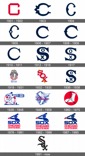
1901 – 1902
The team did not go all out with its first emblem, but it did look professional. It was a simple letter “C” that resembled an outline of a dark red square with cut corners and a slit.
1903
The updated emblem looked a lot fancier. It was deep blue color and curved shape and details in the middle part of the letter. The serif font surely gave the emblem intricate details.
1904
The emblem was still a blue letter “C”, but its shape has changed along with the change of the team’s name. It was more oval and had a pointed décor element in the center on the inside.
1905
The emblem was redrawn once again. There was only a slight adjustment though. The little pointed detail was replaced by a rhombus with a white center, making it more interesting and eye-catching.
1906 – 1907
The previous logo was not used for a very long time. Now, the detail in the center is gone. Although a serif font is still used, now it is more conservative. The shape of the letter is almost a perfect circle with a straight cut at the bottom and an elegant serif detail on the top end.
1908 – 1909
It seems that the team enjoys regularly giving its logo a slightly different spin. This time, they brought back the rhombus in the center, only now it was horizontal and did not have a white center. The bottom end also acquired more details.
1910 – 1911
The team decided to return to a simple design. The letter “C” still had a perfectly round shape with a thicker bottom and thinner upper half. The bottom end had a straight cut once again, while the upper end changed to a more rectangular serif detail.
1912 – 1916
Ten years after the team was founded, a completely new logo was created. Now, this is a capital serif letter “S”. One thing stayed the same, though, the dark blue color of the logo. Inside the upper curve of the letter, there’s a round letter “O”, and in the bottom curve – the letter “X”. The logo reads “Sox”, representing the name of the baseball team.
1917
In 1917, the emblem had a slight adjustment. Both the large “S” and smaller “O” and “X” got thinner. Letter “X” lost the small serif details and was now a simple cross.
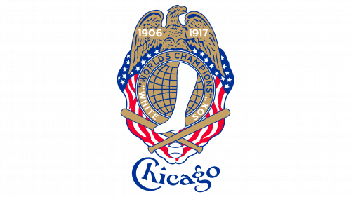
1918 – 1931
It was not long before the world saw an entirely new logo. It had a true American spirit with multiple elements combined into one image. A golden eagle with blue details and years 1906 and 1917 written in white. The American flag looks as if an extension of the eagle’s wings and wraps around a round emblem with the “World Champions” and “White Sox” written in capital letters at the top and the bottom of it respectively. The center resembles a globe and has a white stocking. Two baseball bats in a golden color cross under the round element with a small white ball below the crossing. An intricately written word “Chicago” underneath completes the picture.
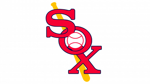
1932 – 1935
Once again, a new logo represented the team. It was a word “Sox” written diagonally in red capital letters that slightly overlapped each other. The letters had a thin blue outline and in the center of “O,” there was a white baseball ball with a red outline. A yellow bat was drawn diagonally just like the word peaks behind the letters.
1936 – 1938
White Sox decided to bring back the logo used during the 1912 – 1917 period. It added a little more serif elements to the letters but otherwise kept it unchanged.
1939 – 1948
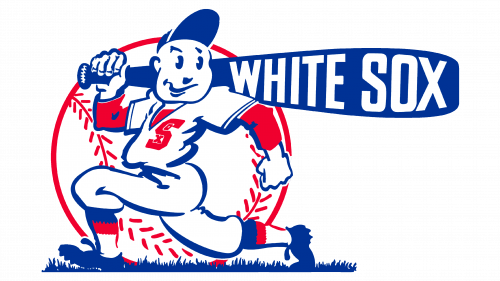
A different logo in the form of an animated baseball player with an exaggerated blue bat over the right shoulder represented the team. The team’s name was written in capital white letters across the bat. A baseball ball in traditional colors served as a background. For an alternate logo, the team had a simple emblem. With a large letter “S” and embedded smaller letters “O” and “X”, it was similar to a previous logo. They had cut edges and straight lines with a dark blue outline and were red inside. This logo was also added to the player’s shirt on the main emblem.
1949 – 1959
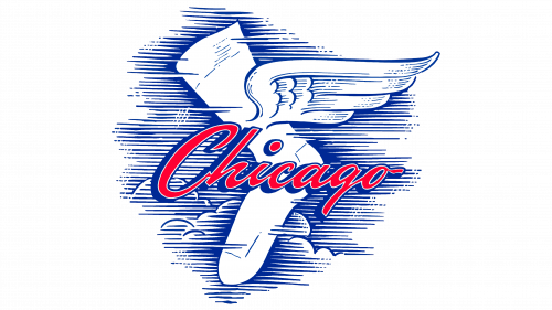
The team updates the emblem once more. It was “Chicago” written in red cursive with a blue outline. In the background, a white sock with a wing is flying with the sky. The sky has some clouds and is drawn with horizontal blue lines, illustrating the speed of the team. There were also two alternate logos.
1960 – 1975
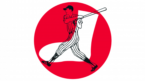
The redesigned logo had contours of a standing player with a bat ready to hit the ball. It was drawn using black ink and was relatively detailed. A red circle with a white a large white sock serves as a background.
1976 – 1981
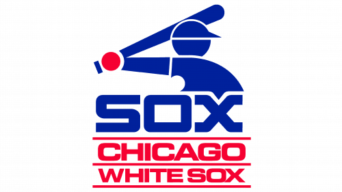
The club has come up with a new design for the logo once again. It had a simple image of a baseball player drawn in blue hitting a red ball. The capitalized words “Sox” followed by “Chicago” and then “White Sox” are written underneath the image. All words have red underlines, which emphasized the team’s name that was written in red as well. In 1987, the team changed the blue and red colors to a darker shade. This version of the emblem was brought back in 2014 as a secondary logo.
1982 – 1986
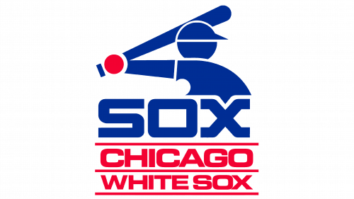
The White Sox has kept the same logo for 10 years. During this period, the blue was altered to a less bright shade of this color.
1987 – 1990
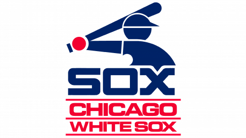
In 1987, the team has chosen a different variation for the blue used in the logo. Now, it was a dark, deep blue color. The logo was otherwise unchanged.
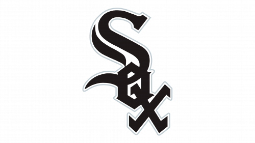
1991 – Today
One probably lost count of the number of logos the team had throughout its history. The new logo was a different spin on the logo presented in 1932. It was redesigned to give it a modern and a more bolder look. The letters were written using a gothic style font, with thick black lines as the base and thin white and light gray outlines wrapping the whole emblem. Letter “S” was noticeably bigger than the other two letters and had a white wave following the shape of the letter.
