Tampa Bay Rays Logo
The Tampa Bay Rays, St. Petersburg’s own MLB titans, clash on the diamond within the AL East division. Birthed as the Tampa Bay Devil Rays, they embraced ‘Rays’ in 2008, echoing Florida’s sunny ethos. With their inception, MLB’s footprint in Florida widened, sharing the stage with the Miami Marlins. Renowned for pioneering tactics and cultivating talent, the Rays continue to sculpt a legacy of ingenuity and developmental prowess in baseball.
Meaning and history
The Tampa Bay Rays, birthed in 1998 in St. Petersburg, Florida, joined MLB as an expansion team. Initially called the Devil Rays, they rebranded in 2008, dropping “Devil” for a sunnier image. Early years were tough, with struggles on the field. A turnaround came in 2008; they clinched their first AL East title. The Rays are known for innovation, notably their “opener” pitching strategy. Despite budget constraints, they’ve been competitive, reaching the World Series twice but not clinching the title. Their journey reflects resilience, smart management, and a knack for challenging baseball norms.
What is Tampa Bay Rays?
The Tampa Bay Rays, hailing from St. Petersburg, Florida, are a beacon of innovation in Major League Baseball (MLB). Known for their strategic prowess and the pioneering “opener” pitching approach, they defy conventional norms to remain competitive.
1998 – 2000
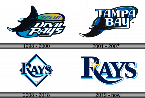
The logo showcases a manta ray, gliding through ocean blues with a dynamic flair. Above, “Tampa Bay” is arched, embracing the Florida sunshine through a gradient of yellow, green, and blue. The word “Devil Rays” rests below, bold and assertive in white, edged with black and a hint of celestial blue. This emblem embodies the spirit of the region and the team’s aquatic namesake.
2001 – 2007
The design simplifies, removing the multi-colored gradient and word “Devil”, focusing on a sleek blue and black motif. This cleaner look reflects a more streamlined team identity, with the manta ray’s silhouette becoming a stronger symbol of the franchise’s aquatic essence. The typeface of “Tampa Bay” is sharp and modern, encapsulating a refreshed era for the team.
2008 – 2018
This logo marks a distinct departure, featuring a diamond shape with “RAYS” in bold, cutting across. The aquatic creature is absent, replaced by a radiant sunburst above the ‘R’, symbolizing a new era and the “rays” of the Sunshine State. The color palette is refined to navy and light blue, which streamlines the aesthetic and gives a crisp, modern feel. This design signals a fresh identity, emphasizing light and energy over the previous marine theme.
2019 – Today
This rendition of the logo presents “RAYS” in a flowing, navy script, with a light blue trim. A yellow sunburst is located in the center of the R, symbolizing the brightness and sunshine of Florida. The design moves away from the diamond backdrop, opting for a more open and fluid aesthetic. It’s a fusion of minimalism and motion, reflecting a forward-looking team spirit. The overall effect is sleek, bold, and energetic, resonating with the essence of the baseball team it represents.
