CIBC Logo
Canadian Imperial Bank of Commerce (CIBC) is a leading financial institution headquartered in Toronto, Canada. Currently, it offers a diverse range of financial services, including retail and business banking, wealth management, and capital markets operations. CIBC serves its clients through operations in Canada, the United States, and around the world. As a publicly traded company, CIBC is owned by its shareholders and its shares are listed on the Toronto and New York stock exchanges. Its commitment to innovation and client-first approach has positioned CIBC as a major player in the global banking landscape.
Meaning and history
Canadian Imperial Bank of Commerce (CIBC) has a rich heritage that spans over 150 years. Originating in the mid-19th century, CIBC was formed in 1961 through the merger of two esteemed banks: the Canadian Bank of Commerce (established 1867) and the Imperial Bank of Canada (established 1875).
The Canadian Bank of Commerce initiated its operations in Toronto and progressively expanded, with noteworthy ventures like the opening of a branch in Dawson City during the Klondike Gold Rush. Meanwhile, the Imperial Bank of Canada began its journey in Toronto, growing steadily and marking its presence across the nation.
The union of these two banking giants in 1961 established CIBC as one of Canada’s “Big Five” banks. This merger aimed to strengthen their competitive position in a rapidly evolving financial landscape.
Throughout the 20th century, CIBC continued its expansion, not only within Canada but internationally, recognizing the importance of a global presence. In the late 1980s and 1990s, CIBC further broadened its horizons by venturing into electronic banking, showcasing its adaptability to technological advancements.
The 21st century saw CIBC focusing on strengthening its core business while divesting non-core operations. This period also marked CIBC’s commitment to digital transformation, enhancing its online and mobile banking platforms, emphasizing innovation and client convenience.
Over the years, while CIBC has undergone significant evolution and faced numerous challenges, it has remained steadfast in its commitment to clients, shareholders, and the communities it serves. Today, it stands as a testament to resilience, adaptability, and a deep-rooted legacy in the banking sector.
1961 – 1966
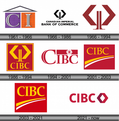
In the initial years of the 1961, this banking entity showcased a logo made up of trio geometric figures. There were two distinct quadrilaterals – a violet-hued one and another in a bright tangerine shade. Each held the initials “C” and “I” respectively. Positioned above these was a slate-colored triangle, giving an impression of a house’s rooftop. The square and the rectangle bore resemblance to pages of a grid-patterned journal. On these figures, there were circular patterns and streaks, giving off a vibe that perhaps the creators had inadvertently left behind the initial sketches while imprinting the characters.
1966 – 1986
The creative team enhanced the symbolic icon by incorporating the bank’s moniker, which was scribed beneath in a dual-line format. They opted for a distinctive typeface characterized by its succinct serifs and subtle indentations on the letter extremities. This emblem stood out as the sole monochromatic representation for CIBC in its history.
1966 – 1994
In 1966, a distinctive emblem in shades of red and brown emerged, marking the brand for nearly three decades. This design showcased twin chevrons, reminiscent of arrows facing outwards. These arrows symbolized the expansive reach of the Canadian Imperial Bank of Commerce, spanning from one end of the nation to the other. Flanking the chevrons were twin pillars, serving as metaphors for the bank’s unwavering foundation and steadfastness. This imagery underscored the institution’s vast presence and its commitment to offering unwavering support to its clientele.
1986 – 1994
In 1986, the iconic chevron design underwent a transformation, adopting a golden hue and nestling within a rich burgundy square. To accommodate this revamped design, the lengthy “CANADIAN IMPERIAL BANK OF COMMERCE” title was condensed into a succinct abbreviation. This revamped design showcased a striking serif font that exuded modernity. A lustrous gold border encased the entire design, adding a touch of elegance and cohesion to the emblem, emphasizing the bank’s commitment to excellence and innovation.
1994 – 2001
Amidst acquiring a significant 55% stake in TAL Investment Counsel, a pivotal rebranding took place for the financial behemoth. Veering away from its previous abstract insignia, the bank embraced a novel geometric motif: a trio of three-dimensional chevrons merging to form a diamond. Nestled within a deep crimson rectangle, this 3D figure was strategically positioned at the upper right, juxtaposed with the “CIBC” label.
Interestingly, the initial “C” stood out prominently, overshadowing the “IBC”, even though the entire abbreviation comprised uppercase characters. A sleek, white crescent line subtly bisected this pronounced “C”, adding depth and dimension to the design.
2001 – 2003
As the new millennium dawned, the Canadian Imperial Bank of Commerce felt the pressing need for a revamped brand image, especially in the face of Canada Trust’s merger with TD in 2000 and its subsequent global rebranding. The visionaries behind CIBC sought a timeless emblem, one that would remain fresh and relevant across several decades. Their pursuit led them to dual arcs – one in a vibrant shade of yellow and the other pristine white. These arcs encapsulated growth, evolution, and the relentless drive forward. Gracefully arching beneath the “CIBC” typography, these arcs were elegantly framed within a rich crimson rectangle, encapsulating a blend of tradition and progress.
2003 – 2021
A couple of years post its initial launch, the emblem underwent refinements. A more vivid color palette was adopted, with a distinct shift in the red hue. The acronym was magnified and shifted to the right, necessitating a slight expansion of the surrounding rectangle, restoring its square shape.
For deeper insights into customer perceptions, the bank collaborated with the renowned Ove Brand design agency. They unearthed that clients resonated most with themes of advancement and evolution. Consequently, the dual arcs symbolizing growth became the emblem’s focal point.
2021 – Today
The bank’s revitalized emblem embodies a gateway, welcoming the aspirations of its clientele. As underscored by CIBC’s leadership, this symbol bridges the institution’s storied legacy with its contemporary ethos. The insignia derives inspiration from the 1966 logo, specifically the chevron element. This feature is designed with two converging pointers, presenting an expansive opening. The typographical elements have been revamped, reflecting a more client-focused approach, underlining the institution’s commitment to aligning its branding with the evolving needs and aspirations of its patrons. This transformation not only pays homage to the bank’s historical roots but also showcases its readiness to adapt and evolve in the modern banking landscape.

