Cincinnati Reds Logo
The year 1889 marked the time when the Cincinnati Red Stockings, a team of professional baseball players, stepped out of the American Association and became part of the national league. For the past almost 40 years, their overall win-loss record is 10,630 and 10,422 respectively, which gives a win rate of 50.5%. They can boast great titles and several World Series championships.
Meaning and History
After losing its team in 1871, the city of Cincinnati lost another baseball team, also called the Cincinnati Red Stockings in 1880. It did not give up and soon formed another team that played from 1882 till 1890. Afterwards the Red Stockings moved permanently to the National League and renamed themselves Cincinnati Reds. For a short period, it was called Cincinnati Redlegs, though, due to the “Red Scare”.
What is Cincinnati Reds?
This is one of the oldest clubs the United States had that was playing baseball. A century ago, the Reds were a solid bet as the best team in baseball. The Cincinnati Reds have long-standing record, so it is not surprising that the fans saw multiple variations of the classic “C” logo.
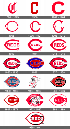
1890 – 1899
The first logo that represented the newly formed team was a classic letter “C” in a bright red color and a fancy Gothic typeface. Although there were no other details, the logo looked well-designed and sleek.
1900
The team maintained the same logo, only gave it a slightly different look by using a different font. It had a shape that looked more geometric thanks to straight lines and cut corners. The ends of the letter were cut straight. This solid serif typeface gave a more aspiring and daring feel.
1901 – 1904
The previous logo did not stay with the team for a very long time. A new and even more simplified logo was introduced. It was still a crimson red “C”, but now it had a circular shape. The ends were cut at a slight angle.
1905
The letter “C” that represented the team was redesigned in 1905. It was significantly thinner with a triangular element in the center. It pointed to the left and had a white center. Although the triangle added a playful detail, all the lines were quite smooth.
1906 – 1907
The logo designed in 1905 was given a more elegant look with intricate details. It acquired a more vertical elongated shape. The typeface used for the logo was a variation of Bruce Double Pica.
1908 – 1912
An updated logo looked very similar to the previous one. It still had a diamond-shaped element on the left and the same color. The ends, though, had different details and the letter itself was thinner. It looked delicate, yet energetic.
1913
A refreshed version was revealed in 1913. It was a horizontally elongated letter “C”, which slightly resembled the logo used in 1905. Now, though, it had pointy ends and most noticeable element was the word “Reds” inside the “C”. It was capitalied and had a bold sans-serif font. The completely red logo clearly told who it belongs to.
1914
It was not long before the logo was changed once again. The “C” acquired a bolder and rounder feel with the ends that were cut straight. The word “Reds” still used the same font, only now it was almost twice smaller.
1915 – 1919
The previous version of the logo was elongated once more, which made the letter look thinner. The “Reds” got bigger again and was stretched vertically a bit.
1920 – 1935
The shape and color of the letter “C” were kept the same, but now a thin black border was added to make it look even bolder. A rounder shape was given to the letters used to write the “Reds” in the middle.
1936
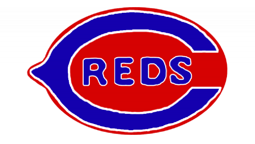
The colors of the logo that the fans got used to seeing were tweaked. Now, it was bright blue color and the “C” was framed by white. For contrast, the whole logo was set against a powerful red.
1937 – 1938
The new version of the logo with the blue colors did not stick for long, and the team returned to a well-recognized variation introduced back in 1920.
1939 – 1953
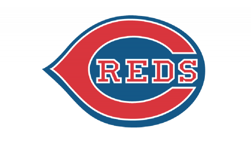
It seems that the public did not approve the new color scheme as the team returned back to the previous colors. The blue was not as bright and served as a background instead. The black color that was used for the outline was replaced by white. The border was also added to the “Reds” inside the letter “C”, which was written using a different font.
1954 – 1960
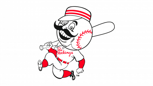
A completely new emblem that had nothing to do with what the team used before was created in the 50s. It was a happy baseball player cartoon-like character with a large head that resembled a baseball ball and a bat over the right shoulder. A hat and a big mustache completed the look. The emblem used white, red, and black and no more blue.
1961 – 1966
The Reds repeated the logo used during the 1939 – 1953 period back. It was exactly the same, except for one small detail – the black, which gave it a more professional and confident feel, was used as a substitution for blue.
1967 – 1971
The color scheme was renewed again. Now, the logo used only two colors. It was white for the writing which popped against a red. It was definitely a good color choice.
1972 – 1992
Lo and behold, the emblem was updated once more. It took the letter “C” from the other versions and added “Cincinnati Reds” on the top and bottom halves of the letter. The words were capitalized with the font in “Reds” being about twice as big as in the other word. The white writing against the red color of the letter “C” looked very nice. In the center, there was the same cartoon character, known as Mr. Red, but now it was running and without a bat in the hands.
1993 – 1998
For several years, the visual representation of the team looked almost like a copy of the one presented in 1967. A lighter red shade, though, was applied and the outline and name in the middle were noticeably thinner.
1999 – present
An updated version of the logo used a deeper crimson red as the basis. All the letters got a black shadow, which gave them some volume. Overall, the logo looked more stylish and sophisticated.
