Cleveland Indians Logo
Cleveland Indians is a baseball team of Cleveland, Ohio. Indians are amongst the most iconic teams in the Midwestern part of the country, and they also hold a very high position in the ranking there. They are considered by many to be the best team from the Central States.
Meaning and History
Cleveland is older than most teams in the NBA – they originated in 1894 and were amongst the first to be admitted into the American League. They were called Grand Rapid Rustlers initially, and a few other names later. They settled on Indians, because there were many of those in Ohio, even though it’s true for the entirety of America.
1901 – 1902
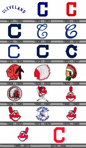
The first official logo was introduced in 1901, and back then it was just the word ‘Cleveland’, written in capital blue letters with a noticeable upside curvature.
1902 – 1903
In 1902, they instead adopted a single letter ‘C’ to represent themselves. By comparison, it was blockier, and had a square appendage on its tip. The color, however, was the same dark blue.
1904 – 1905
It’s largely the same logo, but instead of blue they used bright red this time.
1905 – 1906
In 1905, the emblem was reverted to blue, but was also made rather more squat and short.
1906 – 1908
In 1906, the team decided to turn the blocky, square letter into a more sophisticated, hand-written example.
1909 – 1910
The design stayed, but in 1909 they made it noticeably bolder than before.
1910 – 1914
The 1910 attempt was once more blocky and had square angles. This time, however, they made it thinner and less of a square.
1915 – 1920
By comparison, the 1915 emblem was a full return to that introduced in 1905 without any real changes.
1921 – 1927
In 1921, the designers proceeded to make their letter a more cartoonish look. It was disproportioned and drawn strangely, but it was largely the same design as before.
1928 – 1929
The 1928 design was the first to feature an Indian as a mascot. The emblem was a red head of a Native American. There were no other colors, except black, on him. The lines and facial features were highlighted in black, and so were the feathers on his head. Notably, he was also drawn a big roughly.
1929 – 1932
They learnt their mistakes and introduced a more elaborate Indian head by 1929. This time, it was a more realistic face (drawn in different shades of red) with a big feather-filled headwear colored in white.
1933 – 1938
The 1933 attempt was less stereotypical, but it was still visibly an Indian. The face was now way simpler, yellow, and the man had one black braid hanging off the side of his head. On it, he also wore a feathery headwear, but yellow with red tips and a white base this time.
1939 – 1945
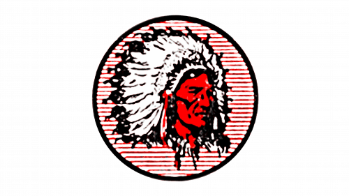
Finally, they decided to opt for the most realistic depiction yet in the 1939 redesign effort. It now featured the same concept as in the 1929 logo, a red face with white feathery headwear, but with more realism. The entire thing was put onto a pink circle, outlined in black.
1946 – 1947
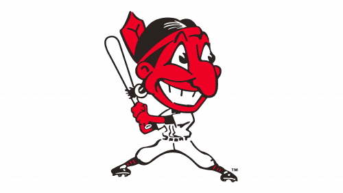
The 1946 saw the first appearance of the team’s mascot called Chief Wahoo. The official logo was him swinging the bat and clad in the classic Indians uniform of pure white.
Wahoo himself was an exaggerated stereotypical depiction of an Indian chief – a big-nosed, red-skinned face with huge eyes and a wide smile, in addition to some black hair and a red feather on the back.
They also sometimes depicted him as yellow-skinned during this period, although the red-skinned variant seems to have been more favored.
1948 – 1949
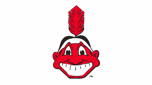
In 1948, they decided to make the Chief face forwards for a brief period. Most features stayed as before, except he was now just the face in all variations.
1949 – 1972
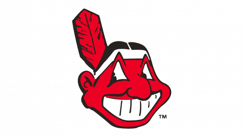
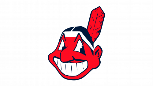
This was the most iconic depiction of their mascot: the same red-skinned face with a big smile and other over-the-top features. This time, however, they made him look to the right (his right) slyly as if planning mischief. Moreover, the feather grew in size, and they also added a white headband for more contrast on the logo.
1973 – 1979
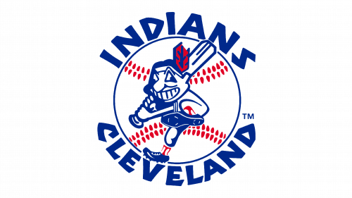
The 1973 logo was way more elaborate. They took Wahoo and put him in the middle of a baseball. He was given a baseball bat and positioned as if readying for the strike. Most of the logo was blue, white or red. Interestingly, they decided to paint the Chief almost completely white this time, and not red.
The only red parts were the seaming on the ball, the feather and the socks. All the rest was blue – including the outlines, the facial features and the ‘Cleveland Indians’ lettering around the ball.
They likely scrapped it because it made the mascot look silly. His eyes are out of focus, and he doesn’t seem to understand what’s going on. Suffice it to say, this one was rather offensive, and they opted for an older design instead.
1979 – 1985
The adoption of this older design followed in 1979. It was largely the same depiction as the 1949 design, but mirrored vertically and with some coloring changes.
1985 – 2013
In 1985, they also changed the red skin on Wahoo’s face to a paler, almost pink shade.
2014 – today
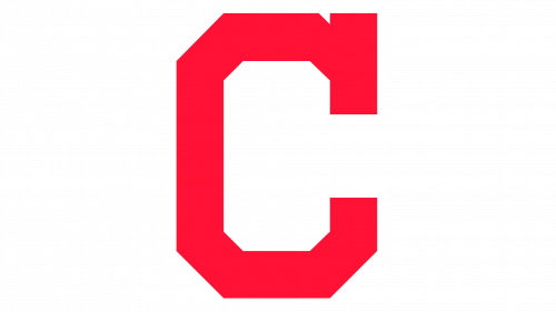
In 2014, the Indians scrapped Wahoo for the official logo (although he still was depicted on the caps and other property), seemingly for good. They instead adopted an old 1904 logo that was just a red ‘C’. This time, though, it was a bit paler.
Emblem and Symbol
Chief Wahoo – the team’s mascot – was still used on the caps, uniforms and merchandise until 2018. That year, they finally decided to get rid of him, following the decades-long decline in the symbol’s popularity. It was particularly criticized by numerous Native American representatives as stereotypical and offensive.
