Coach Logo
The history of the American Fashion House Coach has over eighty years. During this time, a lot has changed both in the company itself and in its style. The models, materials, colors, and styles of bags changed, and new products appeared. Only the incredibly high quality of the brand’s products has remained unchanged throughout all these years. Stylish Coach bags with a unique design complement different styles. The range of the brand’s products is impressive. You will find everything, from large bags for luggage to women’s clutches, classic and modern shapes, along with clothing, shoes, and accessories.
Meaning and History
![]()
Coach was founded in 1941 and was called Manhattan Leather Bags. The founder of the company was so impressed with the design of the baseball glove that it inspired him to create a handbag similar to it. The company produced men’s bags and wallets. Everything changed in the 60s with the arrival of Bonnie Kashin as the chief fashion designer of the brand. It was Bonnie who created the unique style of the brand, bringing to it many new details and fresh ideas. Since then, the company’s products have been known all over the world.
What is Coach?
Coach is an American brand that manufactures women’s and men’s clothing, shoes, bags, and all kinds of accessories. Its products are stylish and spectacular. The secret to the success of the popular brand lies in its high quality.
1941 – 2013
![]()
The name of the company was placed on a rectangular nameplate with corners rounded inwards. It was done in large, uppercase letters of white color with a thick black outline. It was accompanied by the establishment date written on the nameplate right under the name. The location was also specified on the logo. It was placed at the very bottom and done using basic, sans-serif font. The black and white image of a horse-drawn carriage at the top of the company’s logo refers to the way goods got delivered to customers for their convenience at the very start. It was almost the same width as the whole logo.
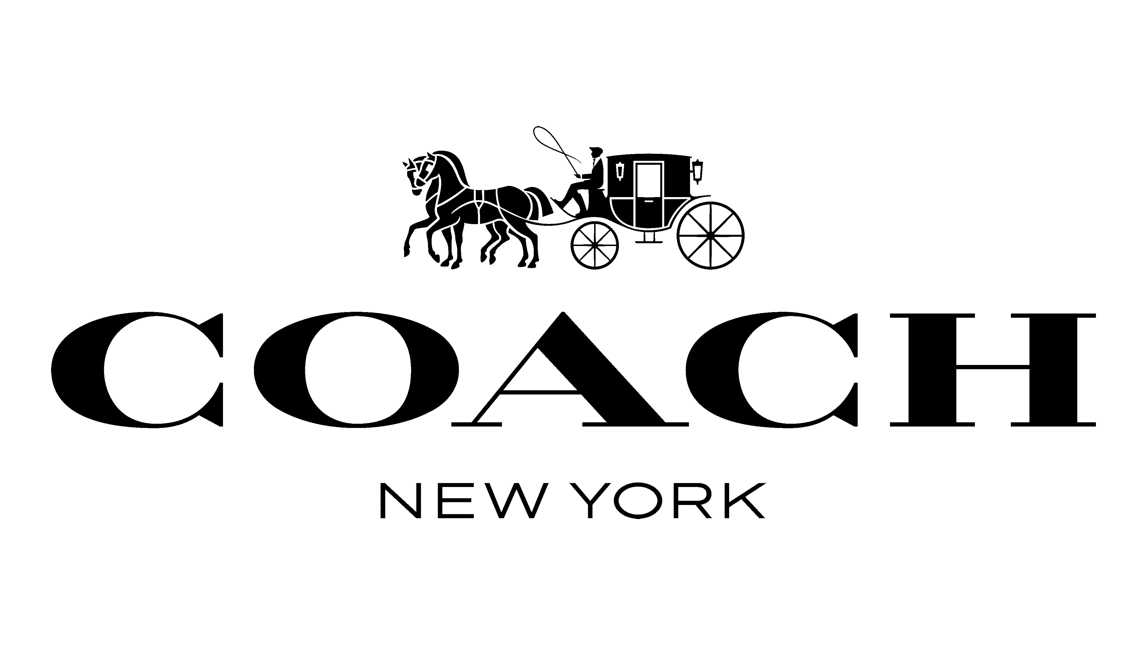
2013 – Today
![]()
The brand decided to remove the nameplate and go for a more modern and impressive font for the name. It was a serif font that featured thicker lines combined with delicate thin lines for an elegant and stylish look. The details of the carriage were also redrawn. The horses looked more graceful and there was something majestic about the whole illustration.
Font and Color
The original logo used a font similar to AZ Placid Regular. Only relatively recently it was replaced by a typeface that resembled Speakeasy Modern by Sudtipos, only the “C” had serifs on both ends. The color palette stayed unchanged throughout all these years though. It is a classic black that looks formal, elegant, and luxurious.


