Detroit Tigers Logo
The Detroit Tigers, a storied franchise in Major League Baseball, boast a rich history dating back to their founding in 1901. Based in Detroit, Michigan, they are a part of the American League Central Division. Their iconic uniform features a classic navy blue and white color scheme, highlighted by the recognizable old English “D” logo. The Tigers call the historic Comerica Park their home, a stadium renowned for its beautiful downtown setting and towering tiger statues. With four World Series titles and eleven AL pennants, the Tigers have a proud tradition of success, fueled by legends like Ty Cobb, Al Kaline, and Miguel Cabrera.
Meaning and history
Founded in 1901, the Detroit Tigers have woven a rich tapestry of history in Major League Baseball. Anchored in Detroit, Michigan, they’re part of the American League Central Division, donning iconic navy blue and white uniforms, with the distinctive old English “D” symbolizing their legacy. Their home, Comerica Park, is a testament to tradition, set against the bustling backdrop of downtown Detroit and framed by imposing tiger statues.
The Tigers clinched their first American League pennant in 1907, initiating a period of success that led to four World Series championships and eleven AL pennants. Legends like Ty Cobb, who claimed a record 11 batting titles, and Al Kaline, with his 3007 career hits, have etched their names in the annals of baseball history. More recently, players like Miguel Cabrera continue to uphold the Tigers’ proud tradition, with Cabrera achieving the prestigious Triple Crown in 2012.
Throughout their storied history, the Tigers have faced trials and tribulations, yet their resilience and unwavering spirit have endeared them to fans worldwide. With a commitment to excellence and a storied legacy, the Detroit Tigers continue to roar with pride, seeking to add new chapters to their rich history.
1901 – 1902
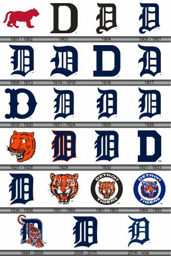
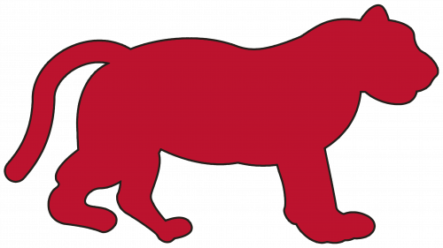
At the dawn of the 20th century, while most sports emblems predominantly showcased the team’s name or an initial letter, the Detroit Tigers broke the mold with their inaugural logo, opting for a vibrant red depiction of a tiger. This choice was emblematic of the team’s boldness and ferocity, setting them apart from their contemporaries and establishing a distinct visual identity.
The red tiger not only symbolized the team’s prowess and determination but also paid homage to the city’s rich industrial history, embodying the spirit and strength of Detroit. This unique approach to branding reflected the Tigers’ commitment to innovation and excellence, capturing the imagination of fans and etching the team’s image in the annals of baseball history.
Over the years, while the logo has evolved, the essence of the red tiger continues to resonate, serving as a testament to the Tigers’ storied past and a symbol of their ongoing quest for victory. It stands as a beacon of pride for the city of Detroit, its citizens, and the legions of fans who have stood by the team through triumphs and tribulations. The red tiger, in all its majesty, remains an integral part of the Tigers’ identity, a timeless emblem that continues to roar with pride and significance.
1903
The Detroit Tigers once embraced a bold, black, block-lettered “D” as their emblematic logo, symbolizing and paying homage to the city they call home – Detroit. This powerful and simplistic design encapsulated the essence of the city, known for its rich industrial history and resilient spirit.
In adopting this emblem, the Tigers aimed to forge a strong connection with Detroit and its citizens, proudly showcasing their roots and unwavering commitment to their community. The black color of the letter mirrored the strength and determination synonymous with Detroit, reflecting the team’s drive to succeed and make their city proud.
Over time, while the logo has seen transformations, the essence of the black “D” remains an integral part of the Tigers’ visual identity, serving as a beacon of pride and a timeless symbol of the indomitable spirit of both the team and its city. It stands as a testament to the Tigers’ storied history and their continual pursuit of excellence, symbolizing their solidarity with the city of Detroit and its vibrant, tenacious community. In essence, the black block-lettered “D” is not just a logo; it is a declaration of the Tigers’ deep-rooted connection with their city and the shared journey toward triumph and success.
1904
The emblem evolved into a sophisticated Old English iteration of the letter “D,” transitioning to a rich dark brown hue. This redesign was not merely aesthetic; it was a deliberate nod to the team’s storied history and a tribute to the timeless tradition of baseball. The Old English font added a touch of elegance and grandeur, capturing the essence of the sport’s rich heritage, while the dark brown color symbolized the Tigers’ strength and resilience, mirroring the industrial prowess of Detroit.
The updated logo was a harmonious blend of past and present, seamlessly combining the old with the new to create a timeless emblem that resonated with fans both young and old. It symbolized a new chapter in the Tigers’ history, one that honored the past while embracing the future, propelling the team into a new era of success and excellence. This transformation was emblematic of the team’s commitment to innovation and its unwavering dedication to its city, its fans, and the beautiful game of baseball.
1905 – 1907
Preserving the iconic font from its predecessor, the Tigers’ revamped emblem introduced a significant shift in its color palette, transitioning to a rich navy blue. This wasn’t merely a cosmetic alteration; it symbolized a deeper connection to the team’s heritage and identity. Navy blue, often associated with wisdom, power, and confidence, perfectly encapsulated the team’s ethos and aspirations.
The choice of navy blue was strategic and emblematic of the Tigers’ commitment to excellence and their relentless pursuit of victory. It represented a fusion of tradition and modernity, appealing to both longstanding fans and new generations alike. The navy blue color, vibrant and bold, became synonymous with the Tigers’ indomitable spirit, reflecting the team’s dedication to their craft and their city. It was a visual declaration of the team’s readiness to face any challenge, armed with the wisdom of the past and the confidence of the present, as they stride into the future with the aim of etching their name in the annals of baseball history.
1908 – 1913
The Detroit Tigers maintained the iconic Old English “D” in their logo, albeit with a newly introduced font that lent the emblem a more robust and three-dimensional appearance. This transformation was more than a mere stylistic update; it was a deliberate enhancement to accentuate the logo’s prominence and significance.
The voluminous rendering of the “D” symbolized the grandeur of the team’s history and its solid presence in the world of baseball. It added a layer of depth, embodying the team’s multifaceted identity and its profound connection with the city of Detroit. The enhanced logo served as a beacon of pride for fans, encapsulating the team’s past achievements and future aspirations.
Furthermore, the three-dimensional aspect of the “D” represented the team’s continuous evolution and its commitment to reaching new heights. It was a visual testament to the Tigers’ unwavering pursuit of excellence and their dedication to uphold the rich tradition and legacy of the franchise. In essence, the new logo was not just an emblem; it was a declaration of the team’s intent to carve out a distinct and prominent space in the annals of baseball history, backed by a rich heritage and a promising future.
1914 – 1915
The creative evolution of the Detroit Tigers’ iconic emblem persisted, as the letter “D” underwent another transformation. This time, the navy blue “D” was not just a symbol; it was a statement, broader and more imposing than ever before.
The widened letter was not just an aesthetic choice; it was a testament to the Tigers’ expanding legacy and their solid presence in the realm of baseball. This bolder version of the “D” conveyed a sense of strength and stability, mirroring the team’s robust foundations and its readiness to face any challenge head-on.
The enhanced emblem was also a visual representation of the Tigers’ commitment to innovation and evolution, while still staying true to their rich history and tradition. It resonated with fans, old and new, symbolizing the team’s persistent pursuit of excellence and its dedication to making a significant impact on the world of baseball.
Moreover, the broader “D” reflected the Tigers’ aspirations to grow and evolve, embracing new opportunities and carving out a unique identity in the ever-changing landscape of professional sports. In essence, this evolution of the logo was a bold declaration of the Tigers’ intent to continue their legacy of success, backed by a strong foundation and a clear vision for the future.
1916
In 1916, the Detroit Tigers made the strategic decision to return to their roots, reinstating the classic navy blue block-lettered “D” as their emblem for the season. This emblematic “D” was not merely a nod to the past; it was a symbolic gesture that underscored the team’s rich history and tradition.
The classic navy blue hue was a testament to the team’s enduring spirit and resilience, embodying the strength and determination that had become synonymous with the Tigers. The block-lettered “D” was a reminder of the team’s storied past, serving as a beacon of pride and a testament to the franchise’s longstanding legacy.
Moreover, this return to a classic emblem signaled the Tigers’ commitment to preserving their heritage while continuing to evolve and adapt to the changing landscape of baseball. It was a visual representation of the team’s dedication to upholding the values and traditions that had shaped its identity over the years.
In essence, the decision to revert to the classic navy blue block-lettered “D” was a powerful statement by the Tigers, encapsulating their commitment to their roots, their fans, and the city of Detroit. It was a declaration of their intent to honor their past while forging ahead into the future, armed with the wisdom and experience garnered from over a century of baseball history.
1917
The team once again embraced the historical Old English letter “D” for their emblem, holding steadfast to the distinct blue hue that had become synonymous with their identity. This specific shade of blue not only symbolized the team’s vibrant energy and steadfastness but also served as a testament to their rich heritage and the unwavering support of their dedicated fan base.
The Old English “D,” with its intricate detailing and classic design, paid homage to the team’s storied past, reflecting the franchise’s deep roots in the realm of baseball. It was a visual representation of the team’s commitment to preserving tradition while also adapting to the evolving landscape of the sport.
Moreover, the continuous presence of the blue color highlighted the team’s consistency and resilience in the face of challenges, both on and off the field. It was a subtle yet powerful reminder of the team’s determination to achieve greatness and leave an indelible mark on the history of baseball.
In essence, this iteration of the logo, with its historic Old English “D” set against a backdrop of vibrant blue, was a perfect amalgamation of past and present. It was a celebration of the Tigers’ legacy, a nod to their origins, and a statement of their ongoing commitment to excellence and innovation.
1918 – 1920
The franchise took a bold step in revitalizing their brand image, introducing a contemporary logo that featured the letter “D” meticulously scripted in the Bruce Double Pica font. This creative decision marked a significant departure from their previous designs, symbolizing a fresh chapter in the team’s storied history.
The Bruce Double Pica font, with its elegant curves and sophisticated style, added a touch of modernity and finesse to the emblem, encapsulating the team’s commitment to innovation while paying homage to their rich heritage. The scripted “D” was not merely a letter; it was a representation of the franchise’s journey, its triumphs and tribulations, and its unyielding dedication to the sport of baseball.
Moreover, the introduction of the new logo served as a testament to the franchise’s willingness to adapt and evolve in response to the changing dynamics of professional sports. It resonated with fans and stakeholders alike, symbolizing a renewed vigor and an unwavering pursuit of excellence.
In essence, the new logo, with its intricately designed “D” in the Bruce Double Pica font, was a masterstroke by the franchise. It captured the essence of the team’s identity, seamlessly blending tradition and modernity, and stood as a powerful visual statement of the team’s aspirations for the future, backed by a rich and storied past.
1921 – 1924
In 1921, the Tigers made a strategic return to the esteemed Old English “D” for their emblem. However, this incarnation of the “D” was notably more refined and slender compared to its predecessors.
The slimmer silhouette of the “D” was a visual representation of the team’s evolution, symbolizing a sleeker and more streamlined approach to their game. The Old English “D” carried with it a sense of history and tradition, representing the deep roots of the franchise in the rich tapestry of baseball.
This adaptation wasn’t merely a nostalgic nod to the past; it was a deliberate choice that reflected the Tigers’ commitment to melding the old with the new, respecting their heritage while also embracing a modern ethos. The slender “D” was a testament to the team’s agility and readiness to adapt to the ever-changing landscape of professional sports.
Moreover, the return to the Old English “D” served as a reminder of the team’s storied past, a symbol of pride for fans, and a beacon of hope for future successes. It was a clear statement of the franchise’s unwavering dedication to excellence, tradition, and the pursuit of greatness in the world of baseball.
1925
In 1925, the Detroit Tigers made subtle yet impactful modifications to their emblem, while continuing to embrace the deep navy blue that had become a hallmark of their identity. These slight tweaks were reflective of the franchise’s commitment to keeping their brand image fresh and dynamic, in tune with the evolving landscape of baseball.
The navy blue color was not just a visual element; it was a representation of the team’s steadfastness, resilience, and rich heritage. This timeless hue symbolized the team’s unwavering commitment to its roots, the city of Detroit, and the sport of baseball.
Moreover, these nuanced adjustments in the emblem were a testament to the Tigers’ keen attention to detail and their pursuit of perfection. It showcased the franchise’s dedication to presenting a refined and polished image to the world, one that is in harmony with their values and traditions.
In essence, the subtle alterations made in 1925, coupled with the continued use of navy blue, were indicative of the Tigers’ ability to balance tradition with modernity. It was a visual statement of the team’s determination to uphold its legacy while continually striving for excellence and innovation, capturing the essence of what makes the Detroit Tigers a revered and iconic franchise in the world of professional sports.
1926
In 1926, the Detroit Tigers introduced a new iteration of their emblem, once again featuring the iconic Old English letter “D” rendered in a bold blue hue. This time, however, the “D” was given a more voluminous and robust appearance, adding a sense of dimension and depth to the team’s visual identity.
This modernized and fuller “D” was a reflection of the Tigers’ growing stature and ambition within the world of baseball. The enhanced volume of the letter symbolized the team’s strength, resilience, and commitment to achieving greatness on and off the field.
Furthermore, the decision to retain the blue color was a nod to the franchise’s rich history and tradition, while also serving as a symbol of unity and pride for the city of Detroit and its passionate fan base. The vibrant blue hue was a testament to the team’s energy, vitality, and unwavering spirit.
In essence, the 1926 logo was a visual embodiment of the Detroit Tigers’ evolution and growth. With its more voluminous and impactful design, it captured the essence of the team’s identity and aspirations, serving as a powerful symbol of their dedication to excellence, tradition, and the pursuit of victory.
1927 – 1928
In a bold departure from tradition, the Detroit Tigers decided to forgo their signature letter “D” in 1927, opting instead for a fierce and vibrant representation of their namesake. The new logo showcased an orange tiger head, complete with piercing white eyes, stark black whiskers, and menacing jagged white teeth. This striking imagery was a significant shift from the previous designs and marked a new chapter in the franchise’s visual identity.
The choice of an orange tiger head was symbolic of the team’s strength, agility, and fierce determination. The white eyes represented clarity of vision and focus, while the black whiskers symbolized precision and attention to detail. The jagged white teeth, on the other hand, conveyed the team’s readiness to face any challenge head-on.
This logo was not merely a visual representation; it was a powerful statement of the Tigers’ evolving identity, embodying their tenacity, vigor, and indomitable spirit. It captured the essence of what it means to be a Detroit Tiger, reflecting the franchise’s commitment to excellence, innovation, and its rich heritage, ultimately solidifying its place as an iconic symbol in the world of professional sports.
1929
In a nod to their storied past, the Detroit Tigers decided to revert to the Old English “D” that had been a part of their identity from 1921 to 1926. However, in this iteration, the familiar blue letter was adorned with a striking orange outline, injecting a fresh and dynamic element to the classic design.
The addition of the orange outline was not just a visual enhancement; it was a symbolic representation of the team’s energy, passion, and burning desire for success. The vibrant orange color, often associated with vitality and enthusiasm, encapsulated the Tigers’ commitment to bringing excitement and excellence to the game of baseball.
Moreover, the combination of the blue and orange colors was a harmonious blend of tradition and innovation. The blue, a symbol of the team’s rich history and deep connection to the city of Detroit, perfectly complemented the orange, representing the franchise’s continuous evolution and forward-thinking approach.
In essence, the decision to return to the Old English “D” and the addition of the orange outline was a testament to the Detroit Tigers’ respect for their heritage, while also showcasing their readiness to embrace change and innovation, solidifying their position as a dynamic and iconic franchise in the world of professional sports.
1930
In a design evolution, the Detroit Tigers chose to eliminate the orange outline that had previously adorned their classic Old English “D” logo. This decision marked a return to a more simplified and timeless aesthetic, reminiscent of their historical branding.
The absence of the orange outline brought a renewed focus on the iconic Old English “D,” allowing its bold and elegant curves to take center stage. This design choice was reflective of the Tigers’ storied past and rich tradition, celebrating the franchise’s deep roots in the city of Detroit and the world of baseball.
By opting for a more minimalist approach, the Tigers showcased their commitment to preserving the essence of their identity while adapting to contemporary design sensibilities. This streamlined logo was a visual representation of the franchise’s dedication to excellence, simplicity, and a deep respect for their heritage. In essence, this design shift was a testament to the Tigers’ enduring legacy and their continuous pursuit of victory, capturing the spirit and essence of this iconic franchise.
1931 – 1933
Reintroducing the blue block-lettered “D”, the Detroit Tigers re-embraced a piece of their historical identity. This particular emblem was significant enough for the franchise to uphold it for two consecutive years, solidifying its place in the team’s visual lexicon.
This return to a classic and timeless design was a testament to the team’s commitment to its roots and the rich history embedded within the Tigers’ DNA. The decision to bring back this logo represented more than just aesthetics; it was a powerful reminder of the franchise’s storied past, filled with triumphs, challenges, and unforgettable moments that have defined the team’s journey.
During this period, the blue block-lettered “D” became a symbol of continuity, tradition, and the unyielding spirit of the Detroit Tigers. It was a visual representation of the franchise’s dedication to preserving its legacy while continuing to forge a path forward in the ever-evolving world of professional baseball. By sticking with this logo, the Tigers celebrated their heritage and reaffirmed their identity as a cherished and iconic team within the sports world.
1934 – 1956
In 1934, embracing a sense of nostalgia and historical significance, the Detroit Tigers opted to revert to the blue Old English letter “D” for their logo, a move that would define their identity for the next twenty-two years. This iconic design was a nod to the team’s rich legacy, embodying the spirit and heritage of the franchise.
For over two decades, the Tigers proudly bore this emblem, a symbol that became synonymous with the team’s name. The Old English “D” was not just a letter; it was a representation of the city of Detroit, the passionate fanbase, and the timeless tradition of Tigers baseball.
However, in 1957, the team decided to break from this long-standing tradition, introducing a completely new logo that would mark the beginning of a new era. This change was reflective of the team’s desire to evolve and adapt, continuously seeking ways to refresh and modernize their image while still honoring the past. The switch was a testament to the franchise’s commitment to innovation and its relentless pursuit of excellence in the world of professional sports.
1957 – 1960
The Detroit Tigers made a significant departure from their traditional Old English “D” emblem, electing instead to spotlight a tiger head as the focal point of their logo. This shift represented a bold and vibrant choice, capturing the fierce spirit of the team.
The logo showcased a front-facing tiger head in a dynamic orange hue, its mouth agape in a powerful roar. This rendition of the tiger was meticulously crafted with attention to every detail. The whiskers, eyes, mouth, and fur were intricately outlined in shades of black and white, providing a stark contrast that added depth and dimension to the image.
This move to incorporate a more detailed and realistic tiger head was symbolic of the franchise’s commitment to innovation and evolution. It was a celebration of the team’s mascot, a symbol of strength, agility, and tenacity. This logo encapsulated the essence of the Detroit Tigers, encapsulating their rich history and the unyielding determination that propels them forward in the competitive world of baseball.
1961 – 1963
For the next iteration of their emblem, the Detroit Tigers chose to build upon the previous design while also introducing new elements to further establish their identity. The tiger head, once prominent and grand, was scaled down in size and nestled within a bold, black circular frame.
This circular frame was not simply an aesthetic choice; it served as a canvas for proudly displaying the team’s home city, “Detroit,” and the team’s name, “Tigers,” which were inscribed along the top and bottom arcs of the ring, respectively. Both wordmarks were executed in a crisp white font, creating a striking contrast against the black backdrop.
This logo design was a strategic amalgamation of different elements, each symbolizing a facet of the team’s heritage and identity. The inclusion of the team’s home city was a salute to their roots and the community they represent. Simultaneously, the circular frame represented unity and continuity, encapsulating the team’s journey and their enduring quest for excellence in the world of baseball.
1964 – 1993
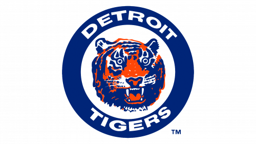
In a bold move in 1964, the Detroit Tigers decided to refresh their visual identity with a modern twist. The team said farewell to the black elements in their logo and embraced a more vibrant and striking blue hue.
In addition to the color update, the Tigers opted for a dynamic shift in the tiger head’s orientation, making it tilt to the right, infusing a sense of movement and vitality. This redesigned tiger head was then encased within a robust blue ring, preserving the same iconic wordmark from the previous iteration of the logo.
The introduction of blue symbolized a fresh start, embodying the team’s continuous evolution while honoring its rich history. The tilted tiger head, on the other hand, was a nod to the team’s forward-thinking approach and readiness to take on any challenge. This logo was not just a visual emblem; it was a representation of the team’s spirit, determination, and commitment to excellence in the competitive world of baseball.
1994 – 2005
The year 1994 marked a significant shift in the visual identity of the Detroit Tigers. In an innovative move, the designers elected to meld together two iconic symbols of the franchise: the formidable tiger and the classic Old English letter “D.” This bold fusion resulted in a powerful emblem that portrayed the full-bodied tiger in an aggressive stance, seamlessly integrated with the letter “D.” This departure from the traditional depiction of just the tiger’s head emerging from the letter was a testament to the team’s dynamic evolution. This emblem symbolically represented the team’s ferocity, unity, and deep connection to its historical roots, embodying the essence of the Detroit Tigers’ spirit and legacy.
2006 – 2015
In a nod to their storied past and a commitment to timeless tradition, the Detroit Tigers made the strategic decision in 2006 to revert to their classic emblem. The fierce tiger was retired, and in its place, the iconic Old English “D” was reinstated with pride. This move was not merely a shift in visual identity, but rather, a profound declaration of the franchise’s reverence for its heritage. The Old English “D” is more than just a letter; it is a symbol that has stood the test of time, representing the city of Detroit and its beloved baseball team. This logo, rich in history and symbolism, captures the essence of the franchise, celebrating its legacy and promising continuity for future generations of Tigers fans.
2016 – Today
The contemporary logo of the Detroit Tigers is a testament to the franchise’s rich history, echoing a design that was first introduced over a century ago in 1904. This emblem, predominantly featuring the Old English Latin alphabet, harks back to a bygone era where signs were meticulously crafted in ornate calligraphic handwriting, akin to the precision of Japanese characters.
The logo ingeniously amalgamates curved, straight, and arcuate segments, encapsulating the essence of the club in a visually striking manner. On one hand, these meticulously crafted elements eloquently articulate the team’s name and its geographical roots. On the other hand, they subtly mimic the formidable fangs of a tiger, forging a strong visual connection with the team’s mascot. This clever interplay between symbolism and aesthetics results in a logo that is not only instantly recognizable but also deeply resonant with the team’s identity and legacy.

