Dick’s Sporting Goods Logo
Dick’s Sporting Goods is one of America’s most popular retailers and manufacturers of sportswear and footwear along with related goods. The company offers its products through an e-commerce platform. It also has many physical stores across the country that not only sell the goods but also allow visitors to enjoy some type of sports activity, such as climbing walls or playing golf. The company also owns and operates Golf Galaxy, Field & Stream, and other specialty concept stores, as well as Dick’s Team Sports HQ, and mobile apps for planning, communicating, and tracking sports scores in real time.
Meaning and History
![]()
The business, which was initially called Dick’s Army & Navy, was started in 1948 by Richard Stack with the first store being in New York. With an expansion in assortment, the store got a new name – Dick’s Clothing and Sporting Goods, which was later (1999) shortened to the version we know today. In 1984, the son overtook the business and opened a second location. The main office moved to Pennsylvania in 1994 and stores in many states were opened since then. Dick’s regularly brings something new to the market. For instance, in 2021, the company launched VRST, a men’s sportswear brand, and opened its largest House of Sports store in New York State. For nearly half a century, the company had close connections with the famous Nike brand. Thus, a partnership with its largest supplier, the Nike brand, allows the customers to shop for exclusive Nike shoes and apparel on Dick’s website. The company’s name comes from the founder’s nickname, which was Dick.
What is Dick’s Sporting Goods?
Dick’s Sporting Goods is a popular US sportswear retailer with around 1000 outlets. Today, in addition to sportswear, Dick’s Sporting Goods also sells sports equipment and accessories for fitness, equipment for golf, as well as for hunting, fishing, and many other activities.
1948 – 1958
![]()
Since earlier the founder worked in a military gear store, he called his store Dick’s Army and Navy. However, the main goods were associated with fishing. Thus, besides the name, the emblem before the store also had a fish at the very bottom that had “Tackle” written across it. It even included a “Live Bait” sign. This store sign did not use any fancy fonts or details. It had a rather basic, sans-serif typeface and all uppercase letters, so the sign could be easily read even from afar.
1958 – 1994
![]()
It looks like the founder put just a little more effort into the new logo. It simply reflected the new name, but the word “Dick’s” was not only enlarged but also placed on a diagonal, which added dynamics and allowed the eye to travel. The red color of the emblem also attracted attention. Even nowadays, this version looks modern, clean, and sleek.
1994 – 1999
![]()
In the 80s, they experimented with a new visual identity. It was decided to abandon the red and go for white and grassy green as the main colors. The word “Dick’s” was printed in large, sans-serif letters with angular corners. The remaining name, Clothing & Sporting Goods, was printed using a rather traditional typeface without serifs. Both inscriptions were done in white and placed on a rectangular background. The logo would look very plain if not for one detail. The apostrophe was replaced by four balls flying one behind the other and representing different sports. This not only added interest to the logo but also reflected the variety of goods one could acquire at the store.
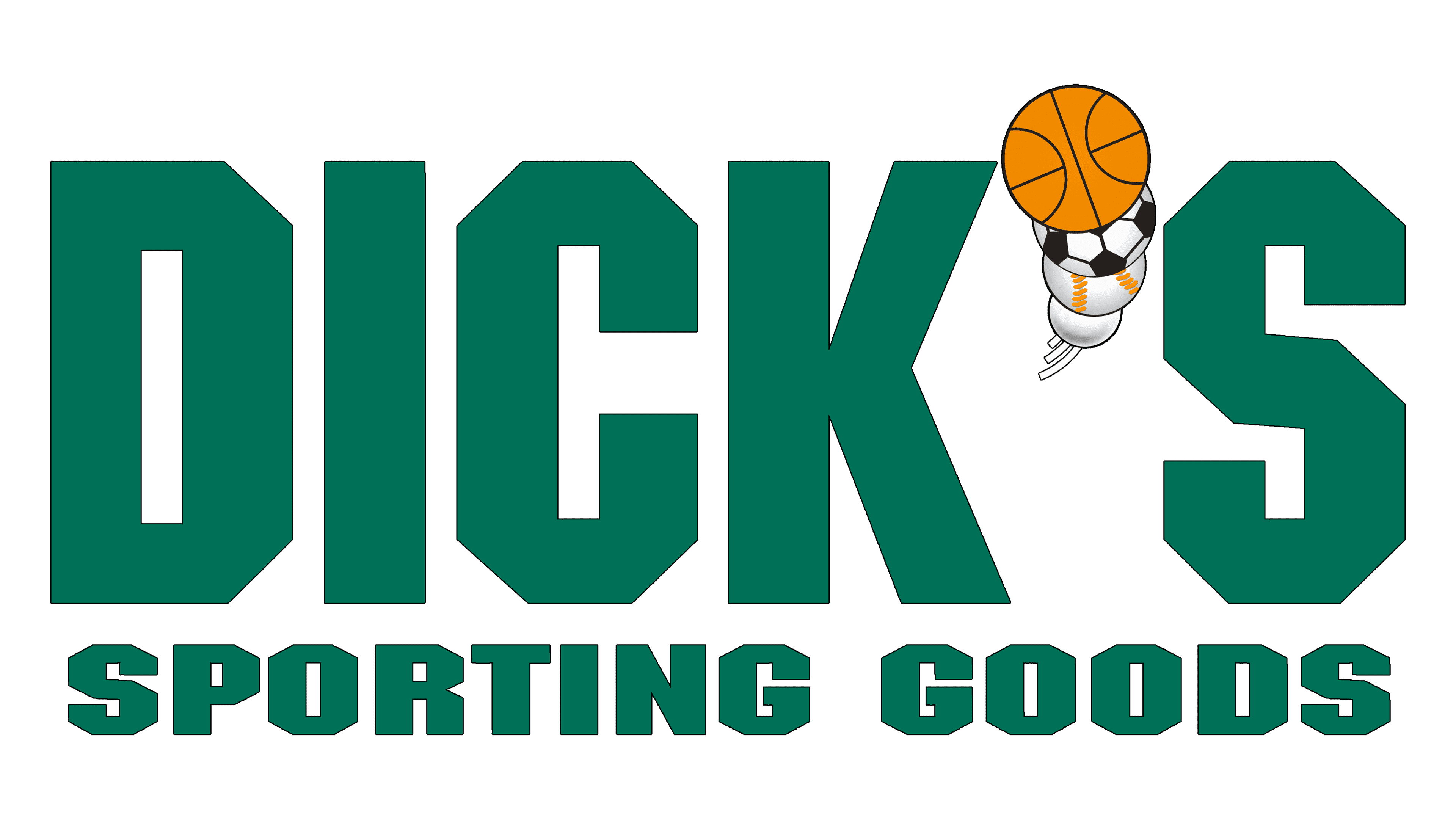
1999 – Today
![]()
The new logo was created mainly because there was a new business name. It was decided to use the same font for both lines. The second line, though, was still printed using a smaller font, so both lines would be the same length. The designers also added shadows and highlights to add volume to the inscription. The was also a frame here and a gradient background. The balls seemed to be flying out of the frame, which surely added dynamics and caught the attention of the viewer. A black inscription at the top that said “Every Season Starts At” completed the picture.
Font and Color
Until the 80s, the company used traditional, sans-serif fonts. A portion of the 1980 logo used a bold, geometric font similar to Yoxall Regular by Roger White, Protestant by DGL, and FreeSans Medium by GNU FreeFont, while the second line was done using a basic sans-serif font of a much smaller size. In 1999, the whole name was done using the same font similar to NFL Dolphins but with an addition of a shadow. Originally, the company went for a bold color that grabs the attention. The red encourages people to shop at the store. Later, it was replaced by a dark green, which is often used to represent the company’s stability and reliability. It is also a good color choice for a company that sells goods that relate to relaxation and health.


