Diesel Logo
Diesel S.p.A. is an Italian retail clothing company, known primarily for its high-end denim products and casual wear. Founded by Renzo Rosso in 1978, Diesel has established a strong global presence. The company operates worldwide, with its products available in numerous countries across various continents. Diesel’s international reach is a testament to its widespread appeal and adaptability to diverse markets.
Meaning and history
Diesel was founded by Renzo Rosso in 1978 in Molvena, Italy. Initially focusing on denim, the brand quickly became synonymous with high-quality, innovative jeans. Diesel’s key achievements include pioneering new styles, materials, and manufacturing methods, significantly impacting the fashion industry. The brand is renowned for its unconventional and imaginative advertising campaigns, which have played a crucial role in establishing its unique identity.
As of now, Diesel continues to be a leader in the fashion industry. Under Rosso’s guidance, the company has expanded its product line to include not just denim but also accessories, footwear, and fragrances. Diesel’s ability to evolve while maintaining its core values of passion, individuality, and self-expression has ensured its enduring success and relevance in the ever-changing world of fashion.
This structure provides a comprehensive overview of Diesel, starting from its inception to its current standing in the global market, focusing on real facts and achievements.
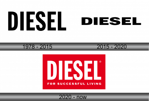
1978 – 2015
The logo you’ve provided is a stark, typographic mark for the fashion brand Diesel. It is characterized by its heavyweight, block capital letters that exude a robust and impactful presence. The typeface is a contemporary sans-serif, which eschews any unnecessary flourishes for a direct and unambiguous declaration of the brand’s identity. Each letter is constructed with geometric precision, offering a uniform and clean silhouette that ensures immediate brand recognition. This minimalist approach conveys a sense of modernity and efficiency. The black hue of the text stands out with a classic, versatile aesthetic, suggesting reliability and an understated coolness that aligns with the brand’s apparel design philosophy.
2015 – 2020
The logo retains the same stark, all-caps font as previously described, with a solid, sans-serif typeface that exudes confidence and contemporary flair. The spacing between the letters is meticulously calculated to provide a visual rhythm that is pleasing to the eye. This unembellished typographic approach continues to serve as a visual anchor for the brand, embodying a chic simplicity that is as effective in 2015 as it was in earlier iterations. The monochromatic color palette underscores the logo’s timeless quality, ensuring that it remains versatile and easily adaptable to different contexts while maintaining the company’s strong brand recognition.
2020 – Today
This rendition of the Diesel logo introduces a vibrant red backdrop, contrasting with the stark white lettering, creating an arresting visual statement. Below the main brand name, the slogan “FOR SUCCESSFUL LIVING” is added, articulating the brand’s ethos in a compact, sans-serif typeface that harmonizes with the logo above. This addition imbues the logo with a narrative element, suggesting a lifestyle or aspiration associated with the brand. Compared to the previous iterations, this logo remains consistent in font and capitalization but evolves in color and messaging, thus reinforcing the brand’s identity while also expanding its communicative reach. The registered trademark symbol affirms Diesel’s established legal ownership of this signature design.


