Dior Logo
Christian Dior or simply Dior is a world-famous French brand that designs clothing, luxury goods, watches, lingerie, eyewear, cosmetics, and perfumes. Christian Dior was daring when it came to the creation of fragrances and the design of clothes. He believed that showing the beauty of a woman is the main task of the designer. The aesthetics of the Christian Dior brand has been associated with femininity since the founding of the fashion house. During the existence of the house, a lot has changed and latest collections show that Dior has adapted to the modern understanding of femininity. Christian Dior is currently a subsidiary of LVMH.
Meaning and History
The brand was founded by the French designer Christian Dior. It was 1925 when Christian gradually began to master the basics of the fashion artist profession thanks to Jean Ozenn. His sketches were bought by tailors and intermediaries, then the sketches of hats and dresses got printed in the weekly Le Figaro Illustre. In 1938, his work was noticed by an already established and highly respected designer Robert Piguet. Later, he was hired by the Fashion House of Lucien Lelong. In 1942, Christian Dior opened a perfume laboratory known as Christian Dior Perfume. The official trademark registration date is December 16, 1946. Since 1985, the company has been led by French businessman Bernard Arnault. It is not surprising as the brand is part of the LVMH, the world’s largest luxury goods manufacturer.
What is Dior?
Dior is a French house of elegant and beautiful first-class clothes and shoes for men and women. It is one of the main fashion companies in the world with locations all around the world. It takes an important place in LVMH, the world’s largest fashion group.
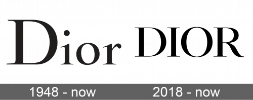
1948 – today
The initial brand logotype was a simple wordmark written in the delicate serif typeface. It has wider vertical strokes, while the other lines, as well as serifs, are thinner, which creates The black color gave it an elegant, professional, and truly timeless look. This wordmark is being used widely as a logo on the products of the brand and pages on social media.
2018 – today
In 2018, the brand designers decided to give a fresh look to the company’s brand identity. It presented an all uppercase letters edition of the familiar wordmark. The logo maintained its sense of style and sophistication. The use of all large letters gave it a more powerful look. Although, this conservative logo does not need any other elements or the use of bright color to be instantly recognized as a high-end brand.
Font and Color
The brand used the Nicolas Cochin font for both of its logos. In the original version, the designers had only the first letter capitalized. In the second alternative, the logo featured all uppercase letters. The font has beautiful serifs, while the varying thickness of the lines gives some dynamics and engages the viewer. The black color used for the logo is a symbol of luxury, sophistication, and elegance. It gives the logo a classy appearance.


