eBay Logo
EBay is basically a massive marketplace with millions of goods sold and bought by the users themselves every day. It’s one of the most successful stories about e-commerce, next to some such as Amazon. Basically, thanks to this company, you can buy whatever you want by just going online.
Meaning and History
The company started in 1995, and it was initially an auctioning service. A few years later, it changed the name – and not because it sounds an awful lot like ‘E-Buy’, but because the founder’s partner company was called ‘Echo Bay’. That’s the entire background for this priceless brand name.
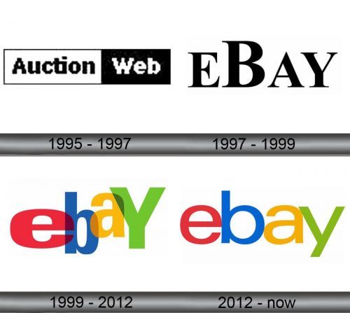
1995 – 1997
At first, the company focused on auctioning made by users and for users. Back then, the Internet was wild, so they just used the most basic emblem for their business.
It said ‘Auction Web’. The first word was black against the white rectangle, and the second one was reversed. Then they just outlined the white part with a thin black frame – and voila.
1997 – 1999
The company changed name to eBay in 1997, but the general approach changed little. It was just a usual serif that said ‘eBay’. Peculiarly, all the letters were uppercase – the second character was simply bigger than all the rest.
1999 – 2012
This was the longest lived logo yet, for some reason. The letters were all over the place – each was stretched to some extent, and that’s not even it. They also collided and merged. Not only that, but you could see through them, which is an interesting design choice, to say the least.
In addition, the letter ‘Y’ was the only uppercase character there if you wondered what was off.
2012 – today
In 2012, they decided to back up to the normal designs, put all of the letters on one level and restricted colliding. They were still very close to one another, but they didn’t merge any longer. Like in the previous case, they were red, blue, yellow and green respectively, but this time they also removed the acidic hues.
The font is also interesting. These letters are all thin and, unlike the 1992 variant, they are continuous and don’t change width or other parameters at all.
Emblem and History
Although the letters are strictly colored in these bright colors (makes the brand look like a ‘Google for e-commerce), they can be readily changed for some purposes. For instance, it’s not uncommon for this writing to be completely black or white, if it’s set against a darker background.


