Ethiopian Airlines Logo
Ethiopian Airlines stands as the flag carrier of Ethiopia. The government of Ethiopia established the airline. It originated in the capital city, Addis Ababa. The creation aimed to boost regional connectivity and economic growth. The airline has grown to symbolize national pride and development.
Meaning and History
Ethiopian Airlines, launched in 1945, began as a visionary project in Addis Ababa. It initially connected cities in Ethiopia. Soon, it expanded, linking continents with a fleet that grew in diversity. Innovation marked its journey, it was Africa’s first jet service operator in 1962. Leadership in crisis response and maintenance excellence became trademarks. The airline embraced technology, often leading with firsts in African aviation. Its story is one of resilience, growth, and African pride, steadily climbing to become a global air travel pillar.
What is Ethiopian Airlines?
Ethiopian Airlines serves as the national airline of Ethiopia, renowned for its extensive network in Africa. It operates from its hub at Addis Ababa Bole International Airport. The carrier is celebrated for enhancing air connectivity across continents, promoting Ethiopian culture globally.
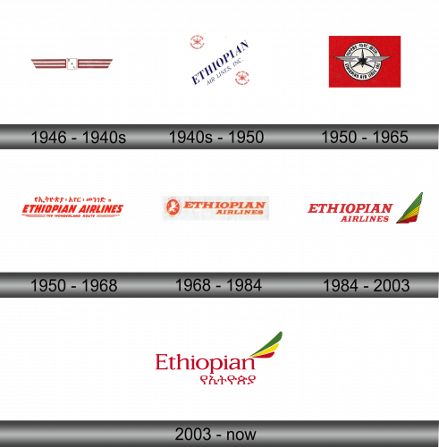
1946 – 1940s
The logo presents a vintage aesthetic, a nod to tradition and history. It features a central shield-like emblem flanked by two wing-like stripes, symbolizing flight and motion. The letters “EAL” nestle within the emblem, abbreviating the airline’s full name. The overall color scheme marries a deep, earthy burgundy with white, conveying a sense of grounded elegance and simplicity. The design encapsulates an era of early aviation and reflects the airline’s longstanding heritage.
1940s – 1950
This logo, hailing from a bygone era, shows simplicity and symmetry. Central is a star, evocative of guidance and ambition. It’s encased within a roundel, implying global reach. The star is flanked by wings, symbols of freedom and flight. The text “ETHIOPIAN AIR LINES, INC.” in classic typography, underscores the company’s legacy. Two iterations of the emblem are mirrored, adding balance. The design speaks of a foundational era in aviation, where identity and aspiration were paramount. The logo encapsulates the airline’s pioneering spirit and the promise of adventure.
1950 – 1965
In this logo, the composition condenses into a singular emblem against a robust red square. It forsakes the roundel for a streamlined wing design, embracing progress. The wings enfold a compass star, maintaining the theme of navigation and exploration. “ETHIOPIAN AIR LINES” is inscribed in a determined, sans-serif font, encircling the central motif. The design, more compact and focused, communicates a sharpened identity. It mirrors the airline’s evolving era, blending timeless symbolism with a new succinctness. The logo speaks of direction, unity, and the dawn of a modern epoch in aviation.
1950 – 1968
In this logo, the boldness of red takes a softer turn, merging with whimsy. “ETHIOPIAN AIRLINES” in assertive, red lettering dominates the design, with “THE WONDERLAND ROUTE” suggesting a magical journey beneath. The Amharic script above adds a touch of cultural identity, rooting the airline firmly in its Ethiopian heritage. The eagle and compass are absent, replaced by an emphasis on the airline’s name and the enchanting experience it promises. This logo steps away from symbolic representation, inviting travelers to a realm of wonder and exploration that the airline offers.
1968 – 1984
The logo takes a sharp turn towards minimalism and clarity. A lone, stylized lion inside a circle captures attention, harkening back to regal symbolism. “ETHIOPIAN AIRLINES” follows in robust, red letters, stark against the white. The previous playful slogan is gone, underscoring a more direct and professional image. This design embodies confidence and a connection to Ethiopia’s heraldic traditions. The lion, a powerful national symbol, stands for courage and the airline’s leadership in African aviation.
1984 – 2003
The new logo heralds a colorful era, introducing a vibrant feather motif. The iconic lion gives way to a dynamic bird’s tail, a kaleidoscope of Ethiopian flag colors. “ETHIOPIAN AIRLINES” now stretches in bold, red block letters, signaling confidence and stability. This graphic leap embodies evolution, embracing modernity and the airline’s African roots. The design radiates energy and diversity, reflecting a progressive spirit. It’s a visual celebration of Ethiopia’s cultural and aerial ascent.
2003 – Today
The logo’s evolution continues with a refined, elegant typeface for “Ethiopian”, bringing a modern touch. The Amharic script below bridges the language gap, showcasing national identity. The feathered motif remains, but now it’s sleeker, more stylized, symbolizing forward motion. The use of space is more calculated, the design cleaner, indicative of a contemporary, global brand. This version embodies a seamless fusion of Ethiopia’s rich heritage with a forward-looking ethos.


