Expedia Logo
Rich Barton and Lloyd Frink founded Expedia, a global online travel agency, in Bellevue, Washington, USA. It originated as a Microsoft division before becoming an independent public company. Expedia simplifies travel planning and booking, offering users the ability to purchase airline tickets, book hotel rooms, rent cars, and arrange cruises and vacation packages. Its creation aimed to democratize travel by making it accessible and manageable online for consumers worldwide.
Meaning and history
Expedia began as a Microsoft idea in 1996, in Washington, USA. Rich Barton and Lloyd Frink led its creation. It aimed to revolutionize travel by offering online bookings. Initially part of Microsoft, Expedia became independent in 1999. It went public, attracting global attention. Expedia expanded by acquiring other travel companies. It now offers flights, hotels, rentals, and more. The platform simplifies travel, making it accessible to all. Expedia has become a leading travel agency worldwide, constantly innovating in the travel industry.
What is Expedia?
Expedia is a digital travel titan, offering a one-stop-shop for globetrotters to secure flights, accommodations, car rentals, and holiday packages, all through a user-friendly online platform. Birthed from a visionary concept within Microsoft’s walls in 1996, it now stands as a cornerstone in the online travel booking realm, empowering travelers with tools and insights to explore the world with ease and confidence.
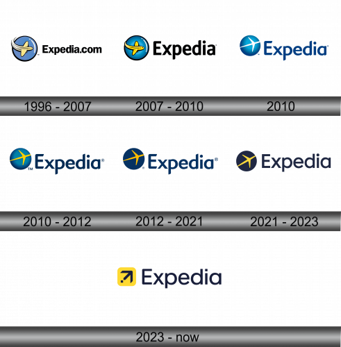
1996 – 2007
The logo presents a bold, circular emblem with a stylized yellow airplane cutting a swift arc through a deep blue backdrop. The elongated form of the aircraft and its white trailing swoosh actively underscore its dynamism, evoking speed and smooth travel. Below it, “Expedia.com” stands out in a confident sans-serif typeface, boldly claiming the brand’s presence in the digital realm.
2007 – 2010
The logo morphs subtly yet significantly, the “Expedia.com” text is streamlined to simply “Expedia”, reflecting a broader brand identity beyond the .com era. The airplane, previously ensconced within a tight circle, now enjoys more visual freedom, conveying a sense of boundless travel opportunities. Its ascent from the globe signifies the company’s rise to global prominence. The color palette remains, preserving the brand’s heritage, while the updated typography suggests modernity.
2010
This version of the Expedia logo embraces minimalism, eschewing the 3D image of an airplane in favor of a streamlined globe with a simple, flat image of the aircraft. The globe’s gradient of blue shades evokes a sense of depth and vastness, symbolizing global reach. The “Expedia” text shifts to a darker, more solid blue, enhancing readability and impact. The font is more contemporary, with a subtle italicization suggesting forward movement.
2010 – 2012
The updated logo features a bright yellow airplane instead of white, reminiscent of the warmth and excitement of travel. The blue sphere adopts a richer gradient, symbolizing the depths of the oceans and the expansiveness of the sky. The “Expedia” text remains in a bold navy, but its lettering is slightly tweaked for a crisper, more modern feel.
2012 – 2021
The latest logo retains the yellow airplane and blue globe, but with a cleaner, flatter design, reflecting modern aesthetics. The “Expedia” text is now sleeker, enhancing brand uniqueness.
2021 – 2023
In this evolution, the logo opts for a cleaner, more sophisticated look. The blue globe is darkened, bordering on navy, which sets off the striking yellow of the simplified plane symbol more prominently. The typography of “Expedia” is bolder and less stylized than before, leaning into modernity and ease of recognition. This design reflects a contemporary, streamlined approach, suggesting a focus on efficiency and elegance in the brand’s identity.
2023 – Today
The most recent logo shifts dramatically, introducing a square, yellow background for the icon, a bold departure from the globe motif. The icon itself transforms into an arrow pointing northeast, symbolizing direction, movement, and exploration. The “Expedia” wordmark is refined: cleaner, with uniform, dark lettering, which contrasts starkly with the bright icon, demanding attention. This design moves towards a more abstract, modern branding, indicative of forward-thinking and an easy, user-centric travel experience.


