Firefox Logo
Firefox is a browser launched in 2004 by the Mozilla Foundation. It was initially one of the few accessible browsers that could be reliably and safely used for all purposes. Right after the thing was launched, over 50 million people downloaded it and set it as a default browser.
Meaning and History
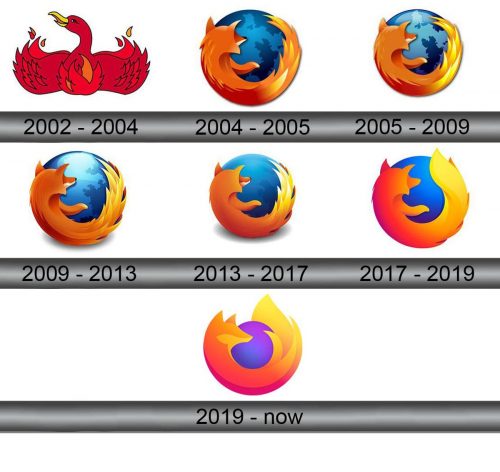
During the beta test in 2002, the name of the browser was ‘Phoenix’. The bird was chosen due to the concept of the browser — it was the ascension from the ‘ashes’ of its predecessor, Netscape Navigator.
In 2003, the name was changed to the Firebird after the claim of the Phoenix Technologies about the brand mark. Finally, in 2004, the name Firefox appeared, slightly reminding us about the initial concept of the browser.
2002 – 2004
On the initial logo of the browser, we can see the burning bird with the spread-out wings. Its head with a yellow beak was turned to the side from us.
2004 – 2005
The very first ‘Firefox’ logo represented the emblem of the red fox, which surrounds the planet with some land drawn on it. By that time, the browser was already popular across the entire world, so this concept of the clever and fast browser helping users worldwide looked very suitable.
2005 – 2009
The logo was a bit lessened, and the color palette in general got brighter and more saturated. Beginning with this version, the emblem had fewer and fewer details. The fox had its tail elongated as well.
2009 – 2013
In 2009, the emblem became more volumetric, returned to its initial size and was darkened. Also, there was a little shadow from the planet.
2013 – 2017
The logo was lessened again, and the shadow of the planet got bigger.
2017 – 2019
Time passed, and the designers of the browser decided to withdraw from the volumetric forms to the flat ones. The planet in the emblem was drawn as a simple blue circle without any land, while the fox had had even fewer details than the previous versions. Also, it was the first time the violet color was used in the emblem.
2019 – Today
The current emblem of the brand was drawn in orange and violet shades. The fox had a longer tail than the previous emblems, while the planet had the violet shades combined with sea blue color.
Emblem and Symbol
The firm feature of the brand is that every new emblem has got fewer details than the previous one. There is a popular joke that the next variant of the emblem will just an orange sausage next to the blue blot. The fashion of simplifying the logos is still on the rise, but Firefox seems to spearhead the process.

