Fortnite Logo
Fortnite is a popular battle-royale game set in a cartoony setting where players can roam around an enormous map, kill one another, collect loot, build structures and generally do whatever they want. The end goal is to survive and slay everyone else on the map.
Meaning and History
Fortnite wasn’t initially meant to be a battle-royale game. Since 2011, it was developed as a survival game where players need to build forts in order to survive the hordes of zombies, basically. The game’s base mechanics that prompted users to build in order to survive was what gave it the name – ‘Fortnite’.
2011 – 2012
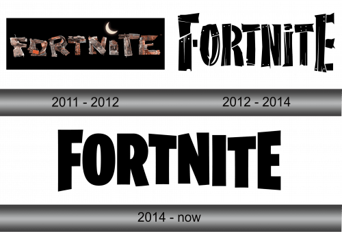
The first logo was given to the game when it was in early development. It featured basically a pile of scrap metal organized into the letters that made up the title of the game.
The entire structure was set against the black background in a form of a rectangle. In addition, there was a moon instead of the dot on top of the letter ‘I’. Basically, the developers went for the nocturnal feel, and the first iterations of the gameplay (as well as the name) reinforced this style.
2012 – 2014
This logo was also in use before the battle-royale days of the game. Again, there was a black rectangle with the scraps making up each letter of the name. This time, however, the scraps were pieces of wood painted white. This played along the game’s theme of building forts to survive the night.
2014 – today
Interestingly, for the 2014 logo they pretty much kept the shapes of the letters from the 2012, except they got rid of the black background and made the characters black themselves.
Emblem and Symbol
In 2017, the developers introduced sub-type of the logo for their battle-royale phase. The black letters were turned white and set against a black background (once more). This time, however, the background was a silhouette of a castle with several towers (a fort, if you will) with a few trees scattered around the exterior.


