Fruit of the Loom Logo
Fruit of the Loom is an old American brand that manufactures clothing and other apparel. They’ve been around for so long (since 1893), that their name is pretty accurate at explaining what they were initially doing – loom being an old automatic weaving instrument.
Meaning and History
Confusingly, ever since this business has been established, they used an array of fruits as their logo. It fits the name, although it’s not uncommon to think that the company grows agricultural products at first, especially for the non-English speakers. However, it’s plain what they were going for.
What is Fruit of the Loom?
Fruit of the Loom is an American producer of clothes, in particular casualwear and underwear. It was founded in 1851 in New England, making it one of the oldest surviving clothing manufacturers in America. Their products are known for their comfort, affordability and simplicity.
1893 – 1927
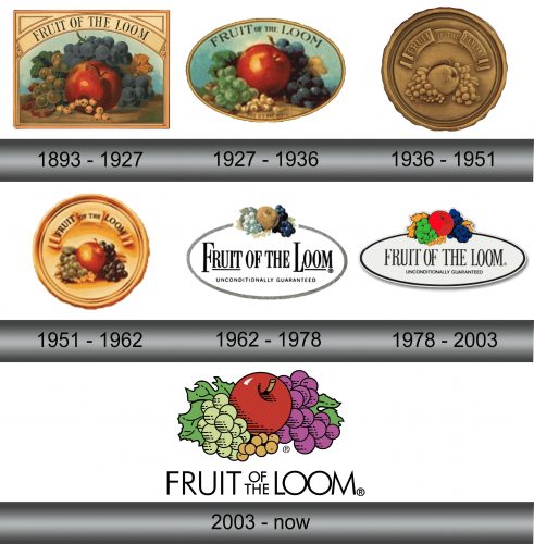
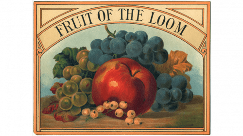
Their logotypes usually featured still life pictures of a fruit basket. The collection included most of the time an apple, grapes, currants and some leaves. In this variation, they put the entire array on the table, framed the painting and put the words ‘Fruit of the Loom’ (in uppercase) on an arch above.
1927 – 1936
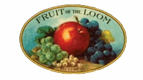
It’s possible that making a painting-style logo each time became increasingly expensive by 1927, which is why they’ve taken largely the same picture and framed into an oval frame instead of the larger square one.
The writing moved to the painted background, where the words ‘Fruit’ and ‘Loom’ were written in uppercase for prominence, while the other words got diminished.
1936 – 1951
In this variation, the entire image was coined in what looked like bronze. Instead of the oval, they preferred circle this entire. The frame got rather thicker, but to make it less complex they removed the table and only left the fruits and the little ribbon that spelled the brand name above the food.
1951 – 1962
In 1951, another re-imagining attempt followed, although it didn’t change the concept by much. The layout persisted, and the only thing that changed was the coloring. They obviously painted the fruits into various appropriate colors, but a previously bronze ribbon and the background were instead painted bright gold.
1962 – 1978
For the 1962, they put the fruit images above the simple oval outline, a new element. The company name, for its part, was placed right in the middle of this oval, and the words ‘Fruit’ and ‘Loom’ were once again given priority – they were underlined, while others weren’t.
1978 – 2003
It’s the same design, except they made the fruits much brighter, changed the letters to complete uppercase, removed the underlining, and, finally, added a new motto – ‘unconditionally guaranteed’ – below the brand name.
2003 – today
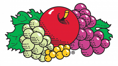
In 2003, the company decided to get rid of the oval and instead make the fruits much bigger and more detailed. The text part was slightly rearranged, both in terms of order and appearance.
The type became less typographic, and they also found the new way to emphasize the key words – simply making them bigger and squeezing the prepositions into the small empty space between the two words.
Emblem and Symbol
The composition of the fruits changed over time. However, the brand was surprisingly consistent with putting roughly the same elements where they stood before. The apple, for instance, is always in the center, surrounded by the grapes on the right and some berries on left. The leaves are always in the back.
