Gap Logo
Gap Inc. is a global fashion retail giant, known primarily for its flagship brand, Gap, which offers contemporary apparel and accessories for all ages. Currently, it operates across numerous international markets, with strong presences in North America, Europe, and Asia. Beyond the eponymous Gap brand, the company also owns Old Navy, Banana Republic, Athleta, and Intermix. As of now, the firm is publicly traded on the NYSE under the ticker “GPS.” Gap Inc. continues to focus on digital transformation and sustainability in its operations, while adapting to the ever-changing retail landscape and consumer preferences.
Meaning and history
Founded in 1969 by Donald and Doris Fisher in San Francisco, Gap started as a single store selling jeans and records, inspired by Don’s difficulty in finding jeans that fit. The name “Gap” referred to the ‘generation gap’ between young adults and their parents. Rapidly, the brand gained traction, focusing solely on apparel.
In the 1980s, Gap started its expansion, buying the Banana Republic brand, a safari-themed boutique, and transforming it into an upscale clothing retailer. By the 1990s, the company introduced GapKids and babyGap, diversifying its audience reach.
The 2000s saw Gap facing challenges due to rapid expansions and changing consumer tastes. In response, the firm launched Old Navy, aiming for a broader demographic with affordable basics, and subsequently, Athleta, targeting the growing athleisure market.
Throughout its existence, leadership at Gap changed hands multiple times, though always retaining familial influence, with the Fisher family playing significant roles in its governance.
Gap Inc., as a global entity, faced criticism and challenges, notably concerning its overseas manufacturing practices. Reactively, the company took strides towards more ethical and sustainable production.
In recent years, while navigating retail’s changing landscape, Gap Inc. has emphasized online sales, streamlined its brands, and committed to sustainability and social responsibility. Despite its ups and downs, Gap remains an iconic brand, symbolic of American fashion.
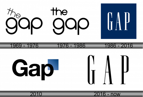
1969 – 1976
The initial logo showcases two terms: “the” and “gap.” These are penned in a clean, sans-serif style, using lowercase letters. The characters “g,” “a,” and “p” appear as consistent circles with lateral extensions, while “t” resembles a cross, merging with “h.” Positioned above, the word “the” adopts a slanted orientation. This design radiates a sense of minimalism, emphasizing the brand’s name with a unique twist in its letter formations, making it stand out and memorable for its audience. The tilted “the” adds a dynamic element, implying movement or progression, in line with the brand’s forward-thinking ethos.
1976 – 1986
Following a subtle revamp, the logo underwent noticeable changes. The creative team prioritized the initial word, positioning it in a linear manner and enhancing the lettering’s thickness. Consequently, the spacing between the letters “t,” “e,” and “h” diminished significantly, leading them to intersect at their edges. The redesigned emblem signifies a more cohesive and bold representation, emphasizing unity and a modern touch. The tighter configuration showcases the brand’s evolution, while still maintaining a nod to its original identity. The new boldness indicates confidence and a renewed focus on brand recognition.
1986 – 2016
In 1986, a new emblem dubbed the “Blue Box” was unveiled. The designers opted for a vivid blue rectangular backdrop to highlight the brand’s name. “GAP” is showcased in towering uppercase letters, adorned with brief serifs that add a touch of elegance. Interestingly, the prefix “the” which once graced the logo was omitted, marking its last appearance in the 1976-1986 design. This evolution represented a streamlined approach, emphasizing the core brand name and showcasing its modern aspirations while paying homage to its historical roots. The transition to this design underscored GAP’s growing presence and a commitment to simplicity in branding.
2010
In 2010, the brand ventured into revamping its corporate image, but the effort was met with backlash. The redesigned logo, which showcased the bold “Gap” typography accompanied by a blue rectangle positioned at the top-left, didn’t resonate well with the audience. Due to overwhelming public disapproval, the company swiftly reverted to its previous design. Remarkably, this new emblem had a short-lived presence, gracing the brand only from October 4th to the 11th. This week-long experiment underscored the importance of aligning branding decisions with customer sentiments and demonstrated the company’s adaptability in heeding feedback. The episode also served as a reminder of the emotional attachment consumers have with iconic brands and their logos.
2016 – Today
Half a decade following an unsuccessful logo makeover, the brand introduced a refreshed emblem. Instead of a complete overhaul, the designers opted for subtlety: they eliminated the geometric backdrop that previously framed the word “GAP,” essentially giving a modern touch to the 1986 design. This minimalist approach was both a nod to their storied past and a step towards a contemporary aesthetic. By doing so, they merged the familiarity of the older logo with the sleekness of modern design principles, hoping to resonate with both long-time followers and newer audiences. The revised emblem became a testament to the brand’s adaptive nature while honoring its legacy.


