Godaddy Logo
Godaddy stands as a notable titan in the digital domain industry. Bob Parsons launched it, marking a significant leap in internet commerce. Its birthplace, Baltimore, Maryland, became the cradle for this innovative venture. Initially, Godaddy aimed to simplify the web presence for individuals and businesses alike. By offering domain registration, it opened new doors for online identities.
Meaning and History
Godaddy first illuminated the internet landscape in 1997. Since its inception, it has grown exponentially, becoming a beacon for digital entrepreneurs. By 2000, it had secured its position as a major domain registrar. This growth was not just in numbers but also in service diversification, adding web hosting and security services. In 2005, and Godaddy was already a household name, championing the cause of easy and accessible internet presence for all. Its history is a testament to innovation, adaptation, and unwavering commitment to customer service.
What is Godaddy?
Godaddy operates as a powerhouse for web hosting and domain registration. It simplifies the process of creating an online presence. With a suite of tools, it supports entrepreneurs in launching their ventures on the web.
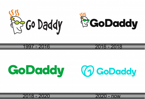
1997 – 2016
The GoDaddy logo sports a bold, playful font, inviting and dynamic. A stylized, bespectacled man’s head, with hair ablaze, evokes innovation and speed. The shades reflect coolness, wit, and a tech-savvy attitude. The lively orange flames symbolize passion and drive, infusing the brand with energy. This graphic representation embodies the spirit of modern entrepreneurship and the zest to disrupt the digital world.
2016 – 2018
The updated GoDaddy logo maintains the original’s playful essence, now with a streamlined look. The man’s head, iconic with its star-spangled hair and green glasses, remains a visual anchor, symbolizing ingenuity and vision. The typography evolves, adopting a cleaner, more modern font that suggests professionalism and growth. This logo iteration reflects a brand matured, yet still whimsical, committed to innovation and user-friendliness in the digital space.
2018 – 2020
In the evolution of the GoDaddy logo, the whimsical man has vanished, leaving a green wordmark that speaks volumes. The company name now basks in solid green, signaling growth, vitality, and a connection to the digital landscape. The font, bold and rounded, conveys friendliness and approachability. This minimalist approach marks a mature brand, focused on its core services, embracing simplicity and clarity in its identity.
2020 – Today
The GoDaddy logo now features a heart-shaped monogram – a fusion of a ‘G’ and a swoosh. This emblem, paired with a bright cyan hue, pulses with energy and innovation. The wordmark beside it, with its soft edges and open forms, speaks of friendliness and approachability. It’s a significant shift from the solid green, suggesting a more universal, heart-driven approach to business and technology. This logo encapsulates a fresh, forward-thinking identity, resonating with a global, diverse audience.


