Hawaiian Airlines Logo
Hawaiian Airlines is a major American airline company operating from Hawaii, one of the states. They are not counted amongst the biggest or most successful providers, but they are still important as a link between the islands and the mainland America. Most of their destinations are in America and the Pacific region.
Meaning and History
Hawaiian Airlines appeared in 1929 as a regional carrier specifically for Hawaii. They operated flights between the islands and the mainland, which explains their early name of Interisland Airways. In 1941, they adopted their contemporary name and started to slowly grow into a nation-wide airline.
Who owns Hawaiian Airlines?
Their owner is just a corporate governing body with the same name. They are a completely private airline.
1929 – 1940
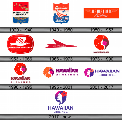
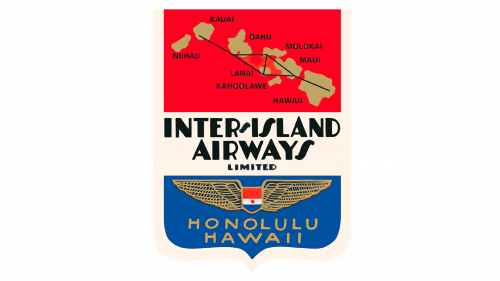
The original logo showed a shield, much like the one used by United Airlines for some time. It was dominated by a red-white-blue tricolor. The upper red one was the biggest and displayed the Hawaiian archipelago colored in brown with major flight routes highlighted in black.
The middle one space held the name inscription (styled as ‘Inter-Island Airways Limited’) in an obscure, artistic font design. The bottom blue space, in turn, held a similar shield, except without any visual elements other than a single red star in the middle, with a golden wing on its each side.
There were the words ‘Honolulu Hawaii’ in gold in the very bottom.
1940 – 1950
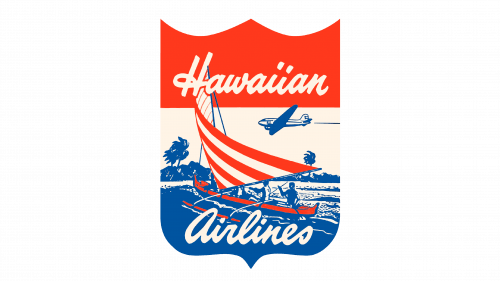
The 1940 logo was a lot more pleasant, albeit also more complicated. They curved the shield, giving it three pointed tips in the top. The top and bottom now held white inscriptions that said ‘Hawaiian Airlines’ in the white cursive writing. The blue space extended into several more visual elements.
There was a red-and-white traditional Hawaiian canoe with a striped sail. What they were sailing on is the blue part – it was styled both as sea and the land behind. A plane located closer to the top red part as also drawn in blue.
1950 – 1953
Afterwards, they decided to scale down the nuance a bit. The name was now a simple collection of capital sans-serif letters (for ‘Hawaiian’) and a signature-like cursive writing (for ‘Airlines’). Other than being engulfed by a red rectangle, the only other detail is two wings stretching out from the first word.
1953 – 1966
The new design a rounded square shape colored in red and filled with a white silhouette of a dove. There was a skewed acronym ‘HAL’ right on it, written in red. Below, they’ve written the full name in a similar style, although the color was white this time.
1966 – 1973
In 1966, they instead introduced a red bird shape – a very flat and angular silhouette that was still unmistakably bird-like. Onto its body, they’ve written ‘Hawaiian’ in a font similar to the one before, except not as bold. Below, they’ve opted to put their title: ‘holder of the world’s safety record’ – a record they still keep.
1973 – 1990
The central piece of the 1973 logo was instead a red hibiscus – the national flower of Hawaii. That being said, its right-bottom third was occupied by a silhouette of a woman’s head – white with brown hair and another, now pink, flower in it.
What is Hawaiian Airlines?
It’s the Hawaii’s very own regional airline. They are crucial for connection the archipelago with the mainland USA
The words ‘Hawaiian Air’ were written below in brown. The font was supposed to resemble the traditional Hawaiian scripts, which is why it’s so blocky and unsteady.
1990 – 1995
Not much changed in 1990, except the dots inside the pink flower became one brown star (a generally American symbol), and the writing changed to ‘Hawaiian Airlines’ (now written in two lines). The ‘Airlines’ was rather smaller and more plain than the word above it, notably.
1995 – 2001
The 1995 redesign was largely reorganization. The two elements from before now stood side by side: the emblem on the left, writing – on the right. Hibiscus turned to orange, and the smaller flower became much more like its bigger brother in shape. The girl’s and the text alike turned from brown to purple, and that’s about it.
2001 – 2017
The layout largely returned to the pre-1995 design, but much also changed.
The emblem above became more realistic in appearance (for instance, the girl has facial features now). The big flower turned pink, and the smaller one changed to orange. The hair also got a purple look.
The writing below also changed. Notably, the letters became more ordinary, although they now they are excessively fluid, soft and uneven. The smaller ‘Airlines’ also received two paint strokes for each side for its trouble. The usual color for all letters was purple this time.
2017 – today
In 2017, they scrapped the big flower completely and introduced a sort of comma shape covered in a gradient purple. The only other notable change happened to the text: it made another step towards normalcy, although there were still plenty of quirks.
Emblem and Symbol
Where does Hawaiian Airlines fly?
They fly constantly to and from the continental States. In addition, however, they have destinations all over the Pacific region, including Japan, Australia, Polynesia, Indonesia and more.
For their livery, the Hawaiian Airlines usually just take the word ‘Hawaiian’ exactly as it appears on their logos. It’s usually close to the cabin. As for the rear decorations, they commonly place a large ornament inspired by their long-time emblem of a Hawaiian girl on the vertical stabilizer, and beyond it.
