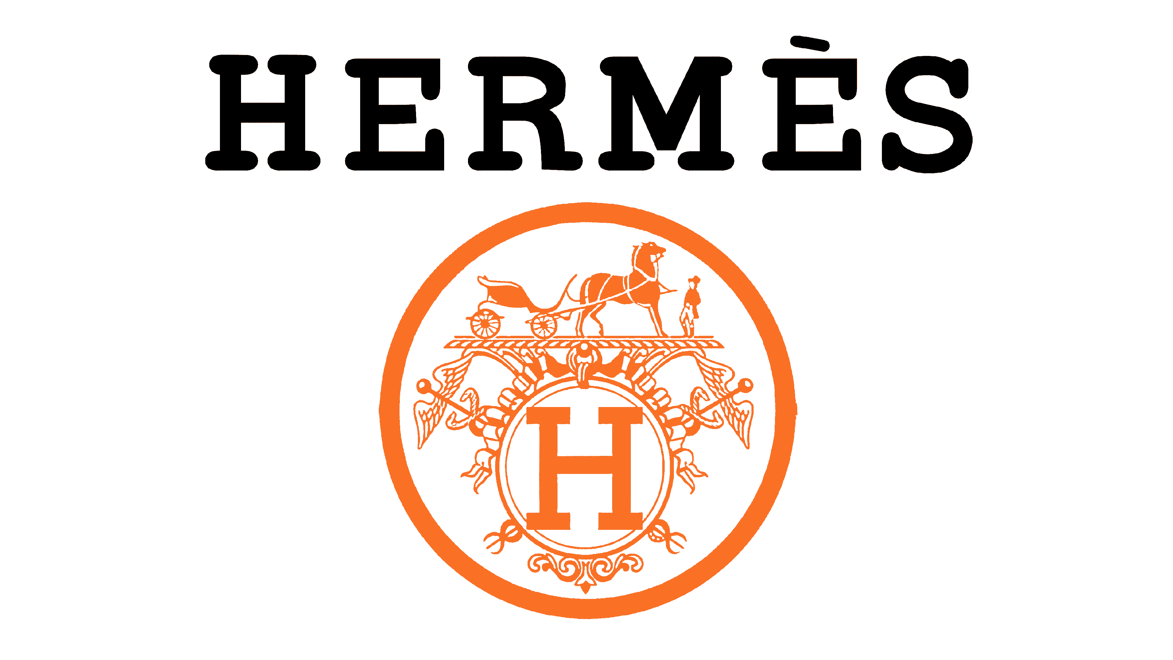
Hermes Logo
Hermes is an international design house and holding, which was established in 1837 and located in France. It specializes in the development, manufacturing, and selling of first-class quality male and female aroma odorants, handbags, accessories, home furnishing goods as well as watches. Their clothes have a reputation as luxury products for their stable perfect quality as well as stylish yet compact and thought-out design. The brand got this name as a nod to its founder – Thierry Hermes, a businessman who gave the basis for the company’s advancement and growing into an international fashion brand.
Meaning and history
Initially, Hermes Company was a small family business producing equipment for horsemen. It was founded in Paris, 1837, by Thierry Hermes – a businessman and designer, who established a workshop and started to provide equipment for professional sportsmen who played in horse races. After his death, his son Charles-Emile inherited the company. Under his management, there was produced the first bag for horse riders, branded by Hermes – Haut à Courroies. Then, Hermes started production of clothes, accessories, and jewelry, which always was as elegant as their name and logo.
What is Hermes?
Hermes is a design house founded in 1837 and located in France. They’re best known for producing high fashion handbags, jewelry, footwear as well as clothes of top-level quality. This is one of the largest and most successful brands of luxury fashion products, which goods are widely recognized across the rich audience for their quality, design, usability, and style. The brand appeared as a workshop making good equipment and targeted the audience of horse riding enthusiasts. Then, the company was recognized for making high-quality products, and it began to get clothes, handbags, and accessories offers.
1950s – today
![]()
The iconic Hermes logotype appeared in the middle of the 20th century. It was an image of a carriage driven by a horse, standing in a proud and graceful position. To the right side of the horse cart image, the brand designers have drawn a gentleman who wears a big cylinder hat, a jacket, and black pants. The whole image has a black line which is supposed to look like a road on which the whole carriage took a stop. This logo is meant to be a nod to what the company was at its start – a small workshop producing gear for horse riders and offering services of its product repairing and modification.
Font
In fact, in many situations, the logotype happens to go without any inscriptions. However, in the cases when there are words on the logotype, they usually put the name. It uses a heavy typeface with large serifs on the uppercase letters. The characters aren’t connected to each other, but they have fewer gaps in between. It gives a strict eye-catching style to the whole logotype. Sometimes, they write another inscription with the ‘Paris’ word below the name. It has a typical sans serif typeface with capitalized letters. The only feature of the font is that the ‘R’ character has an elongated tail.
Color
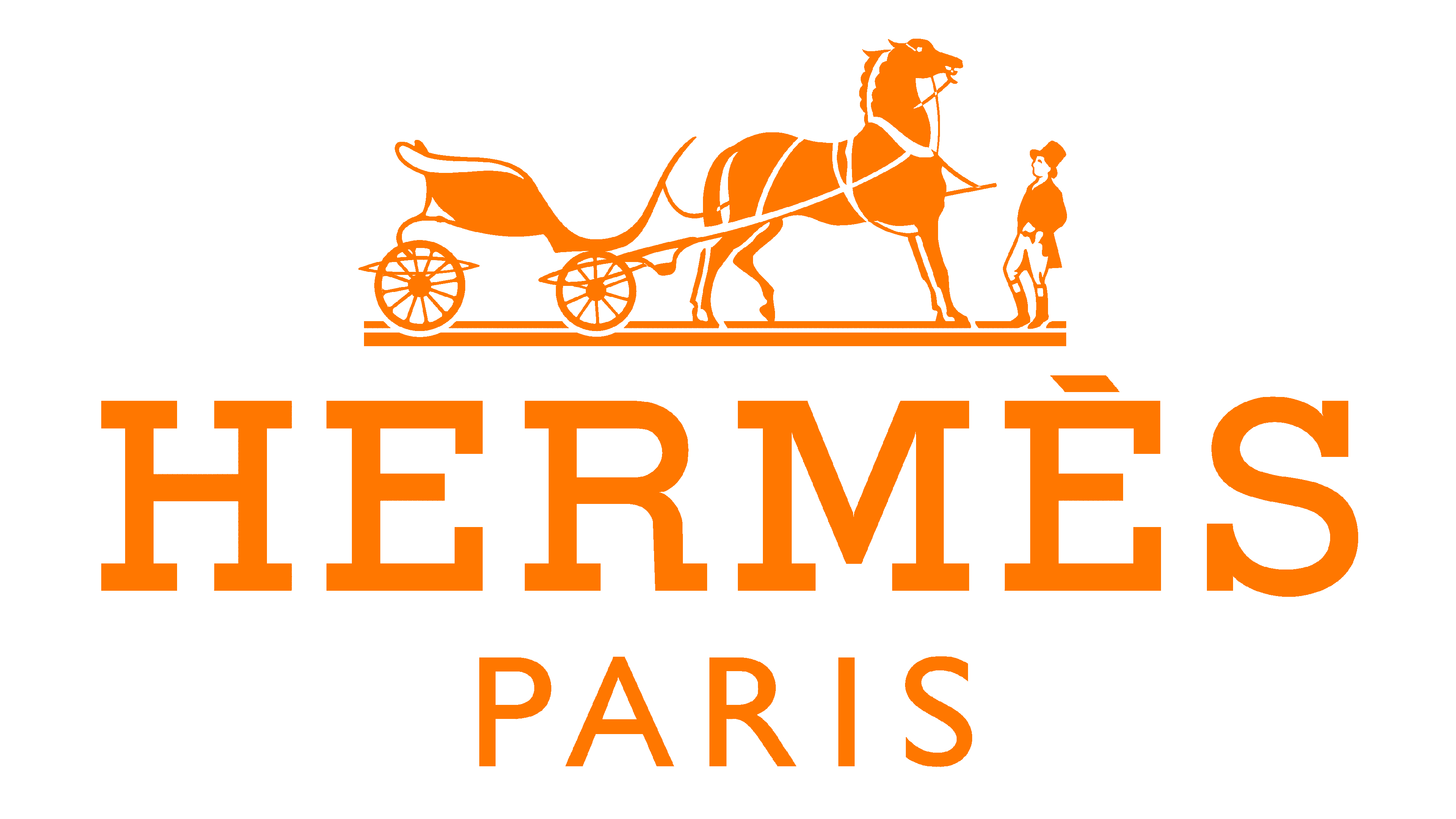
As for the color, so since the appearance of their iconic logotype with a horse carriage, their main corporate color palette was orange and white. Usually, they used orange to show the background and white for the name. But in some cases, the colors may reverse, so there is the orange name located on the white background. The brand designers also use many alternative color duos, which are used depending on the occasion. There are black and white, yellow and black, black and orange, and many other versions of the color set, which you may find in the Internet.


