IHG Logo
InterContinental Hotels Group, known as IHG, springs from the UK’s vibrant hospitality sector. The fusion of Bass PLC and Britvic’s hospitality arm birthed IHG, tasked with steering a vast array of hotels and resorts. With the mission to deliver superior accommodation experiences globally, IHG proudly encompasses esteemed brands like Holiday Inn, Crowne Plaza, and its namesake InterContinental. The group’s inception stemmed from an ambition to spearhead the hotel industry on an international stage.
Meaning and history
IHG, short for InterContinental Hotels Group, launched in 2003 in the UK. It emerged from Bass PLC and Britvic’s hospitality merge. Initially, it aimed to lead in global hospitality. The group boasts brands like Holiday Inn and Crowne Plaza. IHG focuses on premium lodging, expanding globally. It’s known for innovation in hotel management and guest services. IHG also emphasizes sustainability and community involvement. With thousands of hotels, it caters to diverse travelers. Its growth reflects a commitment to excellence and adaptability in the dynamic hospitality sector. IHG continues to evolve, shaping the future of travel.
What is IHG?
IHG, or InterContinental Hotels Group, stands as a titan in the global hospitality arena, orchestrating an impressive tapestry of hotel brands that cater to a myriad of traveler needs. Born from a visionary merger, it has sculpted a legacy of unparalleled guest experiences across continents, marking its territory with innovation and luxury.
2003 – 2017
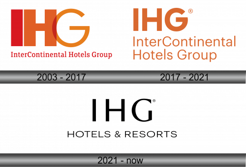
The IHG logo radiates a bold simplicity, with a stark contrast between the warm orange and the assertive red. The acronym ‘IHG’ stands dominantly in block letters, while the full title ‘InterContinental Hotels Group’ is neatly underscored, offering a balance of strength and accessibility. This visual harmony signifies a brand that’s both inviting and confident, reflecting its stature in the hospitality world.
2017 – 2021
In this iteration of the IHG logo, there’s a notable addition of the registered trademark symbol, reflecting a formal assertion of brand identity. The color palette remains consistent, with the vivid orange hue symbolizing warmth and vibrancy, while the typography of ‘InterContinental Hotels Group’ appears more streamlined. This design evolution subtly enhances the logo’s visual impact, underscoring IHG’s commitment to brand integrity and recognition in the hospitality sector.
2021 – Today
The IHG logo now adopts a striking monochrome palette, enhancing its sophistication. The ‘IHG’ acronym is bold and upfront, paired with a crisply stylized ‘HOTELS & RESORTS’ tagline beneath, signifying a focused brand identity. This pared-back design exudes modernity and a streamlined approach, reflecting IHG’s evolution towards contemporary elegance in hospitality. The registered trademark symbol remains, underscoring a continued commitment to brand protection.


