iOS Logo
iOS is a mobile operating system created by Apple Inc., designed exclusively for its hardware. It originated in the U.S. and serves as the foundation for Apple’s iPhone, iPad, and iPod Touch devices. iOS revolutionized user interfaces with its intuitive design, providing a seamless experience for accessing applications and services. Its creation marked a significant milestone in mobile computing, blending innovation with simplicity to cater to a wide array of digital needs.
Meaning and history
iOS, born from Apple’s vision, launched in 2007, transforming phones into smart, versatile devices. Initially powering iPhones, it expanded to iPads, iPods, creating a unified ecosystem. Steve Jobs unveiled it, emphasizing simplicity, ease. Over the years, iOS evolved, introducing the App Store in 2008, becoming a hub for millions of apps. It brought Siri, a voice assistant, in 2011, enhancing interaction. Each version, from iOS 1 to 15, added features, security, making devices smarter, more personal. Apple’s focus on privacy, user experience, kept it at innovation’s forefront. iOS stands as a pillar of mobile technology, shaping how we communicate, work, play.
What is IOS?
iOS, envisioned by Apple, serves as the heartbeat of iPhones, iPads, and iPod Touch devices, blending sophistication with simplicity. This operating system, a canvas for over a million apps, redefines personal technology, fostering seamless interaction in a secure, intuitive environment.
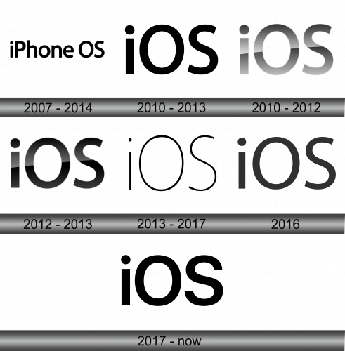
2007 – 2014
The logo consists of two words: “iPhone OS”, indicating the operating system. The logo’s simplicity mirrors the clean, user-friendly interface of the software it represents. The font choice for “iPhone” exudes modernity, while “OS” asserts with certainty, capturing the essence of Apple’s innovative fusion of technology with everyday life. This iconic typography, devoid of any embellishments, reflects Apple’s philosophy where less is more, focusing on functionality and elegance.
2010 – 2013
The logo transitions from “iPhone OS” to a more compact “iOS,” reflecting a shift towards a broader platform identity. The ‘i’ remains dotted with a circle, symbolizing individuality and innovation, while ‘OS’ now stands bold and assertive, highlighting the system’s universality across Apple’s devices. The font is consistent, thick, and rounded, embodying a friendly yet strong presence. This iteration conveys a sleek and modern aesthetic, emphasizing the operating system’s evolution and Apple’s expanding technological horizon.
2010 – 2012
In this evolution, the logo adopts a metallic sheen, suggesting a leap into a futuristic, high-tech realm. The ‘i’ stands with a gradient, giving a three-dimensional illusion, while the ‘O’ and ‘S’ follow with a reflective finish, signifying depth and sophistication. This design choice reflects a move towards an aesthetic that conveys a cutting-edge, almost tangible interactivity, hinting at the technological advancements embedded within the operating system. It’s a visual nod to the progressive engineering and design philosophy of Apple.
2012 – 2013
The logo maintains its metallic gradient but shifts to a darker spectrum, enhancing the contrast and visual impact. The ‘iOS’ exhibit a pronounced gloss. This subtle play between shine and shadow imparts a more pronounced depth, suggesting robustness and a mature sophistication. The design evolution speaks to the operating system’s constant progression and Apple’s commitment to marrying aesthetics with cutting-edge functionality. The overall effect is sleek, modern, and distinctly Apple.
2013 – 2017
Stripping away the previous gradient, the logo now flaunts a monochrome design, exuding classic simplicity. The letters ‘iOS’ are depicted in solid black, with clean lines and no embellishments, reflecting a return to the basics and a nod to elegant minimalism. This design symbolizes clarity and efficiency, core tenets of the operating system’s philosophy. Apple’s choice to adopt this straightforward, unfussy style indicates a commitment to a user experience where content takes center stage, free from distraction.
2016
The logo retains its monochromatic theme yet softens its lines, with the ‘i’ and ‘S’ exhibiting slightly rounded edges. The ‘O’ is now perfectly circular, reinforcing the operating system’s focus on harmony and user-centric design. This iteration conveys a more approachable and friendly interface, indicative of iOS’s evolution towards an even more user-friendly platform. The overall aesthetic is modern, clean, and resonates with Apple’s design ethos of elegant simplicity.
2017 – Today
The logo now features bolder strokes, with the ‘i’, ‘O’ and ‘S’ expanding in width, asserting a stronger presence. The evolution reflects Apple’s confidence in iOS as a mature and robust system. This refreshed design continues to embody simplicity, yet with a more assertive and modern touch, mirroring the constant evolution of the technology it represents.


