Kappa Logo
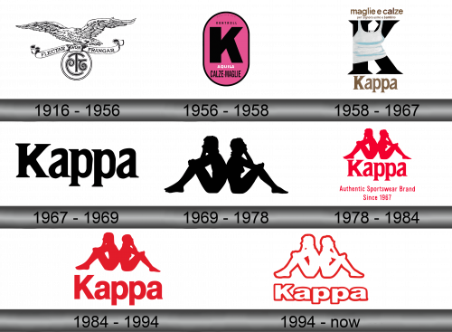
Kappa is an Italian brand of premium sports clothes, which is popular among the members of professional sports teams all over the world. Initially, it was a company focused on socks and underwear, but due to the financial problems in the 1960-70s, Kappa had to restructure itself and turn from socks and underwear to sportswear.
Meaning and History
Kappa is an Italian sportswear brand that was founded in 1967. The company behind this brand is active since 1916, but the name ‘Kappa’ only appeared in the 60s. The name is the word for the Greek letter ‘K’. The brand is known for its iconic logo, which features a silhouette of a man and woman sitting back to back. Kappa primarily produces sportswear clothing and accessories for various sports including football, basketball, skiing, and running. It was formerly
What is Kappa?
Kappa is an Italian brand of sportswear active since 1967. It was formerly known as a luxury line of clothes, but it currently produces a wide range of everyday clothes for all consumers, including women, men and children. It’s still considered one of the best manufacturers of high-class athletic clothes.
1916 – 1956
In the very start, Kappa was known as Società Anonima Calzificio Torinese and had the logotype of an eagle holding the line with inscription ‘Flectar Non Frangar’ (‘I’m not going to be broken’), and the company’s old monogram.
1956 – 1958
The 1956 logo showed the Kappa’s motto – ‘Kontrollen’ (control), placed above the huge black letter ‘K’. It was all depicted on the purple oval with the black contour. Among other features, there is the brand-holder company name, Aqila, and inscription with the products of the brand – Calze (socks) and Maglie (shirts).
1958 – 1967
In 1958 the emblem changed to just the letter ‘K’ with a white sleeveless shirt put on it. The brand name was placed below the letter, while the products’ area was placed on the top of the logo.
1967 – 1969
The next logotype was just the brand name – there weren’t any marks, signs and emblems on the 1967 logotype. Just the black serif name on the white background
1969 – 1978
In 1969, they developed a symbol that since then was used by the company with little change. It depicts silhouettes of man and woman sitting back to back, pointing at the fact that this brand creates apparel for both men and women. The silhouettes are colored black.
1978 – 1984
In this logo, the emblem was placed above the brand name, with the style similar to the 1967 variant. In the bottom of the logo, there was a secondary text part saying ‘Authentic Sportswear Brand Since 1967’. The whole logo was used the red color palette.
1984 – 1994
For the 1984 logo, the brand designers decided to delete the secondary writing below and changed the name font (it became the simple sans-serif office type).
1994 – today
The 1994 logo follows the old traditions and also depicts the man and the woman sitting back to back and the brand name, but this time the symbols became hollow. They became largely white, with the exception of red contours.


