Lancia Logo
Despite a considerable age and influence in the Fiat concern, the Lancia brand managed to maintain the style that was laid down by its founder. Many of its models were popular at different times and brought fame and success to the business. Victories in motorsport contributed to the iconic image of some of the models for a long time, if not forever. Unfortunately, new releases have not appeared yet, and the future of Lancia is very vague.
Meaning and History
Lancia emerged in 1906 thanks to a brilliant mechanic and outstanding driver Vincenzo Lancia and Claudio Fogiolino, his business partner. Fabbrica Automobili Lancia released the first model in 1907. Like many others, Lancia worked for the military during the war times. Instead of producing luxury cars, it made trucks and even armored vehicles. The war contributed to the development of the business. The appearance of the Lancia Lambda in 1921 marked a golden era for the brand. It was also actively involved in motor racing since the mid-1950s. In the late 1960s, it entered the large automotive association of Italian origin, Fiat.0000
What is Lancia?
Lancia is an automobile manufacturer of Italian origin. Throughout its history, Lancia’s automobiles have been successfully exported to the US, the UK, and a bit to Japan. In addition to cars, the brand manufactured all kinds of commercial trucks, passenger buses, as well as military equipment.
1906 – 1911
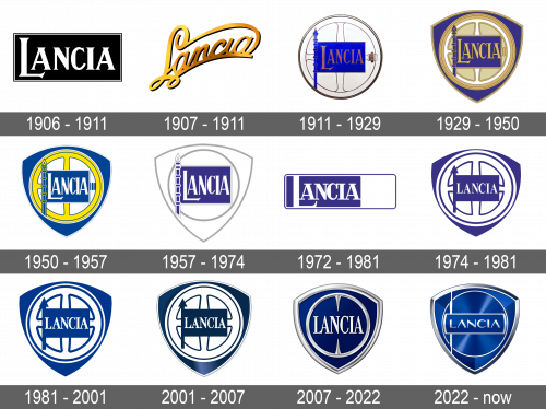
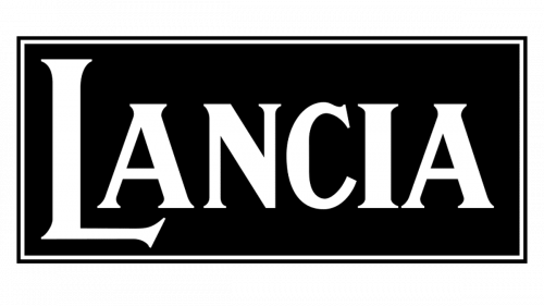
The first Lancia logo was introduced in 1906 and stayed in use for the first five years of the company’s history. It was a simple yet elegant composition with the bold white lettering in the uppercase of a fancy serif font, set against a color black rectangular banner with a thin double frame in the same black and white color palette.
1907 – 1911
The original looked very luxurious and elegant. It had cursive lettering with fancy curves. A dark shadow behind the emblem and the golden color of different shades enhanced this impression.
1911 – 1929
The name and the activity of the brand inspired this new logo. At the base, the company used a white wheel with black outlines. Across it, there was a deep blue flag with a spear (lance) to the left of it. “Lancia” was printed on a blue background using a fancy, serif font of a golden color, bringing a bit of the original style into this logo.
1929 – 1950
The logo was given even more color and boldness. The wheel was given a light yellow and had a slightly different pattern. It had a shield that resembled a triangle with curved sides behind it. The shield was the same blue as the flag and had the same style of the border as the wheel, which made the whole image very cohesive.
1950 – 1957
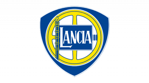
The Lancia visual identity redesign, held in 1950, has brought a lighter and juicier color palette to the logo, with the golden wheel turning yellow, and the background in the center of the badge getting a plain white shade. The lettering on the rectangular banner also Turned white, balancing the circle in the middle of the badge.
1957 – 1974
This version looks very modern and sleek. The blue background of the shield was changed to white. The wheel also had no background or any pattern inside. Instead, the wheel and the shield featured a 3D metallic silver framing that made the logo look very futuristic. The flag was even darker which added sophistication to the overall image. The company kept the same font it introduced back in 1911, only now the letters were silver to go with the rest of the elements.
1972 – 1981
The redesign of 1972 has introduced a laconic and geometric version of the Lancia logo, with the bold white lettering placed on a solid blue background, set inside a horizontally-oriented rectangle with a thin white and blue outline and a plain white square in the right part.
1974 – 1981
This version looks like the one designed in 1929. The bright blue was replaced by a richer shade of this color. The yellow used for the wheel got paler while the wheel pattern was now done using bold, blue lines. This updated 1929 version looked a lot more stylish. Although the font was not changed, the letters were not as stretched out and the first letter was now the same size as all the others.
1981 – 2001
In 1981 the Lancia badge was redesigned again, keeping the composition of the version, created in 1974, but switching the color palette to a calmer and lighter one. The new shade of blue on the Lancia badge made it look more sophisticated and elegant. This version became the most long-lasting one and stayed with the brand until 2001.
2001 – 2007
The redesign of 2001 has made the iconicLancia badge three-dimensional, with the blue getting darker and gaining deep gradients with some gloss, and the white elements looking brighter and cleaner with the new accompaniment. The contours of the steering wheel were redrawn in thinner lines, which elevated the look of the badge, adding elegance and chic to it.
2007 – 2022
The wheel pattern was gone again, opening up space for a more unobstructed view of the shield. The latter now acquired a blue gradient that looked almost black on the left side. Similarly to the 1957 logo, the framing around the wheel and shield along with the inscription was now metallic silver and had a 3D appearance.
2022 – now
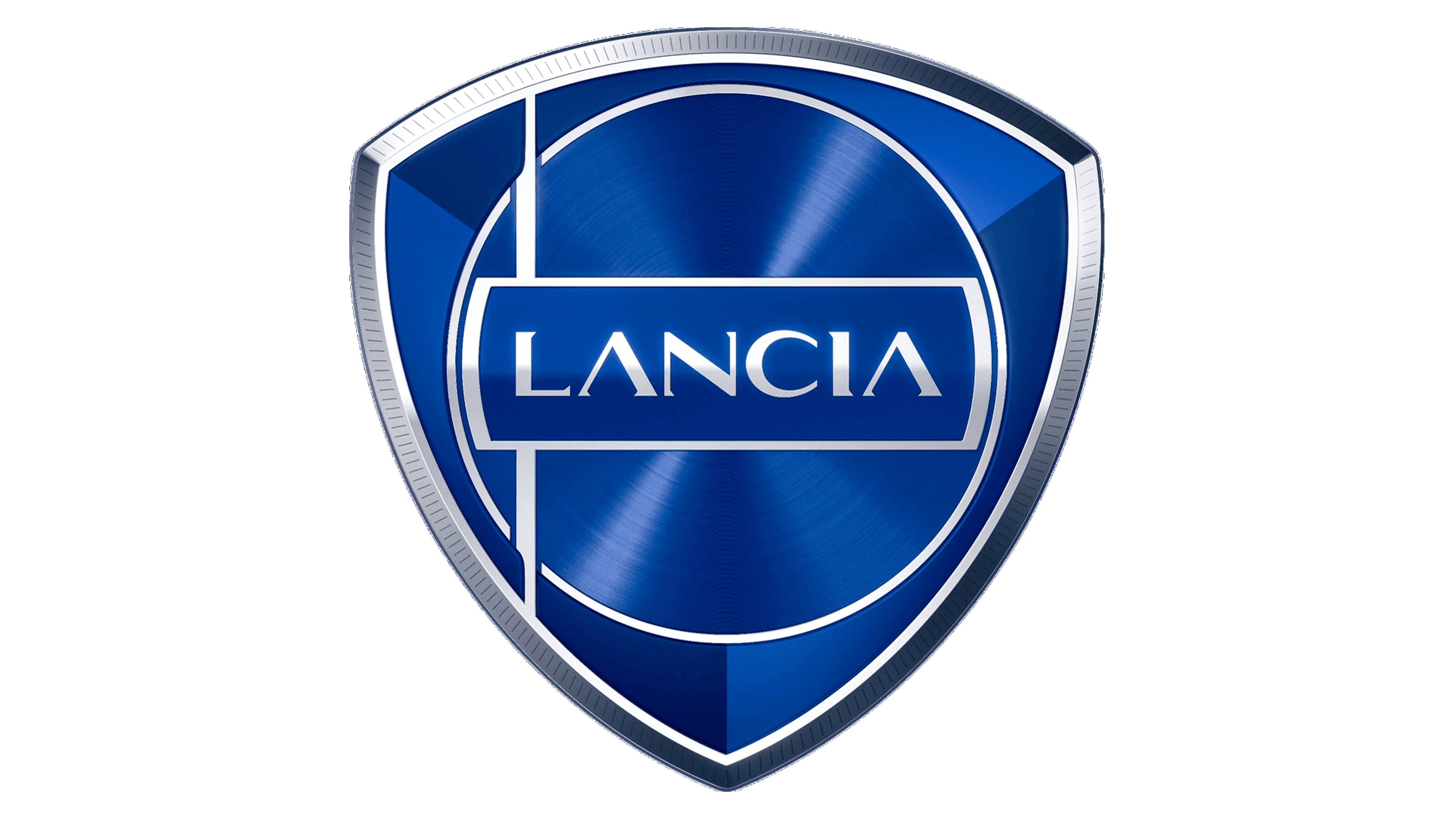
The Lancia badge was redesigned again in 2022, with a completely new vision of the traditional crest with the wheel. The new logo is set in a bright gradient blue; with just a thin silver ring representing the steering wheel now. As for the Lancia flag, it is also set in thin clean lines, with an elongated and sharpened arrow handle, and the completely rewritten wordmark, set in a fancy and modern sans-serif typeface, with the wide contours of the letters and deleted horizontal bars of both “A”s. The sides of the flag are arched from the center, repeating the circular frame it is inscribed into.
Font and Color
The brand was very consistent when it comes to font. With an exception of the original logo, which featured cursive lettering, all the other logos used the same serif font. when it comes to the color palette, blue and silver played a key role in the brand image. The first symbolizes trust, masculinity, and reliability, while the other is associated with modern technologies and glamour. There was also golden color and pale yellow.
