Las Vegas Raiders Logo
Oakland was not a city one would consider as a perfect location for a professional football team. It did not even asked for one and had not stadium where the games could be held. This did not stop the founders and the Raiders have won 3 Super Bowls and had two other appearances the they lost. The history of the team has been inextricably linked with the figure of Al Davis. He was the one who made them who they are. There is no other person who has managed to try on the roles of assistant, head coach, general manager, league commissioner, and club owner.
Meaning and History
It happened so that the Raiders played all across the country. Initially, the club performed in San Francisco, but by 1962 they settled in Oakland, which is why they were known as Oakland Seniors. Since there were jokes about it, the team replaced the “Seniors” with the “Raiders”, which was a top third option that won in the competition. The Raiders performed at the famous Oakland Coliseum until 1981, after which they moved to LA. In 1994, they were back in Oakland and stayed there until 2020. Recently, the Raiders changed their residence again and call Las Vegas their home.
What is Las Vegas Raiders?
This is a relatively new name of a professional football club from the US. Originally, they played in Oakland, CA, where the players were known as Oakland Raiders. The team has acquired many fans who are proud of all of their achievements.
1960 – 1962
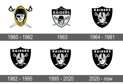
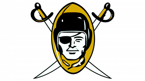
As seen, the emblem is done black, gold, and white. The first color was used for outlines and accents as well as in combination with white to draw a portrait of a determined raider with a right eye covered and a football helmet on his head. A golden football ball served as a background. To continue the pirate theme, the designers added two sabers, which were crossed behind all the other elements. The pirate was allegedly drawn to look like actor Randolph Scott. It was a balanced visual identity that stayed with the team for many years undergoing a few modifications.
1963
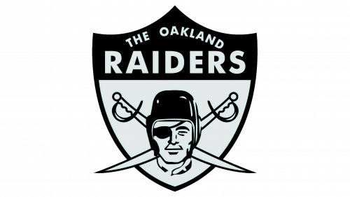
The portrait has undergone minimal changes, but the sabers here look longer and are positioned slightly differently. However, there were much more drastic changes to the logo than just a few adjustments. A shield replaced the ball. In addition, the color palette was now black and very light gray. The full name was printed across the top of the shield. This portion was black, so the letters were printed in gray for contrast. The inscription featured all uppercase letters without serifs.
1964 – 1981
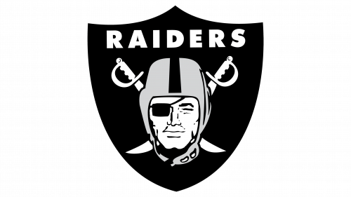
The logo has undergone a major change. The shield was now completely black, but the white color that was used for the inscription, sables, and face brightened it up. The helmet, which now acquired more details along with the face, was the only element that was left gray. The designers changed the look of the sables once more. In addition, the logo now had only “Raiders” written at the top, which made this logo more universal and allowed the team to use it no matter where they played.
1982 – 1995
Although the team now called Los Angeles their home, they preserved the logo they used earlier. This told their fans that they are still the team they love. There were no noticeable changes to the logo.
1995 – 2020
The logo was so well designed and was instantly recognizable by this time, so it was decided to make no changes to it. After all, it looked strong and brutal and had no elements that would need to be modified as the team changed its location once again.
2020 – Today
Even though the team went through several name changes, its logo remained almost the same throughout the years. The changes were actually minimalistic, although they did make an already excellent logo look even better. First of all, the team made the helmet an even darker gray. In addition, the whole emblem got a white border, which repeated the shape of the shield. To make it stand out on the white background, there was an additional thin black outline.
Font and Color
The logo designers used Futura Bold font for the inscription seen in logos since 1964. It is a strong font that leaves no doubt that you are looking at the symbol of a great team. The color palette is just as powerful. It uses black and white as the main colors, although there is also an addition of gray. The black stands for the team’s strength, as well as their determination, while the white is a color of perfection. Gray is used as a neutral color that stays in line with the strict and official overall image.
