Lee Cooper Logo
Lee Cooper is a British clothing company. Morris Cooper and Louis Maister founded the company in London. Originally, they established the business to produce workwear. It has evolved significantly over the years, becoming famous primarily for its denim jeans.
Meaning and History
Lee Cooper was founded in 1908 as a workwear production company. During the First World War, they manufactured uniforms and kits for troops, which helped to establish their reputation for durable clothing. In the mid-20th century, the brand shifted its focus towards denim jeans, capitalizing on the rising popularity of casual wear. The pivotal year of 1940 marked its rebranding to Lee Cooper to emphasize its British identity. Over the decades, Lee Cooper has become a symbol of youthful rebellion through various cultural movements, continually adapting its styles to fit contemporary trends.
What is Lee Cooper?
Lee Cooper is a renowned denim brand known for its jeans. Originating in London, it combines traditional craftsmanship with modern fashion trends. The brand represents durability and style in apparel.
1900s – 1992
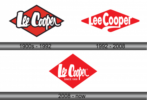
The logo displays the name “Lee Cooper” in a distinctive cursive font, bold and dynamic. Set against a red diamond background, the text pops with a contrasting white outline. The font’s curves exude a casual yet confident vibe, while the diamond’s shape adds a touch of classic sophistication. This design choice conveys a blend of tradition and modernity, reflecting the brand’s long-standing history in fashion. The logo’s color scheme is striking, ensuring visibility and brand recognition.
1992 – 2008
The Lee Cooper logo boasts a bold red parallelogram that points rightward, symbolizing forward motion. Within it, “Lee Cooper” is inscribed in a fluid, white script. The typeface suggests elegance and movement. The logo’s angular boundary conveys progress and direction. Its simplicity offers a modern touch, while the color red speaks to passion and energy. Overall, the design balances tradition with a dynamic, contemporary edge.
2008 – Today
This iteration of the Lee Cooper logo returns to its roots with the diamond shape, signaling a nod to heritage. The script is fluid and confident, rendered in white, standing out against the red background. New is the tagline “SINCE 1908” beneath the brand name, asserting the company’s storied history. The “R” symbol for a registered trademark appears, indicating the brand’s established and protected status. The overall design speaks to a legacy brand that’s proud of its long-standing tradition in the fashion industry.
