Lenskart Logo
Lenskart is a prominent eyewear retailer, spearheading the optical industry with a blend of online and offline shopping experiences. Originating in India, it now has a wide reach across various markets, offering an extensive range of eyeglasses, sunglasses, and contact lenses. The company harnesses advanced technology, including 3D try-ons and AI-based recommendations, to enhance the customer journey. Founded by Peyush Bansal, the brand has consistently evolved, merging innovation with fashion. While it holds a dominant position in India, Lenskart’s ambition of global expansion is evident through its growing international presence.
Meaning and history
Lenskart, founded in 2010 by Peyush Bansal, started as an online platform, aiming to revolutionize India’s eyewear industry. Its inception was driven by the vision to make quality eyewear accessible and affordable. Initially functioning purely online, the company soon realized the potential and importance of a physical touchpoint. By 2014, Lenskart began its offline journey, inaugurating brick-and-mortar stores across India, thereby offering a unique omnichannel experience.
In its early stages, Lenskart faced typical startup challenges but swiftly overcame them through customer-centric innovations, such as the Home Eye Check-up program and the 3D Try-On feature. This focus on technological innovation became a core part of Lenskart’s DNA.
Over the decade, while Peyush Bansal continued to spearhead the company, Lenskart witnessed substantial investments from prominent stakeholders, propelling its valuation and aiding in its aggressive expansion strategies. The company didn’t just stick to its initial product offerings but diversified into manufacturing via its in-house brand, John Jacobs, and introduced advanced eye-testing services.
While the brand remained dominant in India, by the late 2010s, Lenskart started eyeing international markets. Their overseas foray began with Singapore, indicating a broader vision for global dominance.
Today, with a mix of strategic investments, technological advancements, and consumer-focused services, Lenskart stands as a testament to innovation in the eyewear industry, having transformed from a budding startup to a leading optical retail giant.
2010 – 2013
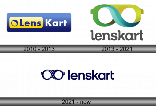
In 2010, Lens Kart introduced its inaugural logo, which remained consistent for a span exceeding three years. This emblem was characterized by a horizontally elongated blue rectangle, paired with a more diminutive yellow segment on its left. This yellow section showcased a gradient backdrop juxtaposed with a bold blue typeface, spelling out “Lens”, positioned to the right of a simplistic emblem. This emblem was depicted by a blue circle with a pronounced upper-right segment. Meanwhile, the word “Kart” was showcased prominently in bold white letters, superimposed over the blue expanse of the main rectangular design. This initial representation was a fusion of simplicity and boldness, effectively conveying the brand’s identity during its early days.
2013 – 2021
Lenscart’s emblematic logo prominently showcases eyeglasses viewed head-on. Ingeniously, the design of the frame morphs into the shape of an infinity symbol. This emblematic sign exhibits a tri-colored palette: a verdant green on the left, a tranquil blue at its core, and a sunlit yellow on its right. Beneath this illustrative design, the brand’s moniker is displayed. Crafted in a muted gray hue, the typography is characterized by its gentle rounded serifs and tightly-spaced lowercase letters, giving it a contemporary yet elegant appearance. This combination of design elements encapsulates the brand’s essence and its commitment to endless style and vision solutions.
2021 – Today
In the latest iteration of Lenskart’s visual identity, the emblematic eyeglasses take center stage. Cleverly, the frame is crafted to resemble the infinity symbol through the seamless integration of certain linear elements. Adjacent to this, the brand’s name is tastefully scripted by the creative team. This refreshed design choice embodies a unified, singular color theme throughout. The decision to adopt a monochromatic scheme amplifies the brand’s modern ethos while paying homage to its timeless commitment to vision and style. The entire composition harmoniously intertwines innovation with the brand’s legacy.


