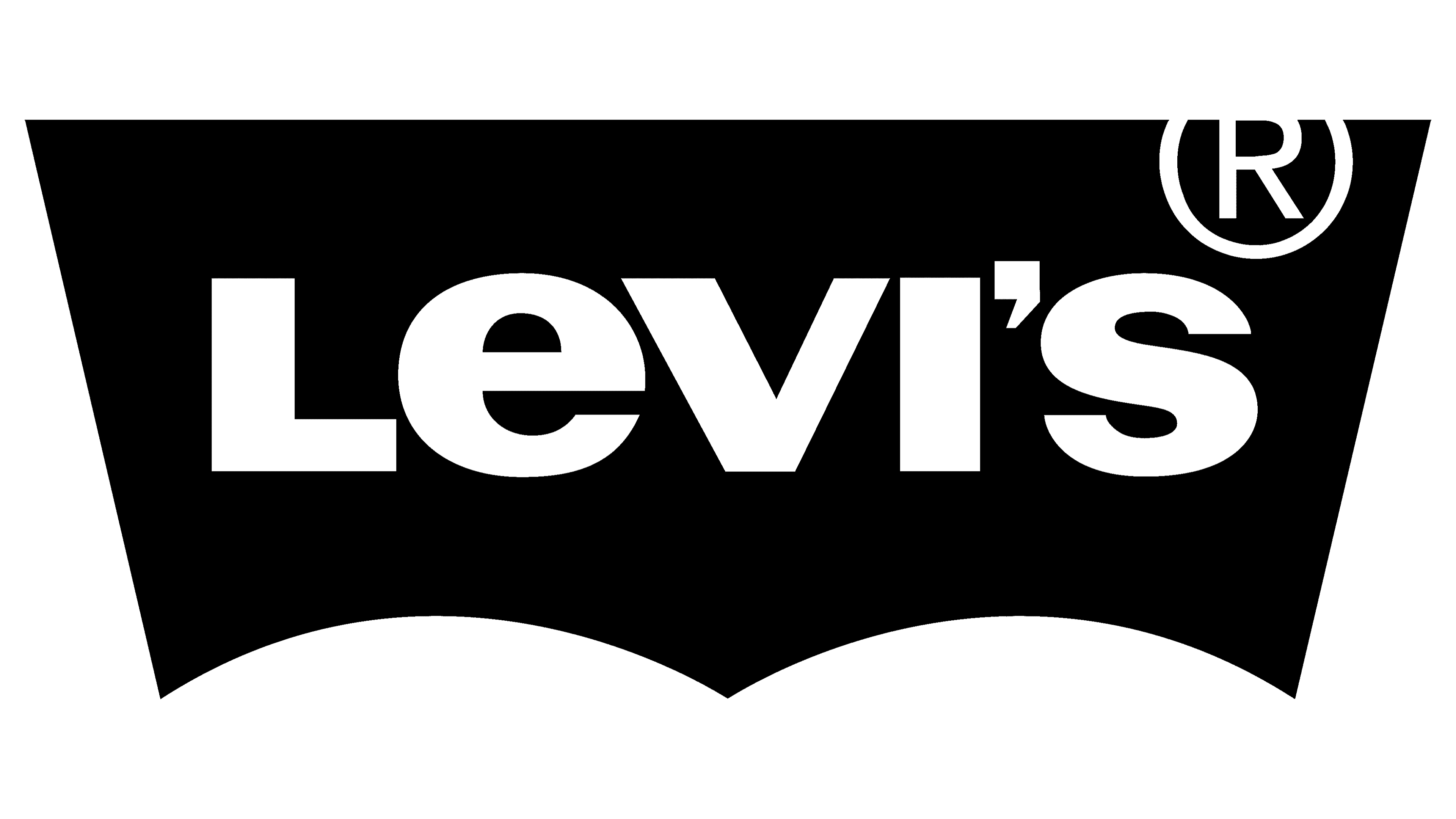
Levi’s Logo
Levi’s is an internationally known brand that manufactures a diverse collection of clothing such as shirts, jackets, jeans, and accessories from denim fabric. Currently, Levi’s is based in San Francisco and has a considerable presence across 110 countries globally. Levi’s is renowned for its quality and timeless style and continues to innovate with eco-friendly production practices and collaborations with other brands to create unique collections.
Meaning and history
![]()
Levi’s has been around since 1853. It was founded by Levi Strauss, who was a German that arrived in the East Coast during the gold rush. Initially, the company manufactured canvas tents and horse covers to miners. Later on, they switched their focus to denim clothing, and in 1873, they brought to the market their most renowned creation, blue jeans. They were constructed with rivets that made them durable and perfect for miners. Today, Levi’s is one of the most considerable denim brands globally, known for its quality and timeless style.
What is Levi’s?
Levi’s is a renowned denim brand, producing an extensive range of clothing, including jackets, jeans, shirts, and accessories, all crafted from denim fabric. With its headquarters based in San Francisco, Levi’s has a noteworthy presence across 110 countries globally. The brand is often associated with high quality and classic fashion, and it continues to innovate with eco-friendly production methods and collaborations with other brands to create exclusive collections.
1853 – 1892
![]()
The original logo featured a rectangle the wording “Levi Strauss Co” inscripted on it. The badge metallic and had a solid grey backdrop with white wording, giving it a robust appearance.
1892 – 1925
![]()
The brand’s renowned logo was crafted in 1892, featuring a design aimed at those who couldn’t read. The insignia showcased a thick uppercase inscription with no serifs at the top, a black white-contoured stripe, and “Original Riveted” caption. The bottom part contained an picture of two men with their horses, with extra text, all underscored by two ribbons. It is the most elaborate and intricate label of the brand.
1925 – 1929
![]()
In 1925, Levi’s underwent a redesign of their logo, resulting in a simpler yet more colorful and playful emblem. The new logo featured the company nameplate in red, outlined in black, and executed in a rounded font without serifs. This redesign gave the logo a more approachable and friendly appearance.
1929 – 1943
![]()
Their logotype was reinstated again in 1929, that time displaying an inscription of fat typeface with angular sans-serif letterforms. Each of them was accompanied by a black contour and a bold shadow on the right. Colored blue, they stood on a deep red background. Additionally, the “America’s Finest Overall” caption was added underneath the name in dark blue capital letters.
1943 – 1949
![]()
In 1944, the logo had met a redesign that included modifications to its color code and shapes. The letterforms were now made in a paler hue of blue, while the background became bright yellow. The slogan was written in light gray, but it was enlarged for better legibility. The outline and shadows of the letters disappeared, but the symbol’s brightness and contrast stayed unruffled.
1949 – 1954
![]()
Levi’s brand identity experienced another transformation in 1949 with the introduction of a red-and-white coloring. The white lettering without serifs stood on a bold scarlet-red background and was paired by the slogan “When There’s Work To Be Done Wear” composed in lowercase utilizing a sans-serif typeface with many circled tips. The addition of the slogan softened the overall look of the logo, balancing the strictness of the bold characters.
1954 – 1969
![]()
The logo changed its style again in the 1950s, resulting in a trendy and fashionable interpretation. The name was rewritten using a custom typeface with softened arcs and slanted cuts on the “E.” The catchphrase “Vintage Clothing” was placed below the brand title and composed in a classic bold sans-serif font. The back color was a darker and more intense shade of red than the previous version.
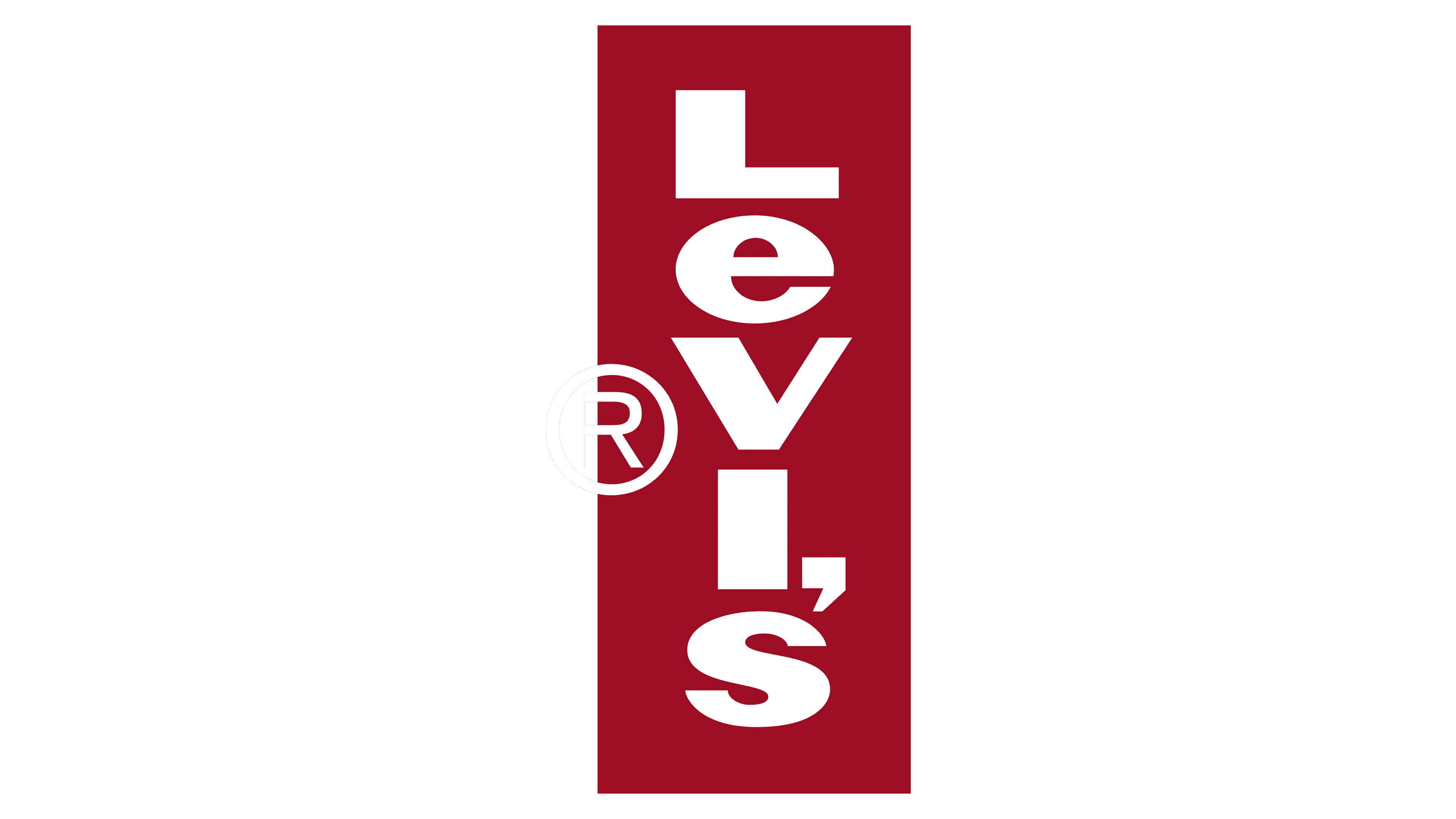
1969 – 2003
![]()
Introduced in 1969, the recent Levi’s brand mark reresents a red angular background with “Levi’s” inscription, with all letters except the “E” in title case. The white name caption is in a simple and modest typeface with no serifs, which looks fresh and clear.
2003 – Today
![]()
Font
The Levis’ Rad Tab emblem features a readable sans-serif font that has stayed almost intact since its invention in the mid-30s, with the only notable change being the form of the symbol “e.”
Color
The bright red hue of Levi’s emblem is eye-catching and ensures perfect visibility, making it a standout among other brands.


