Linux Logo
Linux, initiated by Linus Torvalds in 1991, is an open-source operating system kernel that’s become the foundation for various OS distributions. Diverse in its applications, Linux powers a multitude of systems, from supercomputers to home devices. Championed for its flexibility and security, it’s a favorite for server environments, and has even expanded its presence in desktop, mobile, and embedded systems. A vibrant community ensures its evolution, while its open nature allows for customizable solutions tailored to specific needs.
Meaning and history
In 1991, a young Finnish computer science student, Linus Torvalds, set out on a venture that would revolutionize the tech world. Inspired by MINIX, a small UNIX-like system, he began developing a kernel that became known as Linux.
Releasing it as free software, Torvalds invited developers to contribute. The kernel combined with GNU software formed a fully operational OS. By the mid-90s, businesses saw Linux’s potential. Companies like Red Hat began providing commercial support, elevating Linux from a hobbyist project to a mainstream choice.
The establishment of the Linux Foundation in 2007 marked a significant step, ensuring standardized development and broader adoption. Linux’s adaptability made it perfect for emerging technologies, and it soon became the backbone for server systems, cloud computing, mobile devices, and even supercomputers.
Its open-source nature fostered collaboration, with giants like IBM, Google, and Facebook contributing to its growth. Over time, numerous distributions, or “distros”, such as Ubuntu, Fedora, and Debian, emerged, tailored for specific user needs.
Today, Linux stands as a testament to the power of community-driven innovation. From powering vast data centers to running on personal laptops, its footprint is undeniable and ever-expanding.
1996 – Today
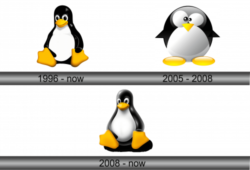
The emblem showcases a penguin set against a pristine backdrop. Crafted with a refined touch, this avian figure rests with its limbs stretched outward, seemingly engrossed in observation. The snout mirrors its natural counterpart, though future designs would evolve it into a triangular shape. A genial countenance graces the creature’s visage, underlining the welcoming nature of the operating system. This depiction continues to hold significance and remains an enduring representation of the platform, symbolizing both its open-source foundation and approachable nature for users worldwide.
2005 – 2008
In 2005, there was an endeavor to switch out the mascot for a more comical and awkward version, bordering on satire. This rendition persisted for a trio of years. The badge showcased a plump penguin, its eyes sketched oddly, conveying a sense of puzzlement. Amplifying this sentiment were the flippers, splayed outwards in contrasting directions, seemingly mirroring a gesture of confusion or as though the avian was nonchalantly expressing uncertainty about something. This whimsical take provided a distinct contrast to previous interpretations, reflecting a light-hearted approach during its tenure.
2008 – Today
Alongside the original emblem, a contemporary iteration is being developed. This depiction presents the penguin in a more bemused and ungainly posture: it stands with wings outstretched and eyes prominently protruding. The artwork embraces a playful, animated aesthetic, evident in the choice to represent the bird’s feet with a pair of golden elliptical shapes. This fresh take infuses humor and light-heartedness, juxtaposing the serious tone of its predecessor while capturing a sense of whimsy and charm that appeals to a different audience segment. The illustrative finesse showcases the versatility of design and the ever-evolving nature of branding.


