Lucid Motors Logo
Lucid Motors is a relatively young electric car automaker that focuses on the premium class. As the name suggests, Lucid is inspired by the desire to see things differently and make the wildest dreams come true. The brand’s slogan “Dream Ahead” supports the brand’s goal to be constantly pushing the technological boundaries in the field of electric vehicles. Its first model was the most powerful car made with innovative technologies that fully comply with zero emission standards.
Meaning and History
In 2007, Atieva saw the light of day, headquartered in Palo Alto, just a few miles from the Tesla office. It had Chinese and Japanese investors and planned to make electric vehicles from the very start. At the end of 2016, the company announced a name change to Lucid Motors. It also presented the premium electric sedan Lucid Air designed to compete with the Tesla Model S. Investors include Chinese holdings Tsinghua Holdings Corp. and LeEco, Japan’s Sumitomo Mitsui Banking Corporation, and America’s Venrock. In 2018, a controlling stake (67%) was bought by the State Investment Fund of Saudi Arabia for $1 billion.
What is Lucid Motors?
Lucid Motors is a sustainable vehicle manufacturer that builds vehicles from the ground up. The development of the smallest details is carried out by Lucid Motors specialists using unique technologies. It has Chinese roots but is headquartered in California, with Peter Rawlinson, a former Tesla chief engineer, holding the CEO position.
2007 – 2016
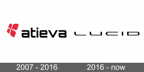
The company’s logo features a bold font and an equally strong and powerful emblem to the left of the name. The latter resembles a side view of four rounded squares that form one figure. The lettering also repeats the rounded, fluid shapes of the emblem. Yet, there are also straight lines and cuts. This creates a perfect balance and reflects the modern approaches of the company when it comes to the design of its cars.
2016 – Today
A logo update was necessary as the company was renamed. The new version has a completely different feel. It features fluid, smooth strokes combined with sharp angles and straight cuts. Its futuristic, sleek appearance is completely in line with the modern, innovative developments of the brand. All capital letters, which are widely spaced, make the company look very confident.
Font and Color
Initially, the company went for a bold red and classic black. This color combination gave the logo a professional appearance. Later, it kept only black for a sleek, modern feel. It used two completely different fonts. Yet, both of them combine curved, fluid lines with straight, bold strokes. Initially, it was bold and featured all lowercase letters. The next logo used thinner and more delicate strokes, which created an elegant appearance.


