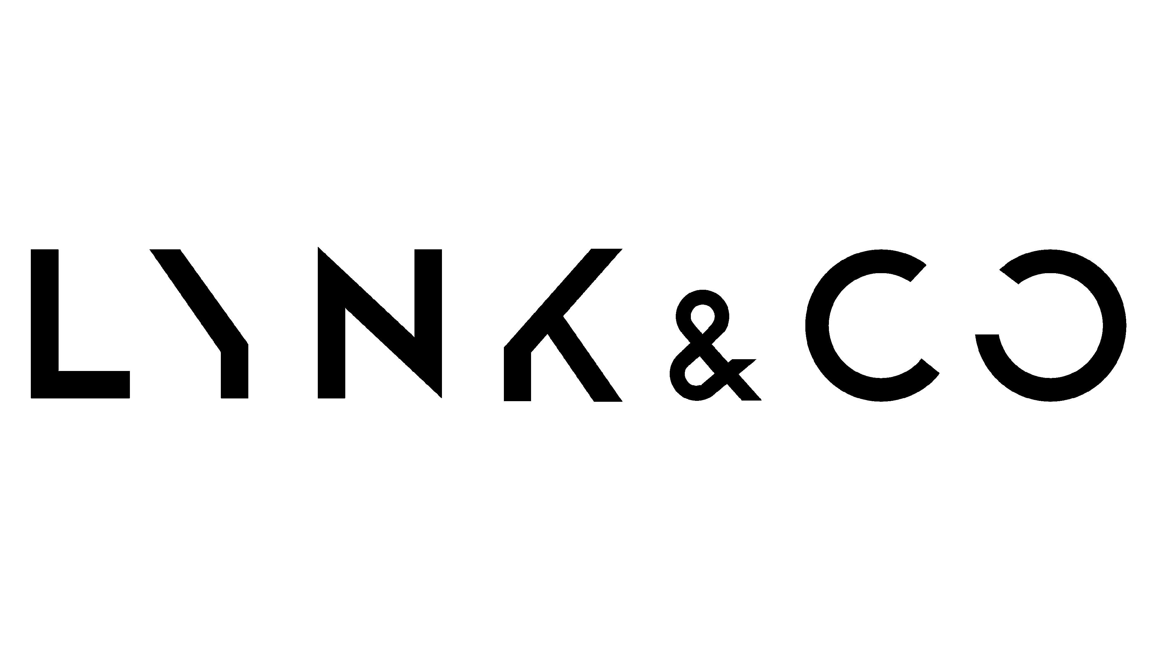
Lynk & Co Logo
The premium brand Lynk & Co is part of Geely Holding and is equally owned by Geely Auto and Volvo. This Chinese brand already entered the European market by opening stores in several countries. The company does not create the usual dealer networks there, though, limiting itself to opening original clubs and renting cars by subscription. The abandonment of the traditional network of car dealerships allows the company to save significant money. It is possible to service cars at Volvo stations, which also ensures warranty obligations.
Meaning and History
When Geely and its subsidiary Volvo launched Lynk & Co in 2014, it was not just a new car brand, but a new sales model. The creators tried to move further from traditional names, so the company was named Lynk & Co. “Lynk” part is associated with the word link and reflects the main value of our time – communication, while “Co” is “cooperation”. The company offered customers to choose and buy cars online with subsequent delivery to the buyer’s home. Sales began in 2017 in the domestic market of China. Today, Lynk & Co products are already officially represented in Germany, Belgium, the Netherlands, Sweden, and India. The plans are to soon expand to other countries, including Australia, New Zealand, and Malaysia.
What Lynk &Co?
Lynk & Co is an automaker that is focused on a young audience, ecology, fashion, and mobile technologies. They have versions with a conventional internal combustion engine and a hybrid circuit as well as a very unique sales approach.
2016 – Today
The logo of this new, innovative brand has a simple, yet bold and timeless look. It features all uppercase lettering of black color. The strokes are quite angular and thick, which makes the brand look very confident. The right diagonal line of the “Y” and part of the vertical stroke of the “K” are missing, which creates some kind of symmetry around the “N”. The “O” is also not fully closed, which creates a feeling of openness to new connections and possibilities. The “&” sign is done using a smaller font.
Font and Color
The designers used a geometric, bold, sans-serif font. It has a very modern and sleek style. All the letters are title-case and feature clean lines combined with straight and pointy angles. An interesting feature of this font is the fact that the letters “Y”, “K”, and “O” are missing some of the strokes. It used a black color for the logo, a classic color. It also has something powerful, elegant, and luxurious about it.


