Malibu Logo
Malibu is a coconut liqueur made from white Caribbean rum and coconut. The technology of making liquor was brought to perfection. Carefully filtered light molasses light rum is blended with coconut milk and other natural ingredients. It has a delicate taste and can be consumed on its own or used in the preparation of cocktails. The strongest of the liqueurs, Malibu Black, contains dark rum. Malibu is recognizable thanks to its original white bottle. The drink has received many international awards.
Meaning and History
![]()
Malibu is a brand of liqueur, which has been founded in Barbados islands – a small nation in the Caribbean Sea, close to South America – in 1982. In 1997, Guinness, which owned the Malibu trademark, became part of the world’s largest producer of alcoholic beverages, the Diageo concern. In 2002, the brand was sold to Allied Domecq. Since 2005 Malibu is owned by the French company Pernod Ricard. Thanks to the professionalism of the new management, the company became the world leader in the field of elite alcoholic beverages in a short time. Have you been thinking, why did the brand designers come up with this visual identity? Well, as Malibu is a brand with Caribbean origins, its marketing reflects the spirit of this region. The sun and palm trees logotype of the brand is supposed to share the Caribbean atmosphere with people across the world.
What is Malibu?
Malibu is one of the most popular alcohol brands in the world. The Malibu brand belongs to Pernod Ricard, a giant corporation that owns dozens of famous brands. The company’s products are supplied to more than 150 countries around the world.
1982 – 2013
![]()
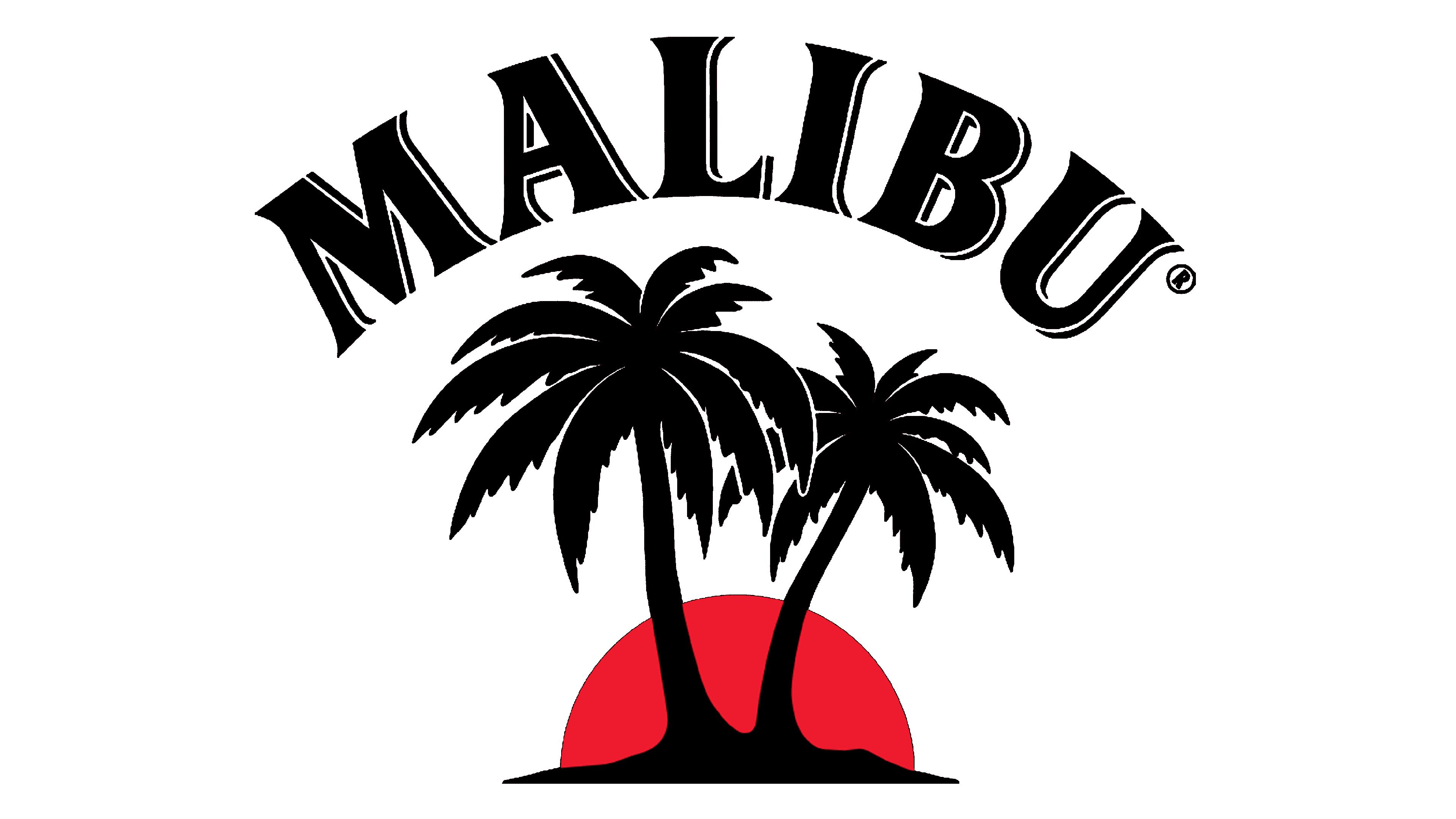
The logotype of the brand depicts a sunny island somewhere in the Caribs. Two dark brown palm trees stand out against the sunset in the background. The sun in the background is drawn as a half-circle with an orange and yellow gradient. Above this emblem, the name of the brand is written. Designers used a serif typeface with a thin outline on one side that created a 3D appearance. All the letters are uppercase, while the word itself is slightly arched.
2013 – 2019
![]()
The new logo kept the name and the general idea unchanged. The palm trees and the sun, though, looked completely different. The sun in the background was significantly bigger and had a form of a circle with a light brown frame. The palm trees also featured a lighter brown with an even lighter brown for highlights. One of the trees looked smaller than the other and they were turned towards each other instead of growing in opposite directions. The sun still had a reddish-orange and yellow gradient, but now the yellow was brighter.
2019 – Today
![]()
The most noticeable changes were done to the color palette. The dark brown was changed to black, while the light brown acquired a different shade. There were also some thin white highlights on the trees. The horizon now looked like a straight line. The sunset acquired a lot more yellow and even a little pink at the top. The was no more frame around the circle and the bigger palm tree has slightly changed its shape. It was also the first time the company modified the way its name was written. It removed the thin line that added some volume and made the letters slimmer and closer together. Their shape, otherwise, has not changed.
Font and Color
The font used for the name is a custom one. Although, it resembles Dragon Serial Heavy with an addition of a shadow line in the first two versions of the logo along with some other minor adjustments. The color palette featured dark brown/black for the name and palm trees which contrasted amazingly against the bright and bold colors of the sunset in the background.


