Meta Logo
Facebook is a social networking platform with well-thought-out functionality that allows users to actively communicate and interact with each other at any time of the day and in any city or country in the world. Users can leave comments, share photos and post links to news or other interesting content on the internet, chat and watch short videos. Facebook is not only a great platform for communication but also a platform for doing business. All the largest and most successful companies have long created their own pages on the social network and are also actively involved in filling and promoting them. Now, it will not be associated with only one product (the social network Facebook). Today, the Meta includes apps and social networks such as Instagram, WhatsApp, Oculus, and Facebook. Rebranding means a company’s focus on the metaverse. A special page on the company’s website states that the foundational products in the Meta structure are communication technologies such as virtual reality, augmented reality, and smart glasses.
Meaning and History
![]()
At the end of October 2021, Facebook founder Mark Zuckerberg announced the name change of his corporation. The company now bears the name Meta. At the same time, the social networks Facebook, Instagram, and WhatsApp retain their former name. Facebook started in February 2004 as an internal social network at Harvard University. It was created by Mark Zuckerberg along with Edward Saverin, both college students. It wasn’t until 2006 that Facebook became available to anyone 13 years of age or older and quickly gained popularity, surpassing MySpace as the world’s most popular social network. Currently, the social network is among the TOP-5 most visited websites in the world. The number of registered users on Facebook has already exceeded one and a half billion.
What is Meta?
Meta is the new name of the well-known platform Facebook, a company that also owns Instagram and WhatsApp. According to the official version, the new name better matches the current activities of the company. It will be a metaverse, an online world where people can work, play games, and communicate, often through virtual reality headsets.
2004 – 2005
![]()
Significant transformations ensued, leading to the emergence of a platform named “thefacebook,” presented in a singular, unified spelling. This name served as the foundation for the brand’s visual identity. The wordmark, rendered in azure lowercase characters, was framed within square parentheses. This entire assembly sat prominently against a deep navy-blue rectangular backdrop. Over time, this distinctive design became synonymous with the platform, highlighting its innovative approach and the beginnings of what would become a digital revolution. This emblem not only represented a brand but also marked a shift in social networking dynamics.
2005 – 2015
![]()
2005 marked a pivotal moment for the social media giant, leading to significant alterations in its visual identity. Following the acquisition of a new domain, the brand’s emblem underwent a transformation, becoming more streamlined and refined. The prefix “the” was eliminated for clarity, making the platform’s name more prominent. Enhancements to the typography, with enlarged and whitened lettering, ensured the brand name stood out prominently. Consequently, “facebook” expanded, nearly occupying the entirety of the azure backdrop. This pivotal change laid the foundation for the emblem’s iconic rectangular format, a defining look that remains associated with the platform’s enduring legacy.
2015 – 2019
![]()
On July 1, 2015, the brand introduced a refreshed logo, showcasing a contemporary typeface. Even though a distinct emblem was later revealed for mobile applications in 2019, the 2015 design remained the staple for the primary website. This retention signifies the lasting impact and relevance of the 2015 redesign, illustrating how iconic symbols can endure, even as brands evolve and adapt in the digital age. It’s interesting to note how companies often have multiple visual representations to cater to various platforms, ensuring the most effective engagement with diverse audiences across different digital touchpoints. This strategic move underscores the significance of adaptability in modern branding.
2019 – 2021
![]()
The corporation behind the social media giant, Facebook, Inc., unveiled a fresh wordmark, distinct from its flagship social networking platform.
This rejuvenated emblem employs bespoke font styles and is crafted for sheer legibility. Its primary intent is to draw a clear visual line between the corporate entity and the well-known application. Facebook’s rationale for embedding the phrase “from Facebook” was to enlighten the public about the interconnectedness of its various applications, emphasizing that they operate on a common backbone and are managed by overlapping teams. The revamped identity was a collaborative effort, conceived in-house, but in tandem with experts from Dalton Maag and Saffron Brand Consultants.
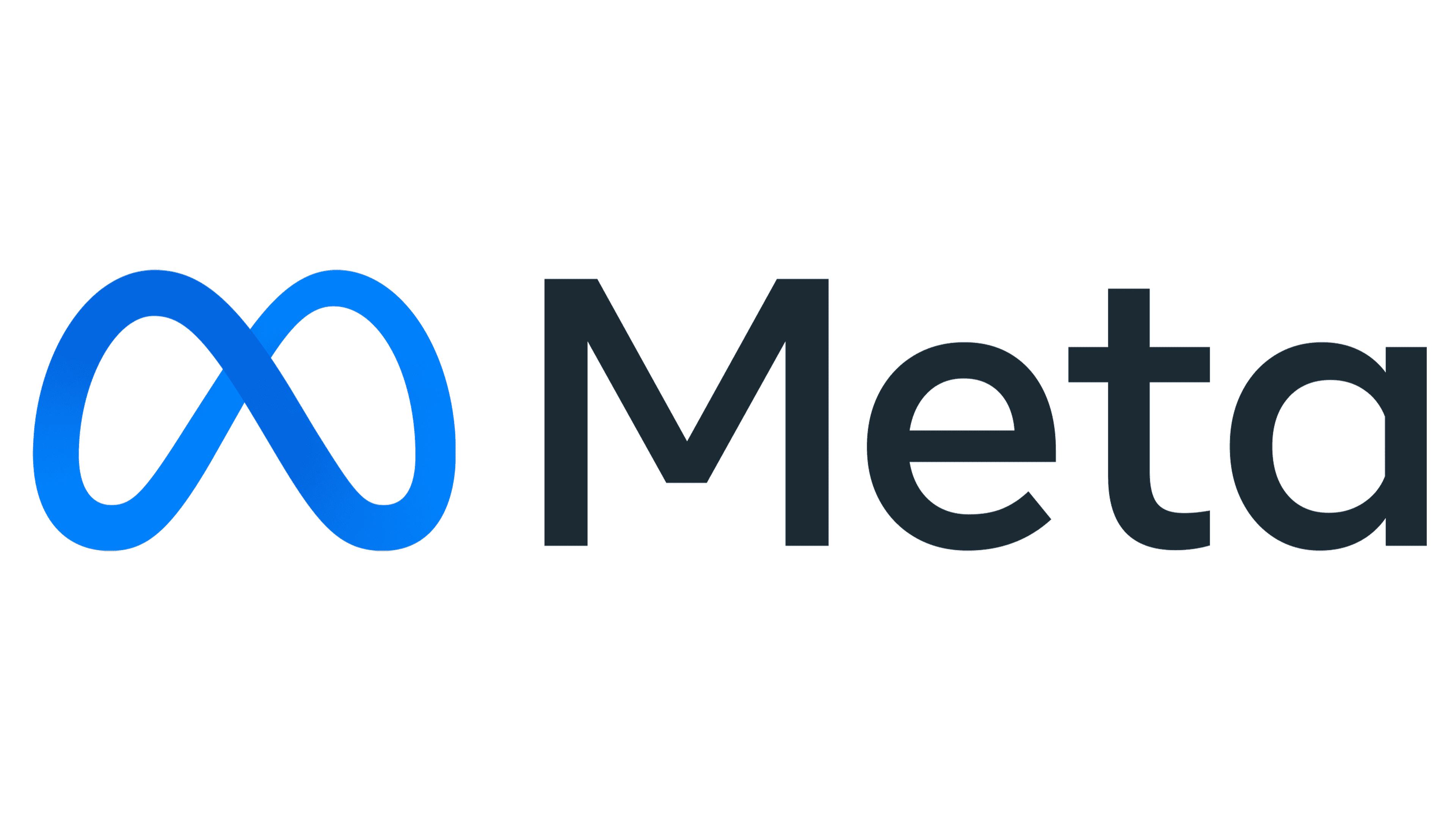
2021 – Today
A new corporate logo has been presented at the time of the name change. It is a Mobius strip, which is a mathematical concept that describes a figure that looks like an infinity sign. “I used to like classic research, and the word Meta comes from the Greek word for after,” said the IT entrepreneur. The founder said that this form is symbolic for him because one can always come up with and implement something new. The strip is varying shades of blue for a 3D appearance. It is accompanied by the name of the company on the right. The word “Meta” is written in black with the first letter being capitalized.
Font and Color
The famous platform used its company typeface that was introduced in 2019 for its wordmark. The font resembles the “Lto. Poligon Medium” typeface, which was created by Doni Sukma and published by Letter Omega Typefoundry. This is a traditional full-shaped sans-serif typeface. The company uses a black and blue color palette. These are classic, formal colors that stand for power, stability, loyalty, intelligence, security, and communication. These are great choices for a company that places innovation and communication at the core of its business.


