MSN Logo
MSN.com is one of the most popular internet portals. There is also a search engine search.mns.com. The MSN system is also the default search engine used when Internet Explorer users enter a search query into the address bar. It is also an information platform, and according to MediaMetrix, is one of the most visited websites among American web portals. It is second only to Google and Yahoo! search engines. Moreover, many are familiar with MSN Messenger, which was later replaced by Skype.
Meaning and History
Web services are launched and run on the MSN domain of the same name, which was created in 1995. The name MSN is an acronym for Microsoft Network. It hosts an information portal owned by Microsoft. It is interesting to note that the MSN search engine (msn.com) never had its own directory. Since 1997, the MSN system has used different databases to provide search results, such as Yahoo!, LookSmart, Altavista, DirectHit, Inktomi, and RealNames. In recent years, developers have largely changed the design of the resource and expanded the possibilities for users to access services and services. For instance, it added an MSN Messenger Service in 1999, but since 2013, it is no longer available.
What is MSN?
MSN or Microsoft Network is a whole system of web services owned by the software giant. To date, several dozen web applications and websites are known under the MSN brand. The MSN domain itself is a large information portal on a wide range of subjects, which is quite popular among regular network users.
1995 – 1996
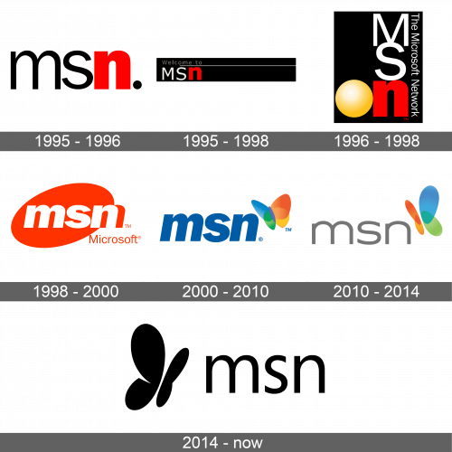
As many companies do, Microsoft used an acronym for its new service as the main element of the emblem. All the letters were lowercase with an accent made on the last letter “N”, which stood for “Network”. It was bold and printed in red. An interesting feature of this logo was a black dot at the end of the logo, which made it instantly relatable to web addresses.
1995 – 1998
1996 – 1998
The new logo had the initials stacked on top of the other. Since the emblem was done on a rectangular black background, the black color of the letters was replaced by white. The font was preserved the same, although the first two letters were now capitalized. They also introduced a yellow circle with a gradient that gave it an appearance of volume. It was placed on the right of the “N”, creating the word “ON”. In addition, the company added the full name, which was running down the right side of the rectangle.
1998 – 2000
The designers took the red from the previous versions to create a new powerful image of the service. It was used mainly for the diagonal oval shape. The white letters looked of the name acronym looked well against the red. The designers preserve the font but made all the letters lowercase, italicized, and bold. The inscription was going a bit beyond the oval, so they added a red shadow behind. As a final little touch, they added “Microsoft”. The inscription started right under the “N” and was done using a red, fine, sans-serif font.
2000 – 2010
The only element that was left from the previous version was the style of the inscription, although it was now blue to show the reliability and trustworthiness of the service. It was accompanied by a completely new element – a butterfly. The latter had each wing of different color, going from orange to yellow, green, and then blue. It was placed in the upper right corner. It is interesting that three different design providers worked on this emblem. They were FutureBrand, McCann Erickson, and Everbrand.
2010 – 2014
The butterfly was drawn from a different perspective as it turned around and flew toward the inscription. Its shape also changed. Another change introduced this time was a new font. The inscription was no longer bold, although it was still done using all lowercase letters. The gray color of the letters created a formal, stable, and neutral image of the brand.
2014 – Today
In 2014, the company introduced a modern and stylish logo. It still featured the same elements – a butterfly and the initials. Here, though, the butterfly was placed on the left and the whole emblem was done in black. In addition, the inscription featured a new font, which was similar to the one used in several other versions.
Font and Color
Until 2010, the company used a font that resembled Helvetica or Franklin Gothic Bold Italic. Sometimes the letters were made bold. After that, it introduced a new logo that featured a font similar to Artegra Sans Extended Regular by Artegra. In 2014, the company applied a font it introduced back in 2012 – Segoe UI. The color palette used to represent the MSN services varied throughout the years. Initially, it was a rather bold and powerful combination that had black and red as the main colors with white balancing them out. Then, the designers moved to a more colorful, yet professional color palette that instilled trust and loyalty. Besides a multicolor butterfly, the inscription was done in blue, then light gray, which was later replaced by black.
