New Balance Logo
New Balance, an establishment which was originated in Boston, Massachusetts in 1906, is an American enterprise that specializes in fabricating footwear and apparel. The enterprise started with the production of orthopedic boots and arch backs but subsequently broadened to manufacturing athletic footwear and apparel. New Balance is renowned for its dedication to high-quality artistry and for fabricating an extensive collection of products within the US.
Meaning and history
![]()
The firm aims to produce footwear that not only looks good but also provides the wearer with the perfect harmony between amenity and support. The name “New Balance” symbolizes a new approach to creating shoes that cater to the needs of all individuals, regardless of their physical activity levels.
Founded in 1906 in Boston, Massachusetts, New Balance began as a humble manufacturer of arch supports and orthopedic shoes. The business soon ventured into the world of athletic footwear, offering a new range of shoes designed to provide maximum convenience and performance. The brand’s popularity soared in the 1970s, thanks to its unique design that catered to runners who needed stability and comfort.
New Balance has always been dedicated to quality craftsmanship, and it is one of the few shoe manufacturers to produce its products domestically in the States. The brand has a strong reputation in the running and sports communities, sponsoring numerous athletes and sports teams globally. Its innovative designs and use of premium materials ensure that New Balance remains a leader in the footwear industry, always striving to achieve the perfect proportion between style and performance.
What is New Balance?
New Balance, an American firm founded in Boston, Massachusetts in 1906, crafts footwear and apparel. Beginning with orthotic shoes and arch supports, the organization grew to include athletic footwear and apparel. Recognized for its commitment to quality craftsmanship and producing a spectrum of products domestically, New Balance boasts a strong reputation in the fashion industry.
1972 – 2006
![]()
Despite its long history tracing back over a hundred years ago, New Balance only unveiled its premier famous symbol in 1972. It was composed of the intertwined characters “N” and “B”, with 14 strokes or speed marks, cut diagonally across the “N.”
2006 – 2008
![]()
The following insignia of the label still showed the familiar amalgamation of the characters ‘N’ and ‘B’, interwoven together’. The update of the emblem was that the number of strokes lowered from 14 to 12, and they also became thicker. Moreover, the image changed the color palette to bright red.
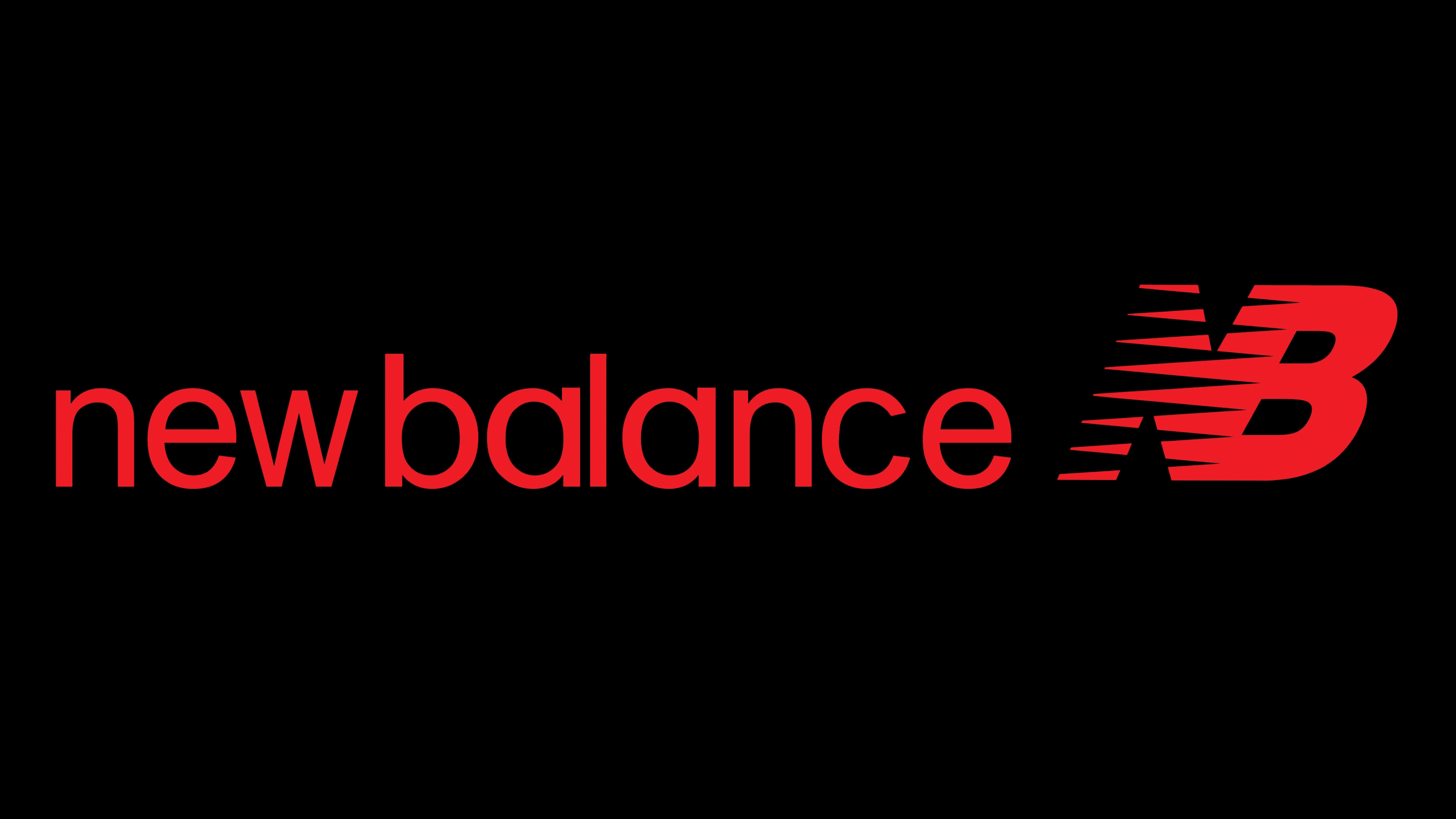
2008 – today
![]()
After a pair of years, in 2008, New Balance updated its logo by reducing the quantity of marks from twelve to five. This variant of the symbol is commonly used in conjunction with the corporate name caption, but there is also an edition that only includes the intertwined “N” and “B” letterforms.
Color

Throughout the past, New Balance’s brand mark has maintained a consistent color scheme, using a few hues: red, black, and white. Despite the color palette has undergone some changes over time, these colors have remained at the core of the brand’s identity. Initially, the logo was monochromatic, but the addition of red was made later to add a pop of color. Today, the logo is available in both black and white, as well as red and white color codes.
Font
The script utilized in the New Balance logo strongly resembles ITC Avant Garde Gothic Demibold, a font family designed by Herb Lubalin for Avant Garde magazine.


